

hello


Problem
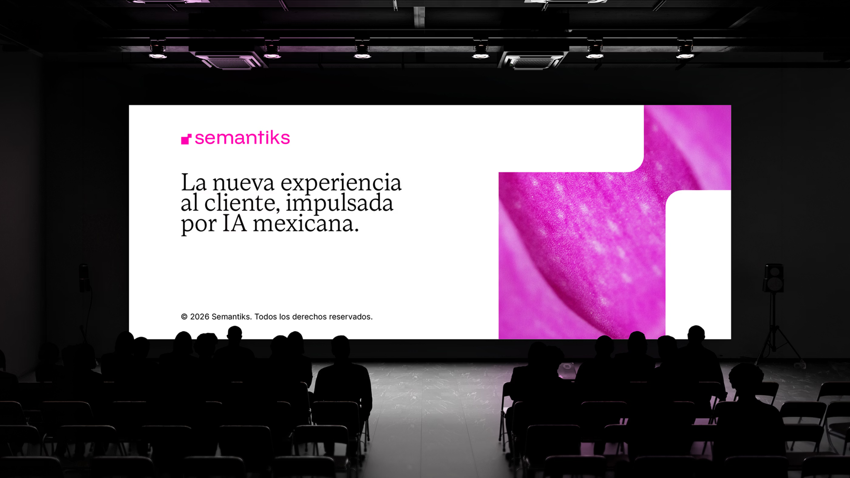
As AI adoption accelerated, businesses faced a growing challenge: turning sophisticated technology into something teams could actually use across customer interactions. Increasing volumes and channels made consistency harder to maintain, while many solutions remained highly technical. The opportunity was to position Semantiks as a platform that could bridge that gap, making advanced AI more accessible without reducing its capabilities.
Solution
The response was to create a brand rooted in Mexico with the ambition and sophistication to compete globally. Built around intelligent presence, the system translates advanced technology into an experience that feels accessible and intuitive, connecting product and brand through a shared language. This gives Semantiks a distinctive position in the category, bringing a local perspective to a global technology.

Smart Certainty.
Information became the central material for exploring how Semantiks could behave visually. Data and interfaces brought structure to the experience, while a Mexican perspective introduced a more expressive approach to color and composition. Together, they shaped a graphic environment where information feels precise and intuitive, while carrying a distinctive point of view.
This thinking extends into a language where typography carries expression and interface elements move naturally beyond the product. Functional cues become recognizable brand assets across different applications. The result gives Semantiks a visual logic rooted in the behaviors of its technology, making information an active part of the identity.
Built to Adapt.
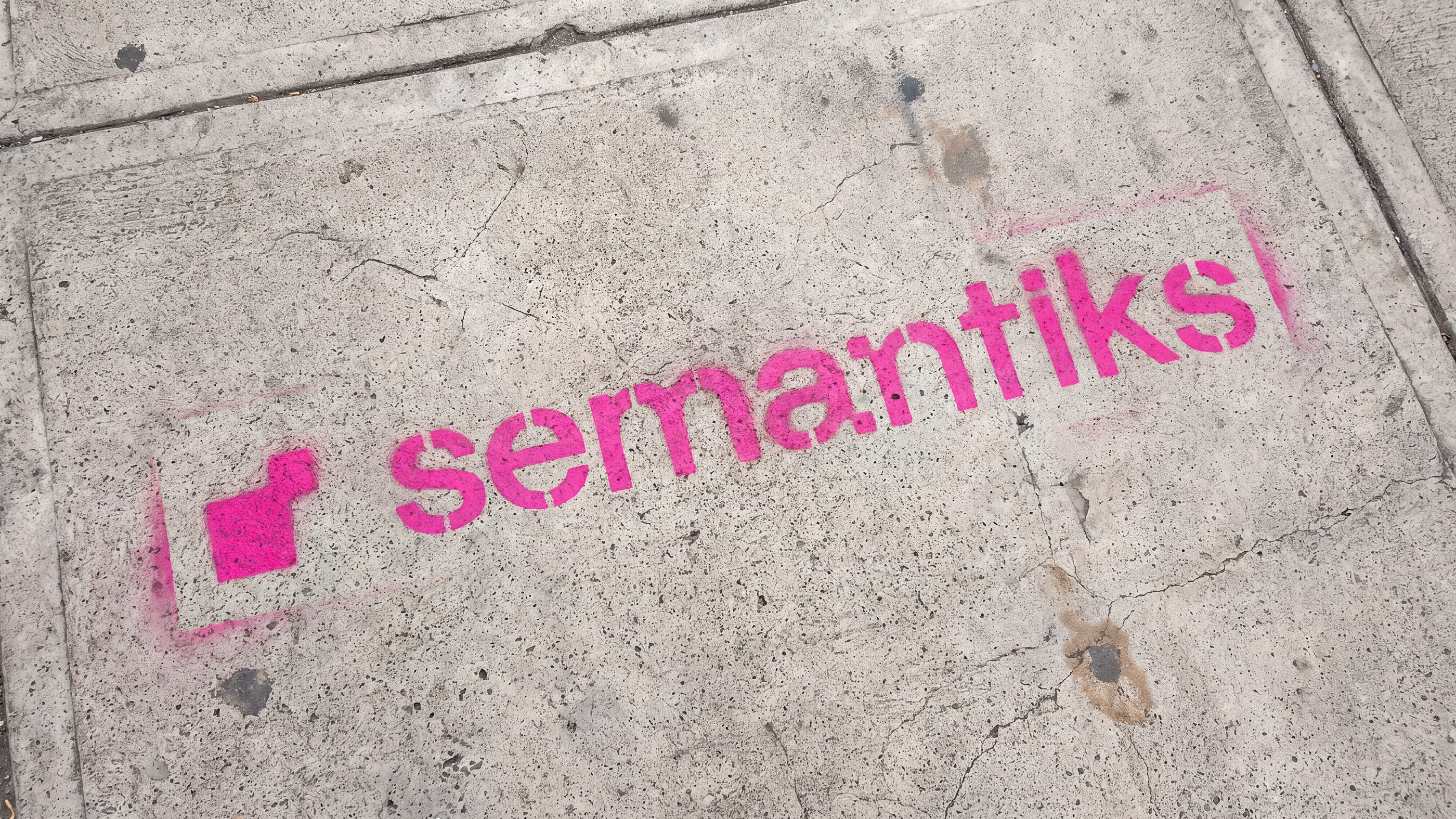
Adaptability became a defining principle for how Semantiks would take shape. The wordmark starts with sans serif typography, redrawn and adjusted to give its letterforms a character specific to the brand. Custom details introduce the geometry that runs through the identity, making the name itself a recognizable expression of the system.
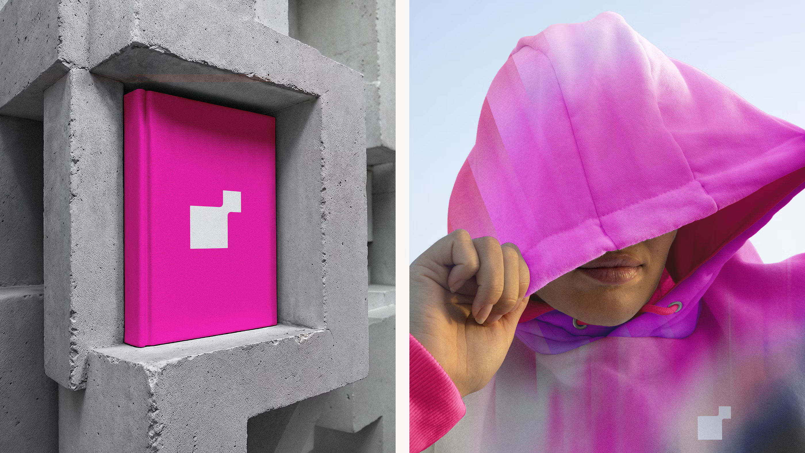
The icon takes shape through connected message forms, reflecting the interactions at the core of the platform. Designed as a responsive symbol, it adapts to different contexts while remaining recognizable. Its modular behavior extends across the system, allowing the mark to shift and evolve while maintaining a consistent visual presence.
System Architecture.
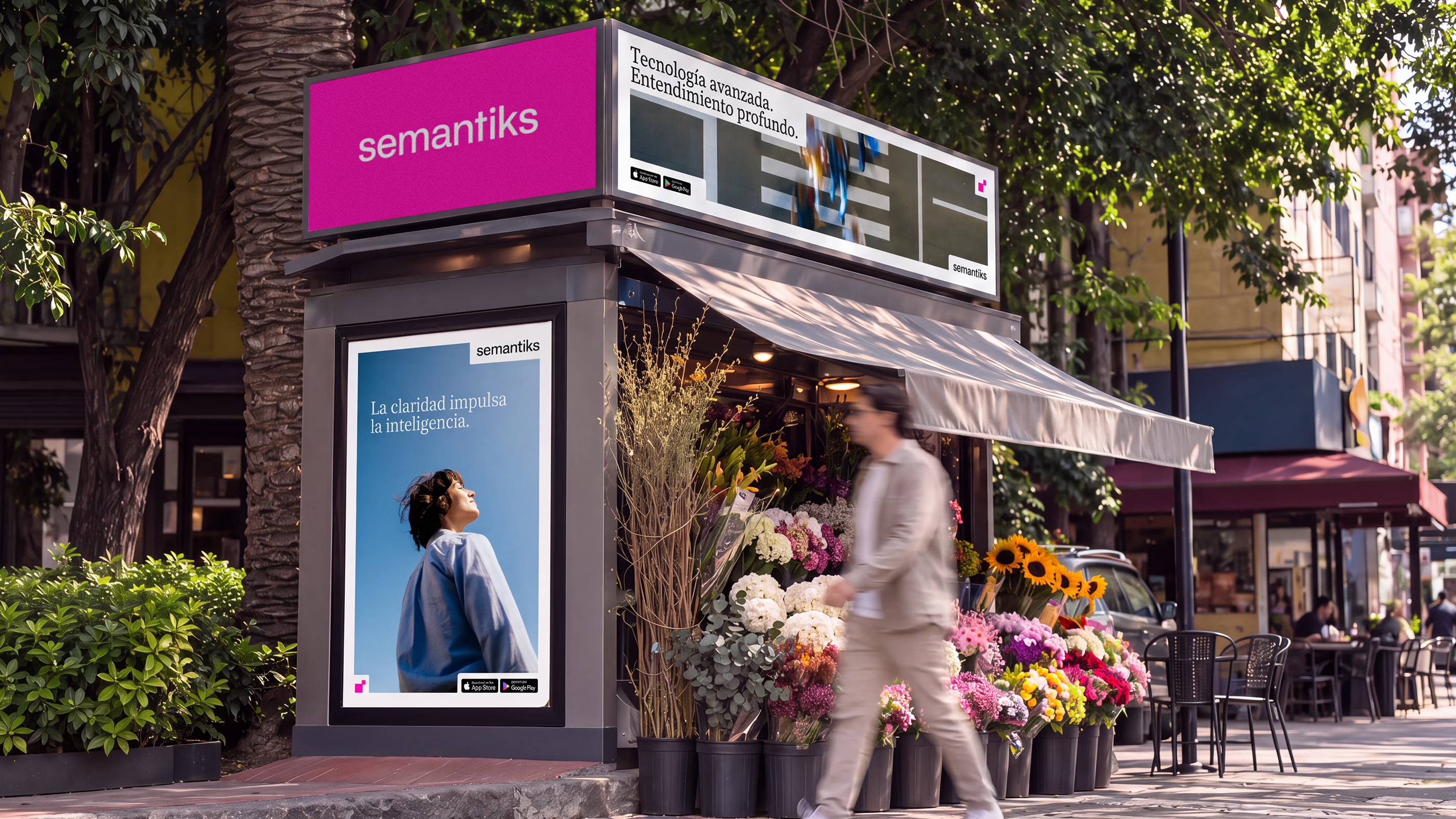
With the platform at the center, the visual system was designed to make every interaction feel natural and easy to navigate. Modular grids generate flexible frames and layouts that organize different levels of content across the Semantiks interface and website, creating familiar structures that bring the user closer to the technology.
Typography and imagery shape hierarchy, while graphics and color guide attention across the experience. Transparency adds depth between interface layers, allowing data and content to coexist naturally. Together, these elements create an intuitive digital language that keeps interactions focused and makes the platform feel like a natural extension of the user.
Life in the Frame.
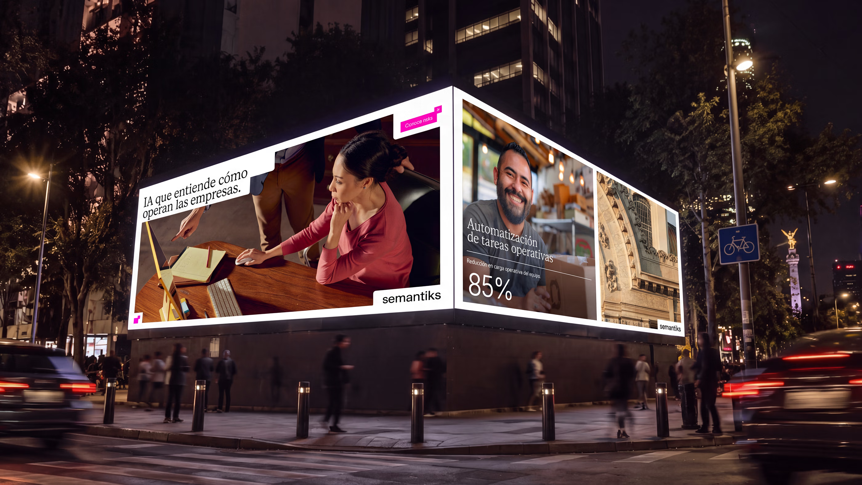
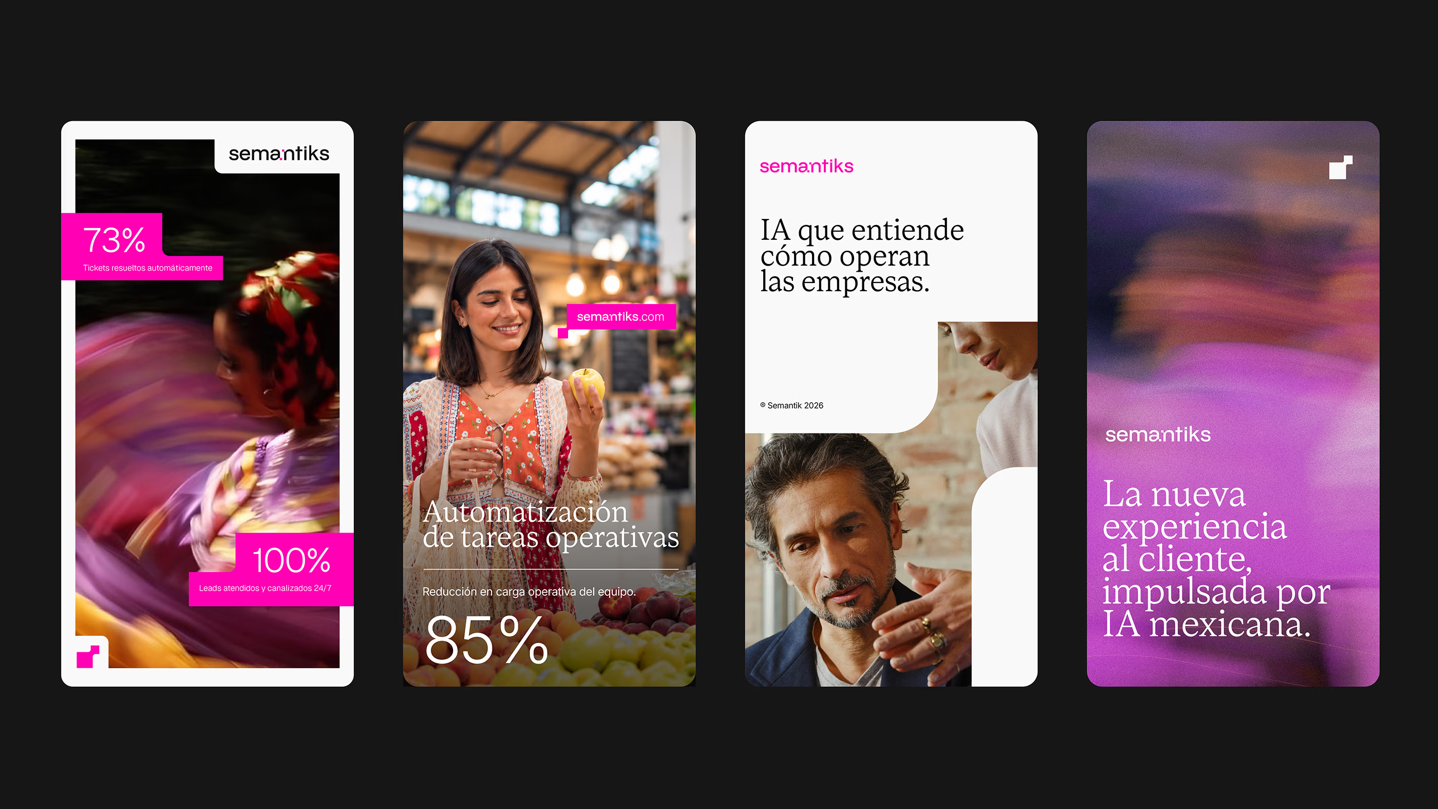
Photographic curation became key to connecting the technological ambition of Semantiks with the people and businesses it is designed to serve. The imagery focuses on the moments where its value becomes tangible, portraying real people and businesses with local impact through a perspective that feels distinctly Mexican.
Warm tones shape the photographic world, balanced by contrasting blues and touches of purple that connect naturally with the identity. Direct portraits bring individual stories forward, while wider scenes capture the character of their surroundings. Together, the imagery places Semantiks within the culture and everyday life where its technology creates value.
A World of Its Own.
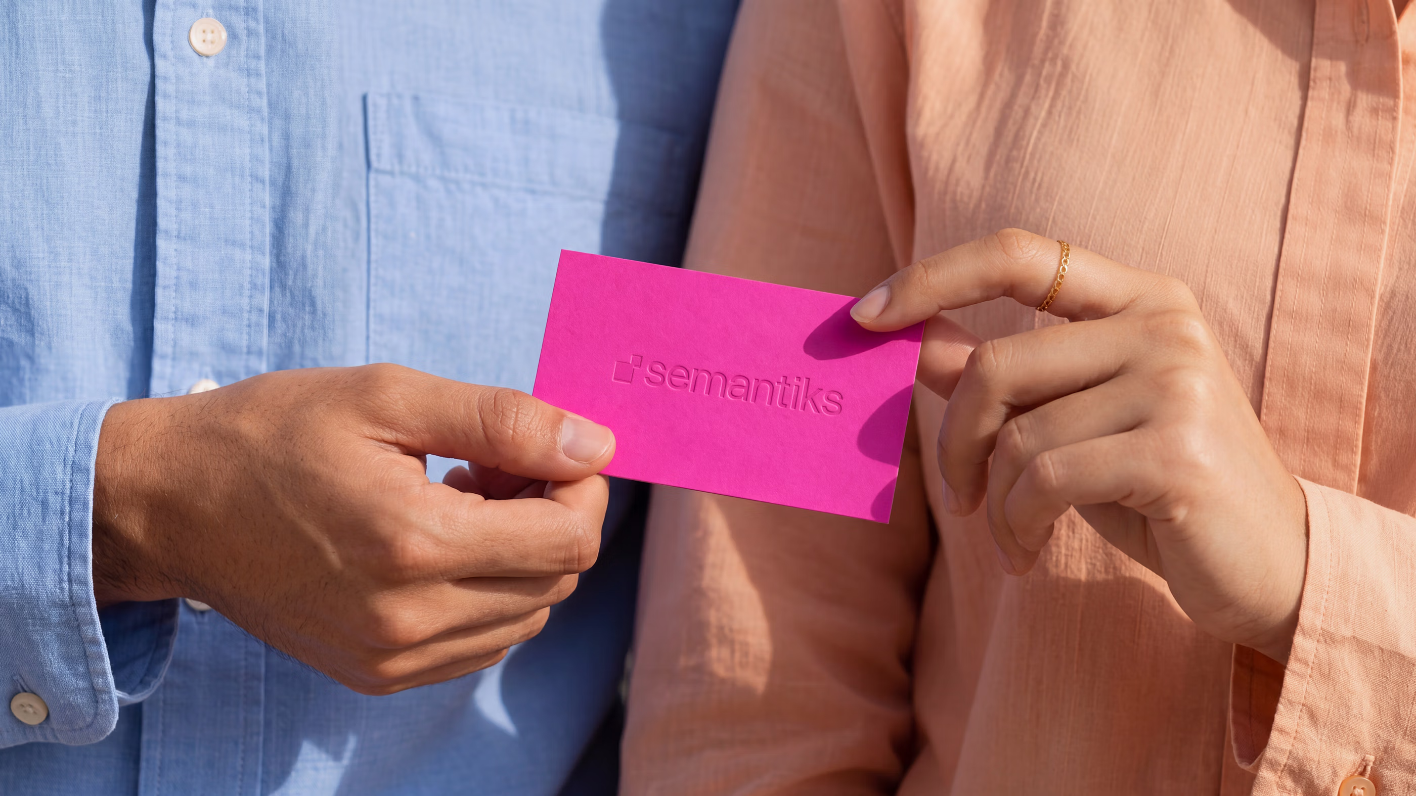
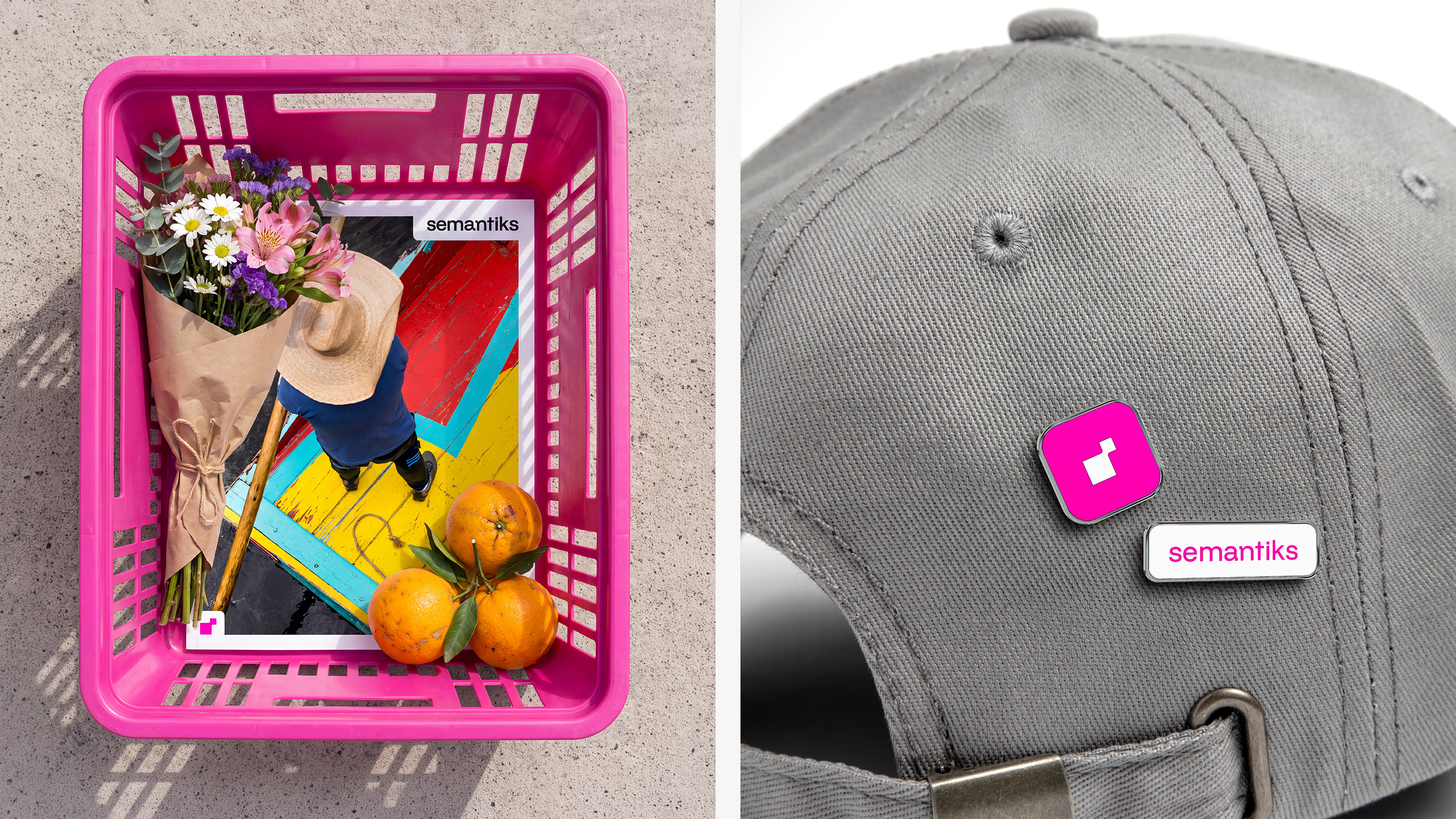
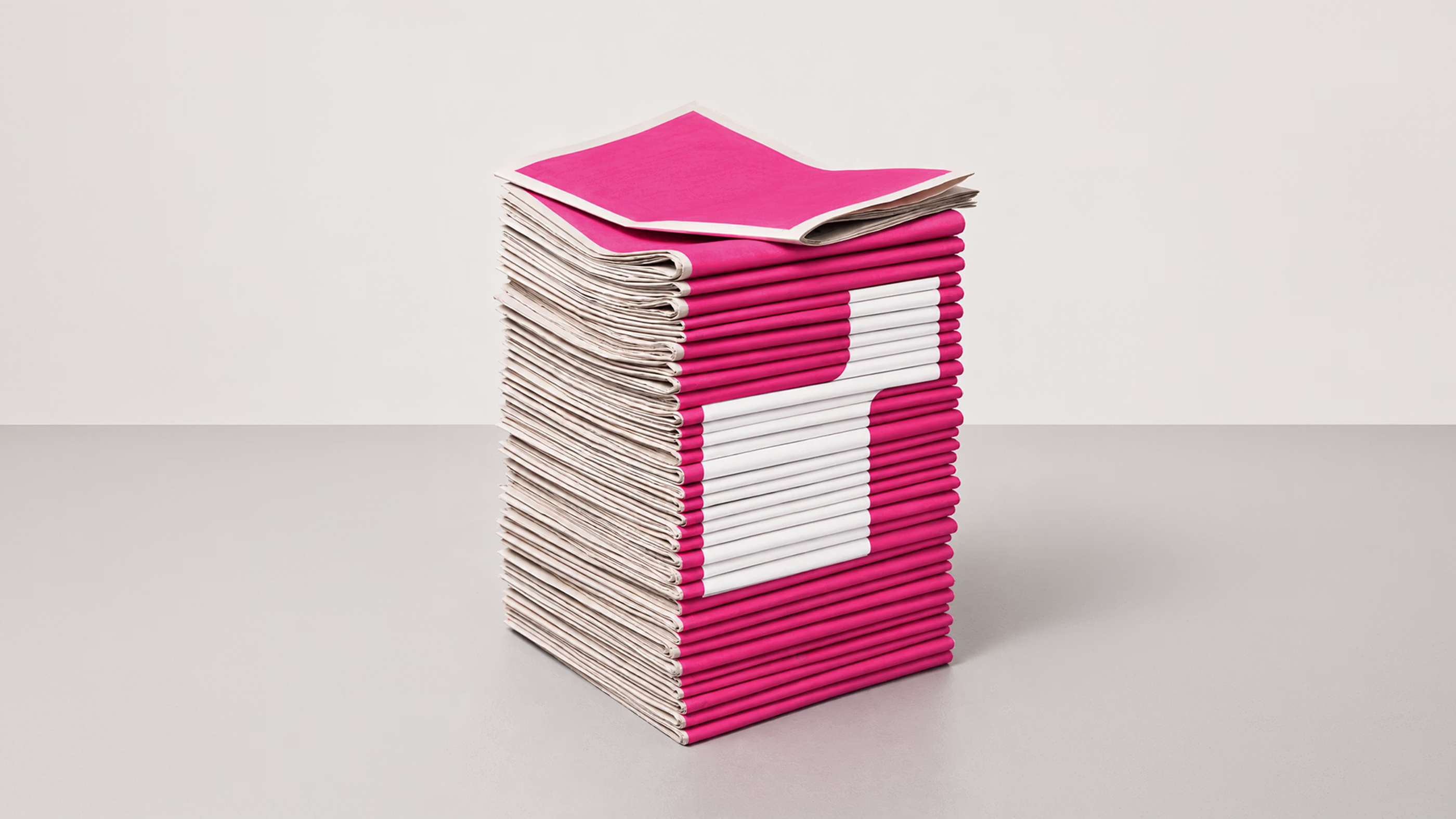
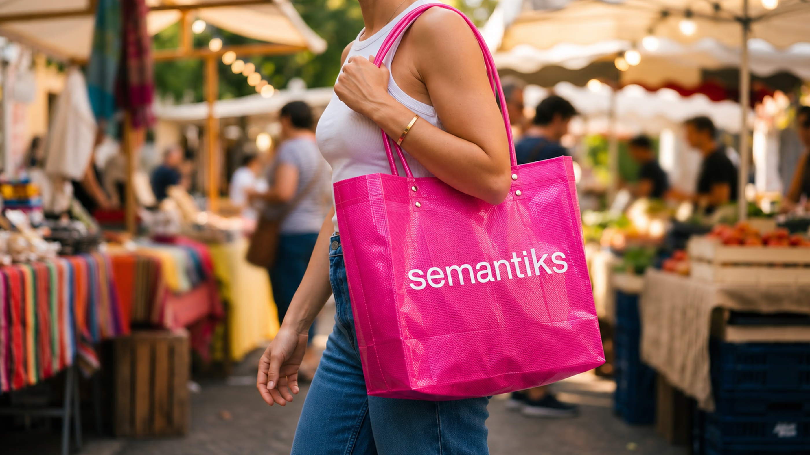
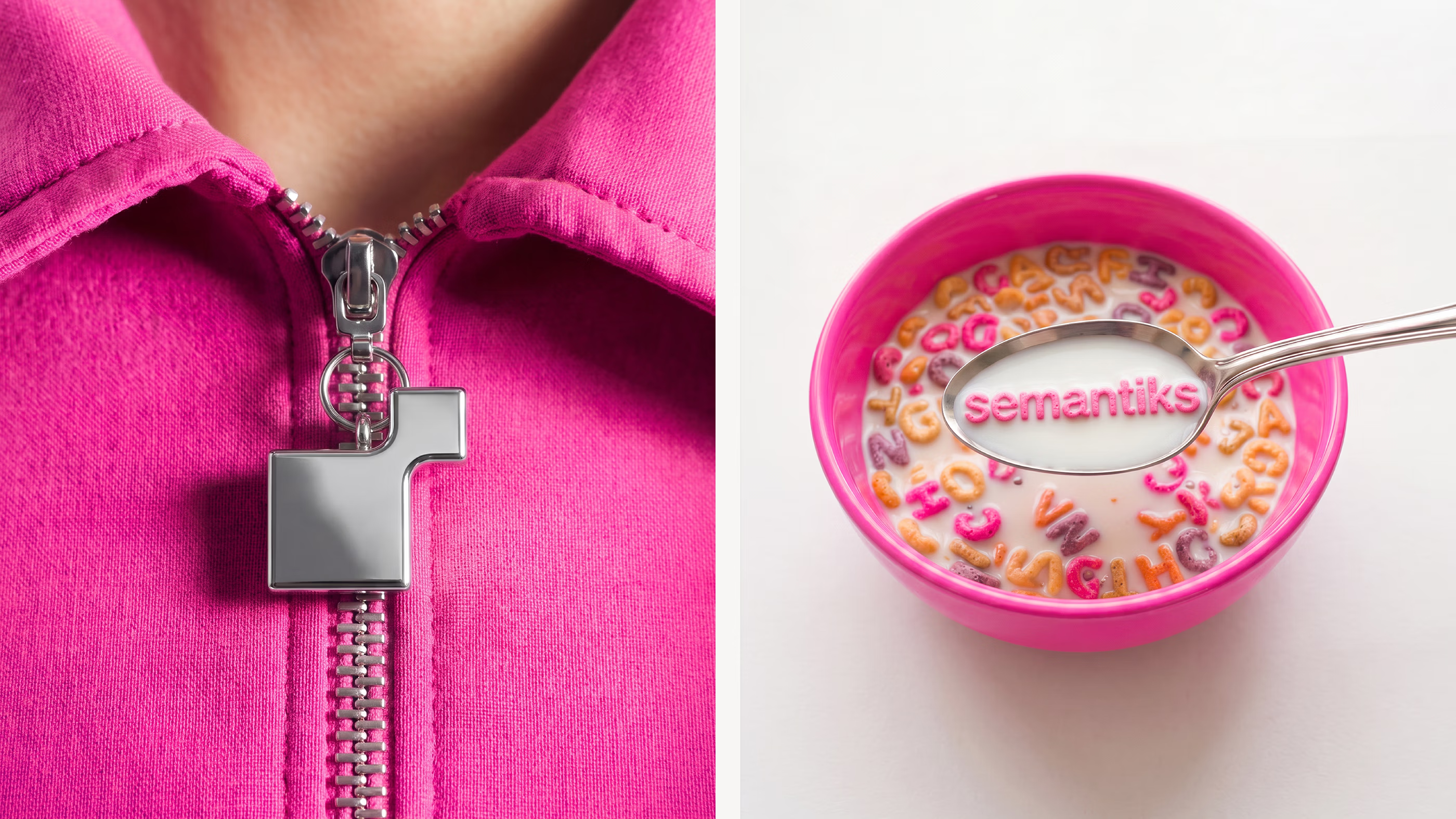
Placing Semantiks in unexpected contexts gives the brand room to build a relationship with people outside the product experience. Pop-ups, merchandise and physical objects turn its visual language into something tangible, creating moments where the company can participate in everyday life and introduce a different expression of what an AI brand can be.
This shift gives Semantiks a presence that is defined by more than its technology. Each application adds another dimension to its world, turning recognition into familiarity and creating new opportunities for people to connect with the brand across different contexts. In doing so, Semantiks begins to build a presence people can experience outside the product itself.

Why did it work?
In a category where AI can become abstract or difficult to navigate, Semantiks needed to make its engineering feel accessible while preserving the value of its technology. The process turned data and complex interactions into an experience that feels intuitive and approachable, using design to help businesses understand what the platform can do and engage with it naturally.Its Mexican roots bring a different business perspective, shaped by adaptability and a practical approach to solving everyday challenges.That thinking informed how the platform presents intelligence: not as technology to navigate, but as intelligence designed to strengthen business performance and expand what companies can achieve.