

hello

Problem
The category has long been defined by systems centered around procedure rather than experience. In markets like Germany, where clinical precision has shaped the standard, dermatology has rarely been approached as a space for human connection or cultural relevance. This created an opportunity to rethink dermatology as an experience with the ability to generate loyalty, community and long-term business value.
Solution
The project was developed as a connected brand world where identity, spatial experience and digital interaction follow the same narrative direction. Inspired by the freshness associated with lemon itself, the system introduces a visual atmosphere that reframes dermatology through harmony, transforming medical care into an experience that feels familiar, human and naturally part of how people live.

A world shaped through freshness.
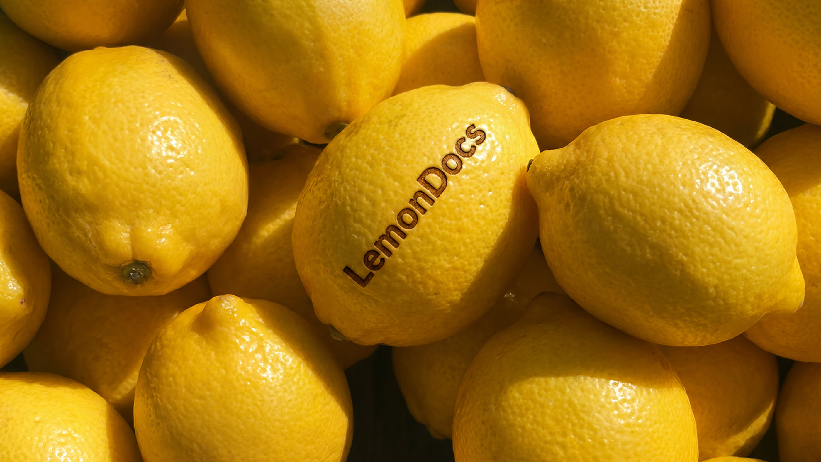
The concept begins with the emotional associations naturally connected to lemon and the freshness the fruit evokes within everyday perception. This atmosphere introduces a lighter presence within a category often shaped through traditional clinical experiences. From this starting point, dermatology takes on a more open experience of care.
This essence gives the brand an emotional direction shaped through ease and renewal. The idea of lemon carries a sense of immediate relief and familiar comfort, allowing the experience to feel open from the first interaction. Through this lens, the brand builds a warmer relationship with dermatology where care feels naturally connected and present.
Squeezing the essence into form.
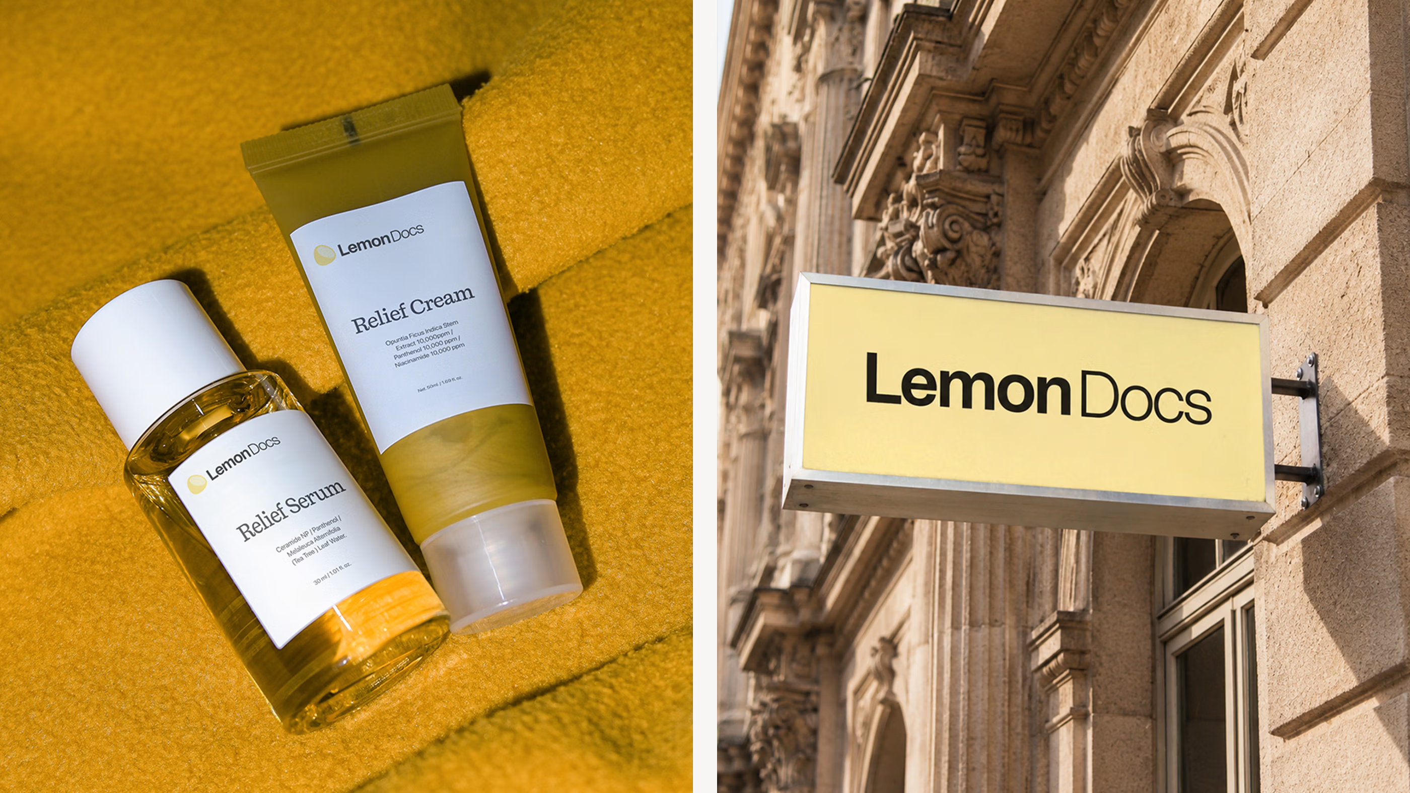
The logo system translates the familiar atmosphere naturally associated with lemon into a mark designed to feel immediate within the medical category. Rounded curves soften the visual structure while the lemon icon introduces a familiar point of recognition that gives the identity a fresher and more human presence from the very first interaction.
Color and typography shape the system through a contrast that shifts expectations within the medical category while maintaining credibility throughout the experience. Citrus tones introduce a brighter visual presence rarely associated with dermatology, while contemporary typography preserves the confidence expected from medical care.
A smarter kind of care.
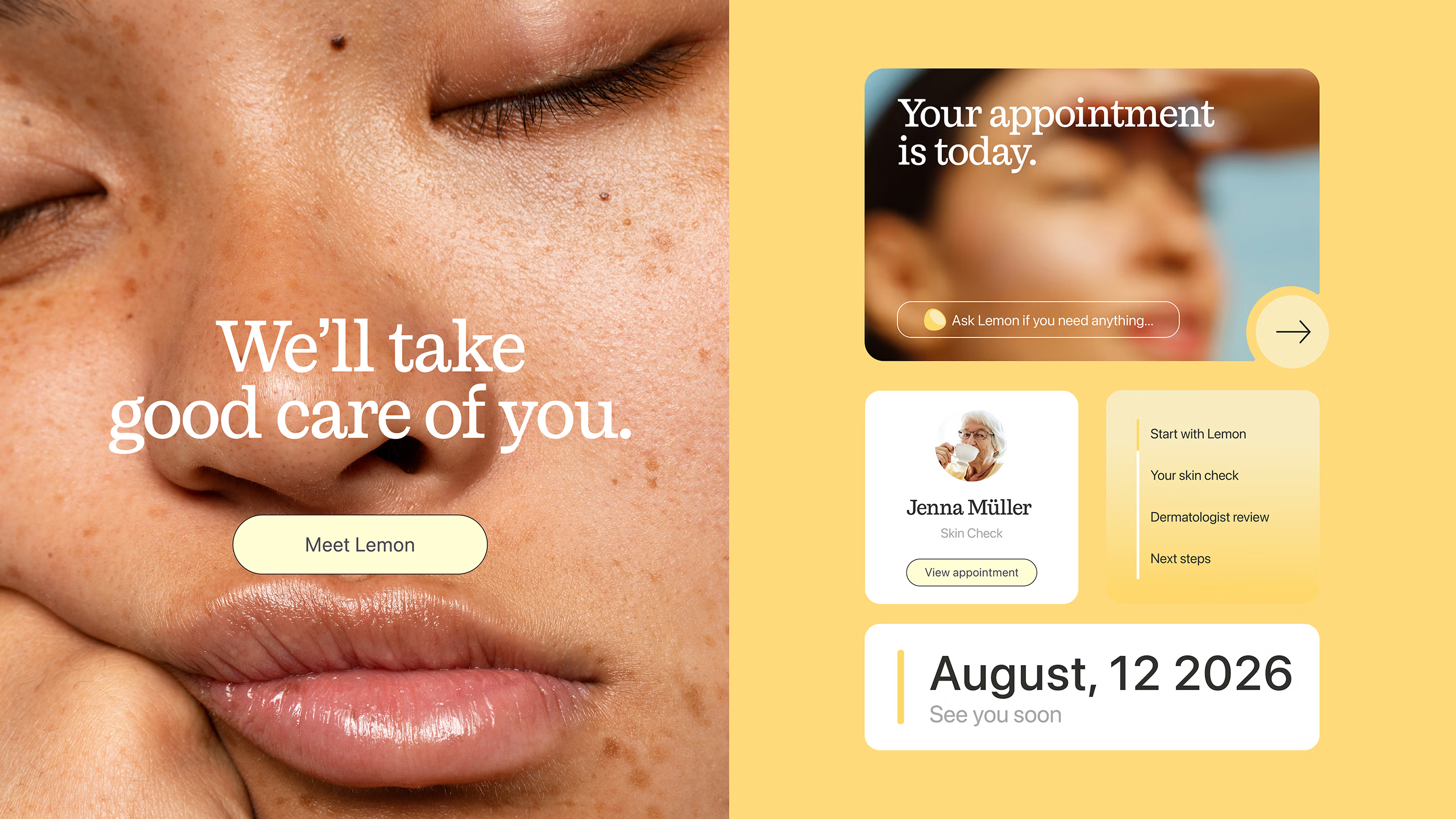
Continuity became the foundation of the entire experience, shaping a journey designed to feel connected from the first interaction onward. The process removes the fragmented feeling often associated with dermatology, replacing isolated moments with a flow that feels familiar, guided and naturally integrated from step to step.
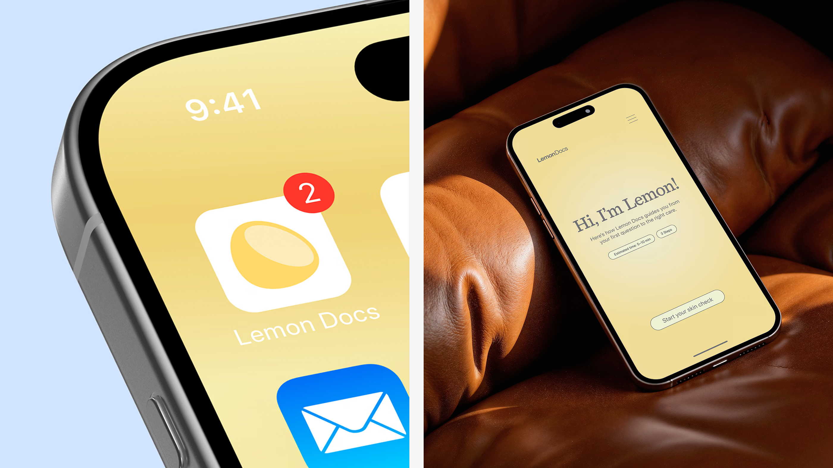
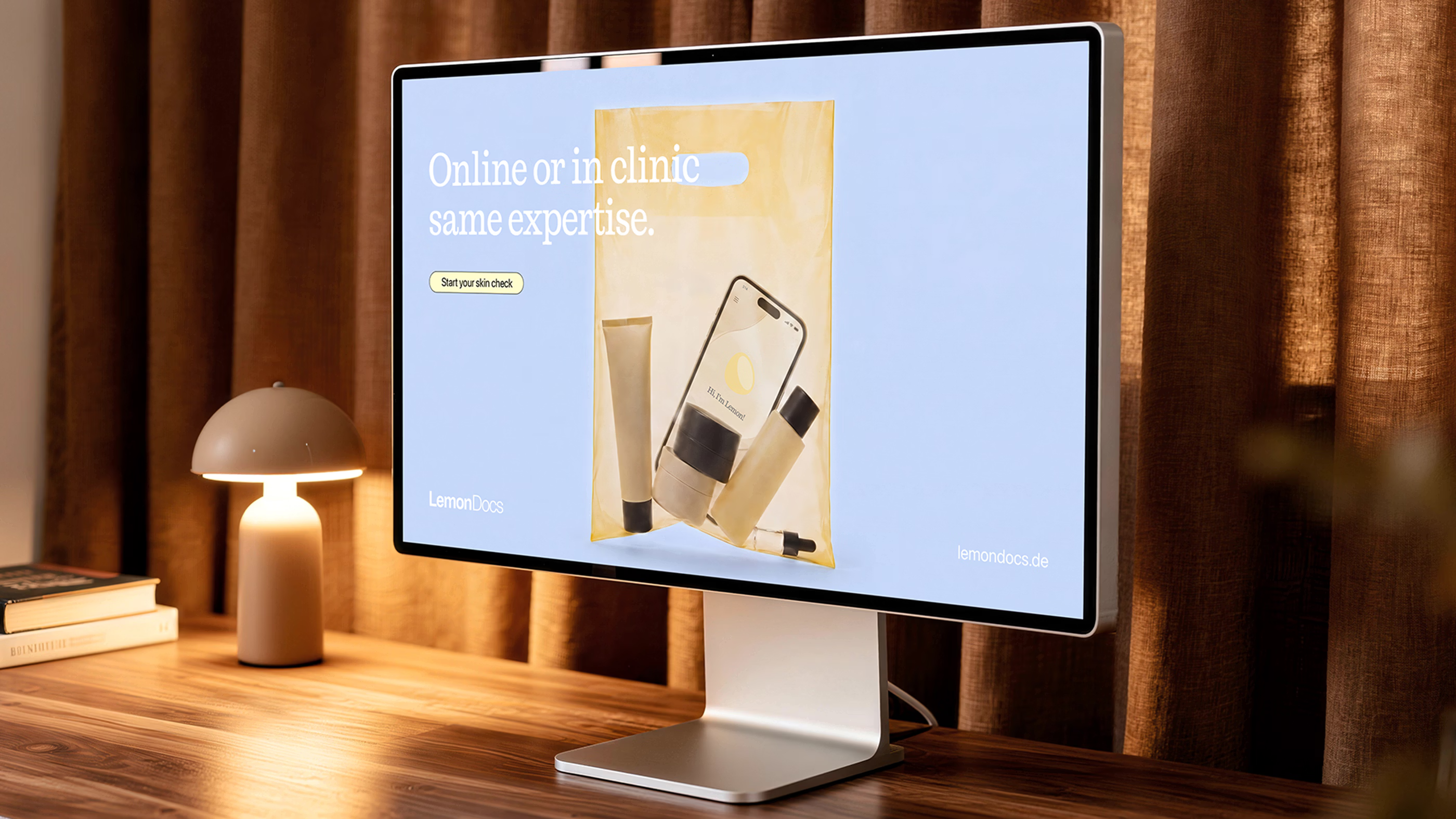
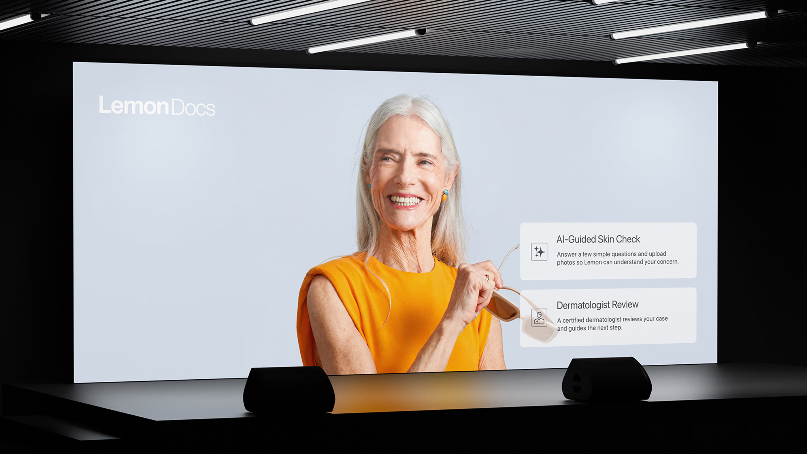
Digital guidance and in person care operate within the same ecosystem, allowing information and medical context to move seamlessly between both environments. Through this connected structure, the AI agent Lemon becomes a consistent presence designed to guide and accompany people throughout the journey.
Hospitality first.
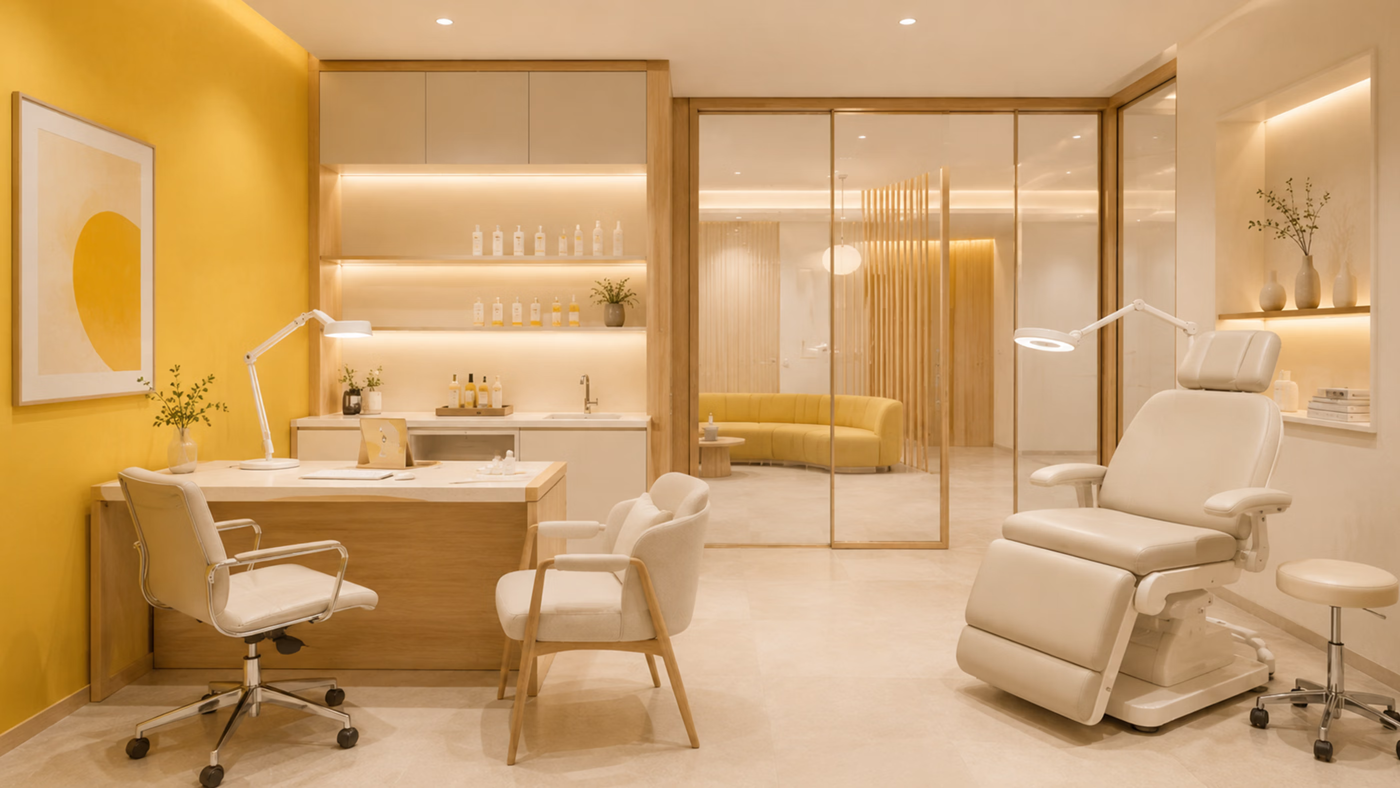
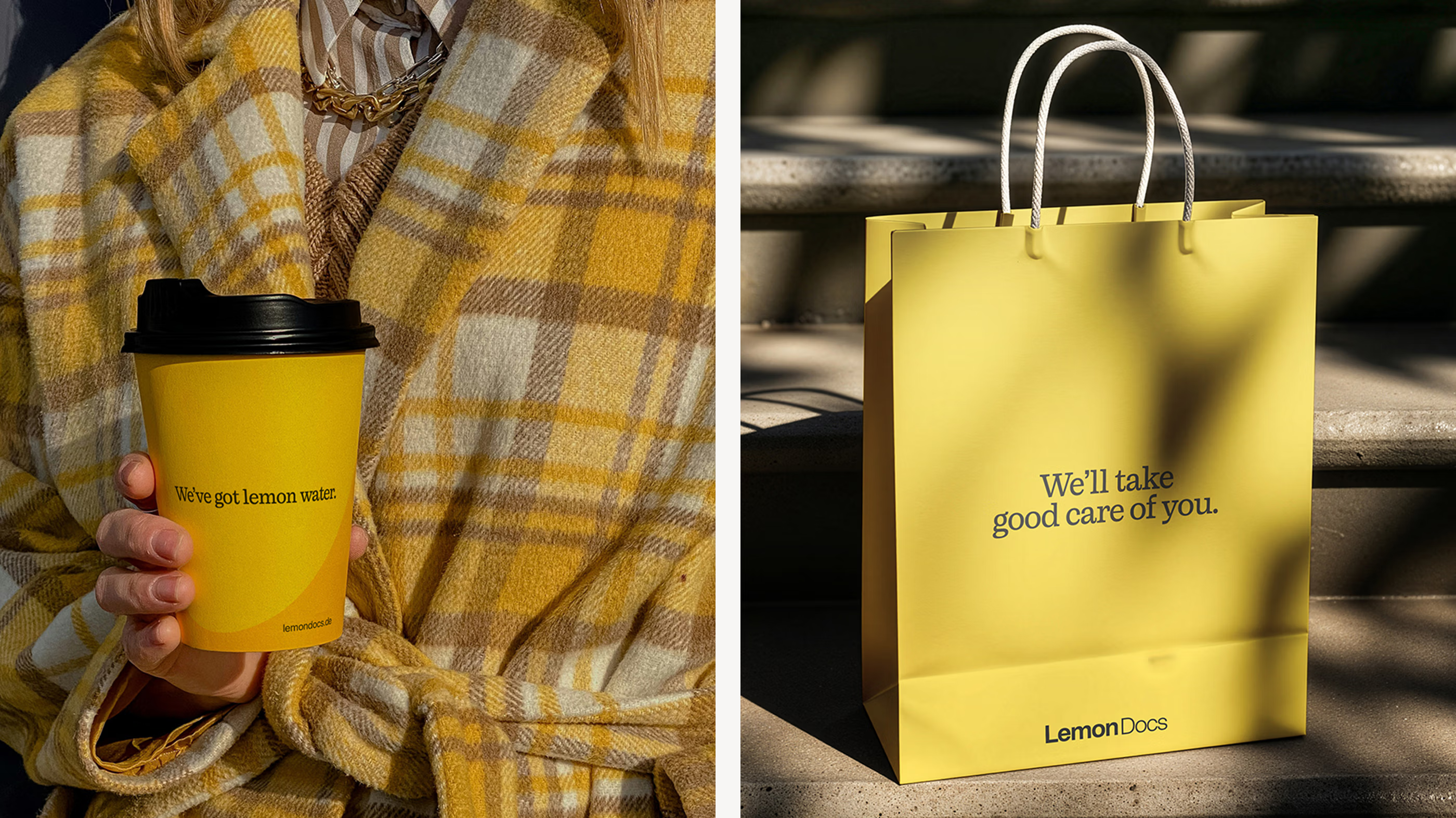
The experience was shaped around the idea that dermatology could feel closer to hospitality than to a traditional medical consultation. Small gestures throughout the journey create a stronger sense of familiarity from the moment people arrive. From lemon water at the entrance to the warmth of the environment itself, every detail contributes to a more welcoming experience of care.
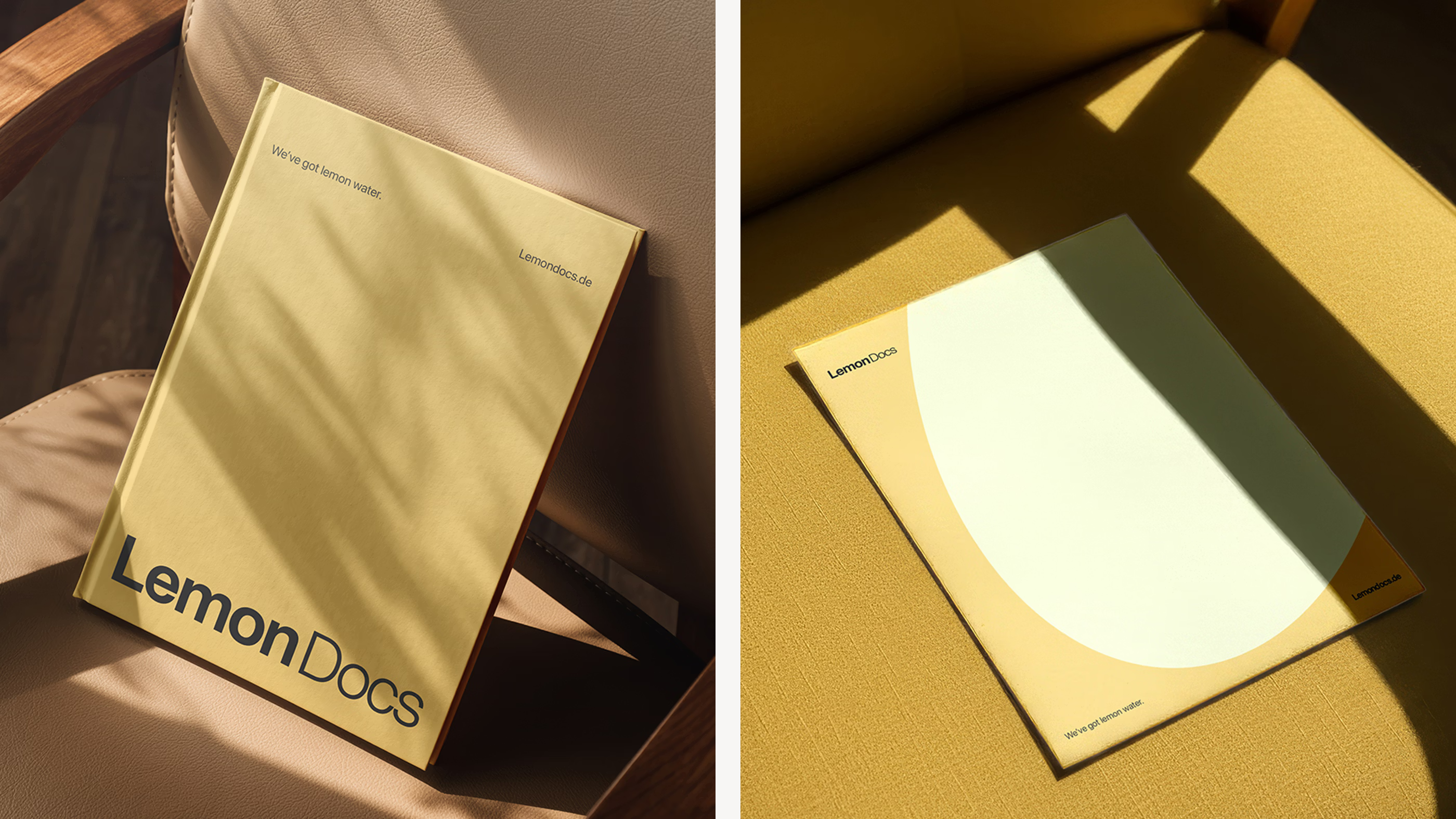
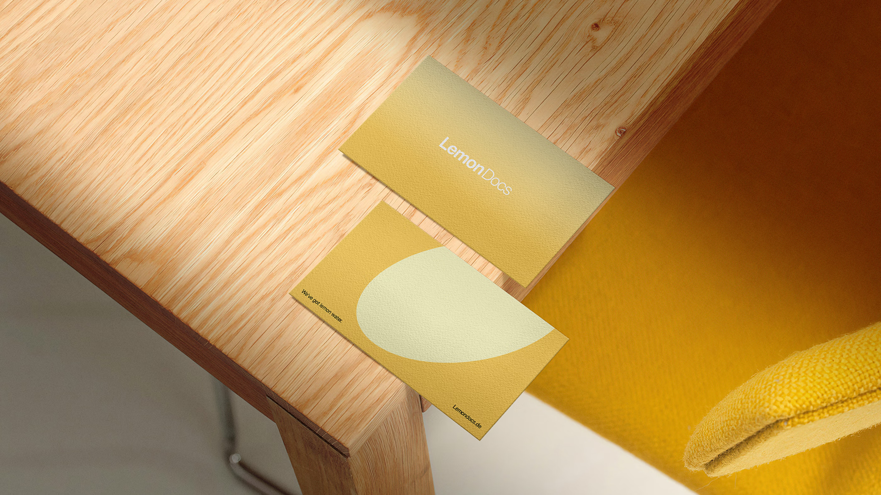
Premium stationery, refined materials and thoughtful service moments reinforce a stronger sense of attention throughout the experience. Spatial details feel calm and approachable while maintaining the professionalism expected from medical care. Through this direction, the brand creates a relationship with dermatology that feels reassuring and close to the way people actually live.
Built as a living brand.
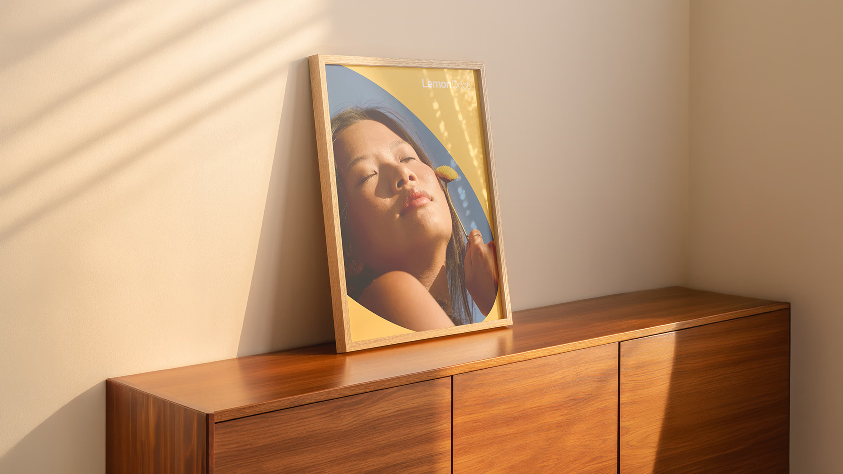
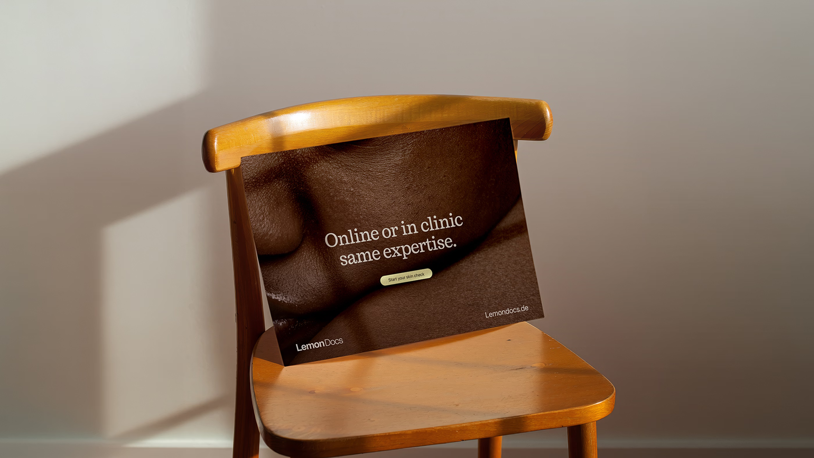
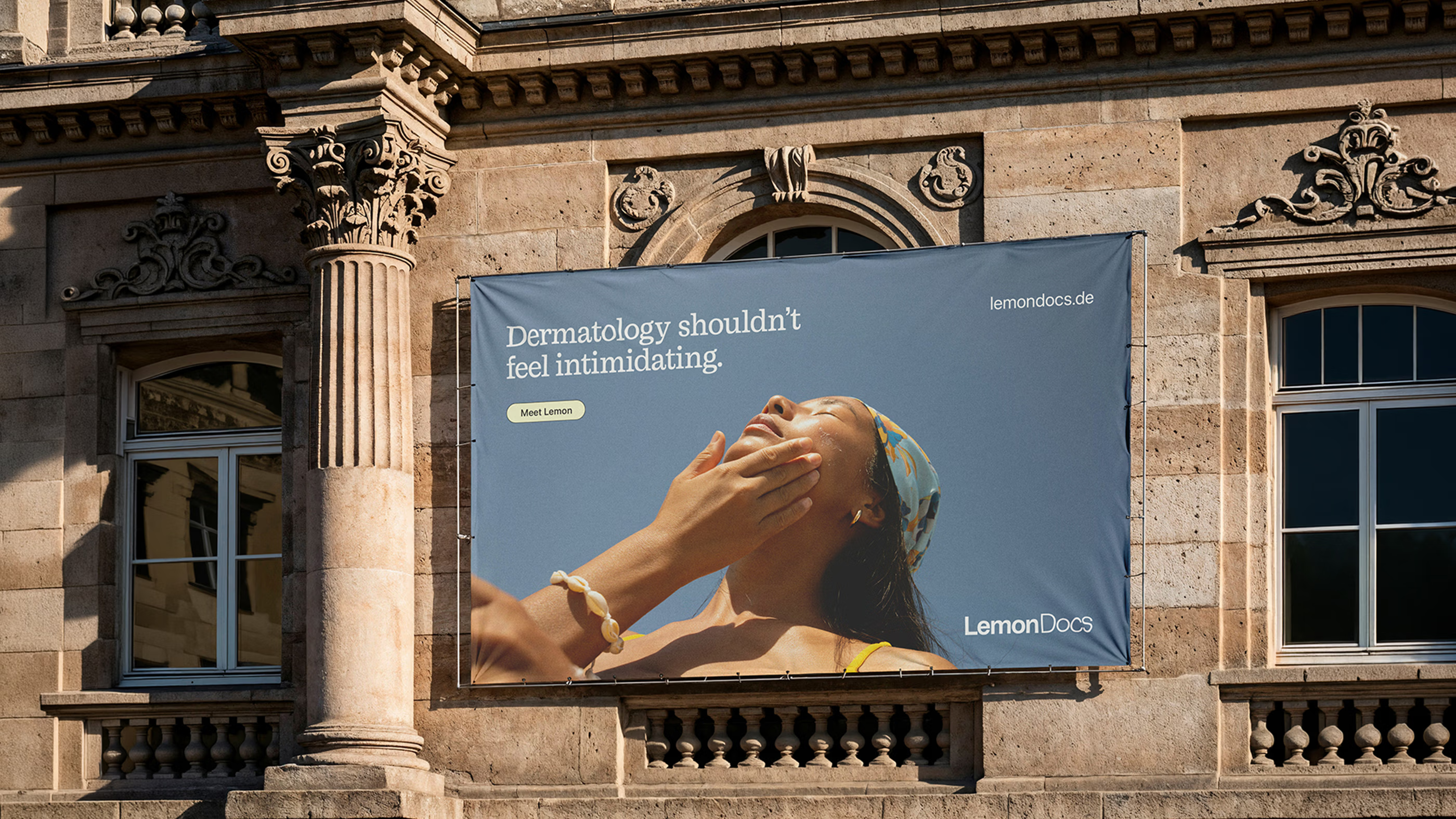
Expressed through a system of applications, the identity is designed to make the brand feel present beyond the consultation itself. Touchpoints across the experience reinforce familiarity, allowing people to connect with the brand in ways that feel naturally integrated into their routines. This approach transforms the experience into something people recognize and want to be part of.
This direction transforms the system into something people recognize and remember over time. Every detail contributes to a more connected world surrounding the brand, creating a presence that feels consistent across environments, materials and interactions. Within this ecosystem, the experience becomes something people feel part of rather than simply visit.
Why did it work?
The project responds to a shift in how people expect brands to behave within categories traditionally shaped by distance and rigidity. Rather than treating identity as something separate from the experience itself, the system was designed as one continuous narrative that makes dermatology feel more culturally relevant and resonant within contemporary life.
The outcome reflects an ability to develop systems aligned with cultures where precision and excellence are held to high standards. By translating a more emotionally connected perspective into the quality expected within the German market, the project demonstrates how a flexible creative approach can adapt across contexts while maintaining refinement throughout.