


hello


Problem
BumCo. needed a brand that matched the rhythm of modern parenthood. Families looked for clarity in communication and reliability in what they used. The challenge was to build an identity that felt as dynamic as their routines and adaptable across every product and channel, creating consistency without losing closeness. The project focused on creating a brand that combined honesty and design to inspire confidence. It sought to connect through empathy and practicality, building a presence that could grow alongside families and remain meaningful in every space where the brand lives.
Solution
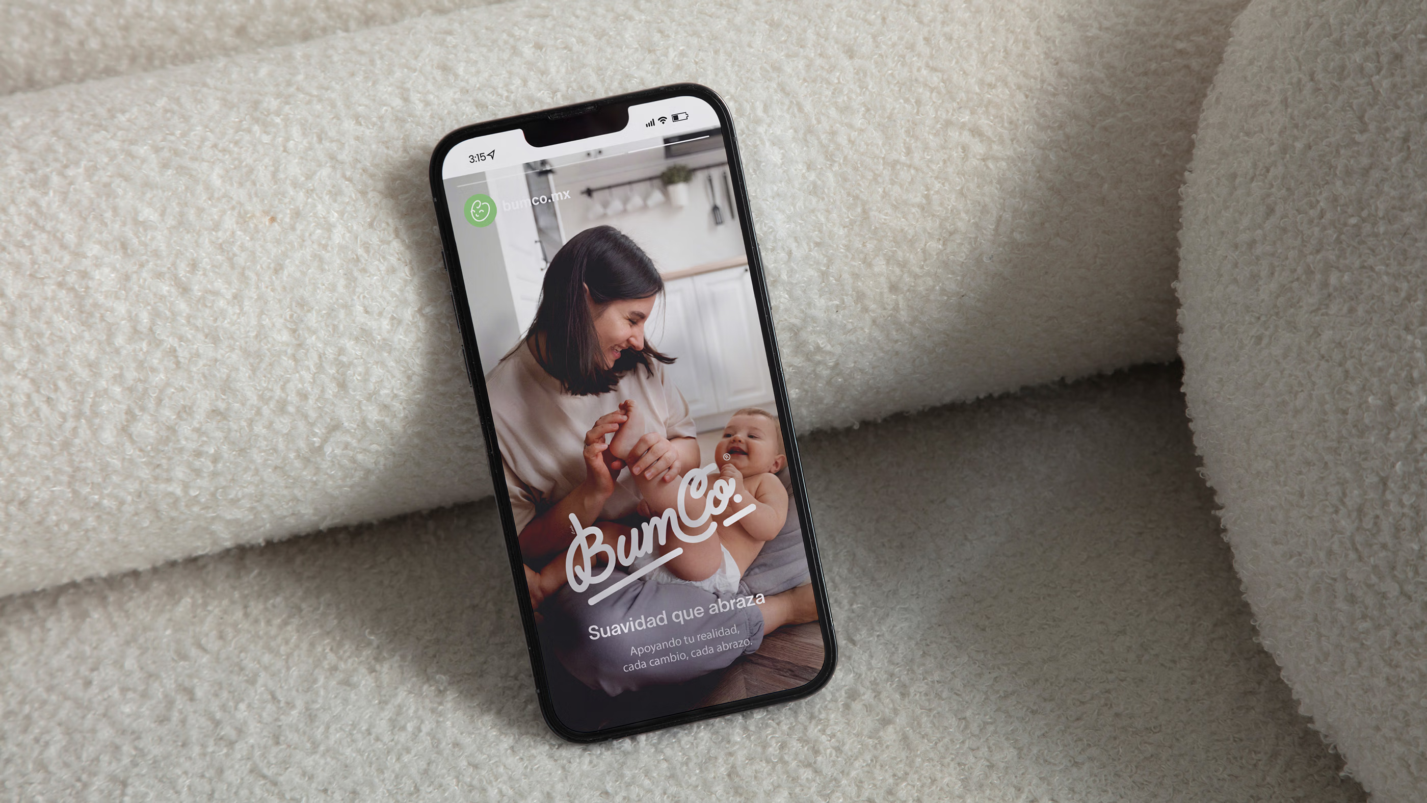
The identity was built as a system to bring warmth and clarity into a category in need of both. It worked as a whole, carrying softness into packaging and continuity through digital spaces. Each expression formed a connected language that feels human and adaptable, positioning BumCo as a trusted brand with the strength to grow across every context. This approach united empathy and strategy in a single vision. It created a consistent experience that feels intuitive for parents and distinctive within the market. By blending design and emotion, the brand found a balance that strengthened recognition and built lasting trust among families.

Conceptualization.
BumCo was conceived on the idea of “the diaper for real parenthood,” a concept that reflects the beauty of everyday care. It highlights the closeness between parent and child, turning each stage into a moment of connection and presence. From its origin, the vision was to celebrate family life with simplicity and warmth.
This foundation defined the spirit of the brand. It speaks with honesty and empathy, embracing parenthood as something meaningful and complete.The concept became the guiding thread that unites every expression, giving BumCo a voice that feels genuine and a presence that lives in harmony with modern families.
The essence of BumCo.
The name BumCo captures the playful rhythm of baby talk, echoing sounds that feel soft, familiar, and maternal. It carries the lightness of a word born in early childhood, yet holds the confidence of a brand built to last. Its brevity gives it strength, its boldness makes it memorable, and its warmth keeps it approachable, embodying real parenthood with clarity and trust.
The logotype was first drawn by hand, its curves refined into digital form to preserve warmth while gaining clarity. Each stroke carries the closeness of its origin, balanced to remain clear and adaptable. Alongside it, the baby-face icon reduces empathy to a simple gesture, becoming a universal symbol of care and trust.
Visual language.
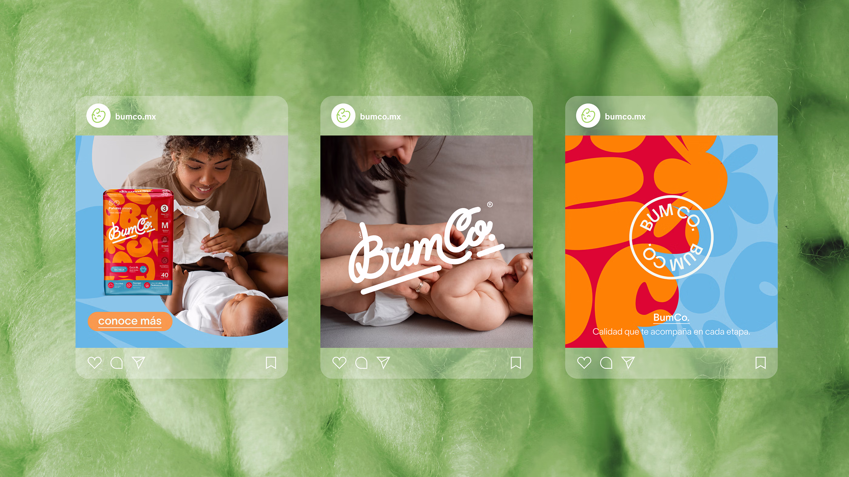
The palette was built to reflect warmth and care, blending tones that feel calm, fresh, and reassuring. Each stage introduces an accent that reflects moments of growth, guiding families with ease while maintaining system coherence. More than a visual tool, it became a chromatic language of trust that allows the brand to expand with harmony.
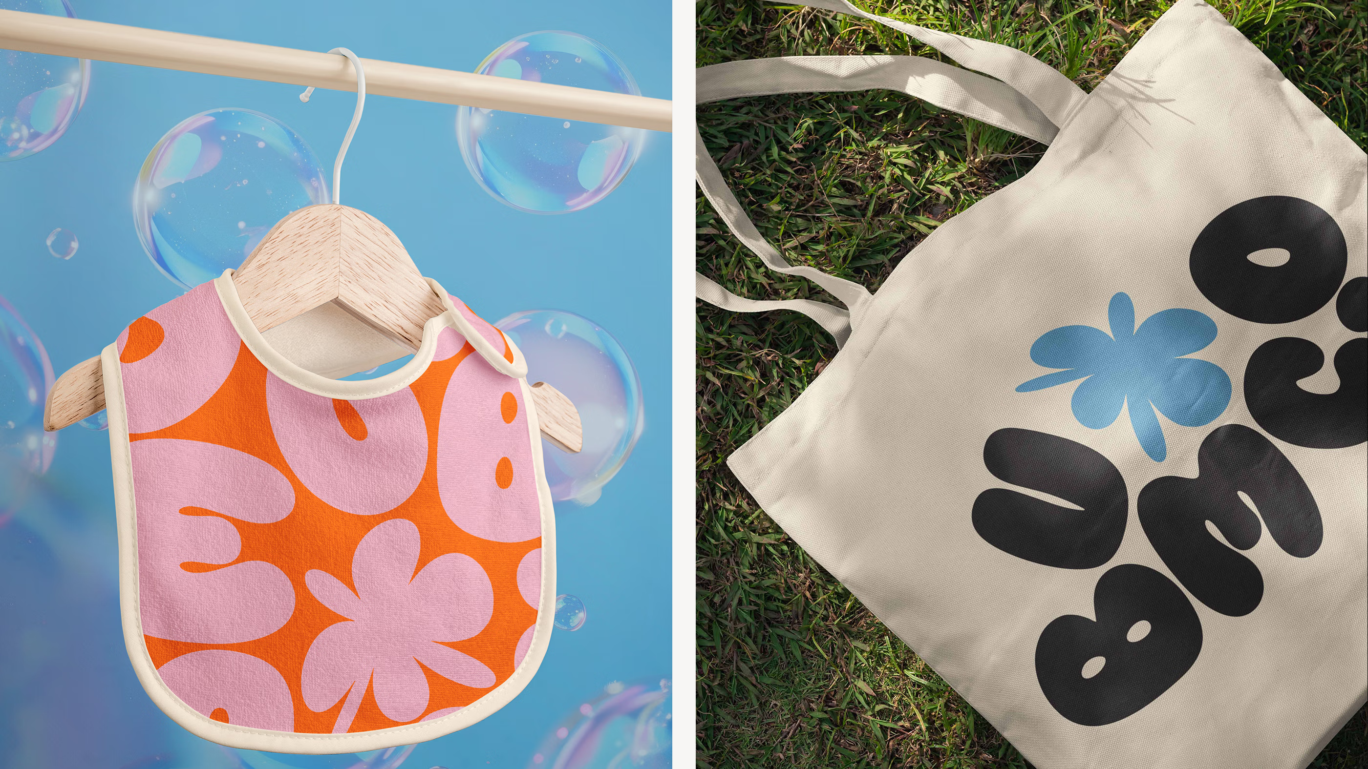
The pattern system emerged from the brand’s letters, evolving into shapes that echo the softness of cotton and the drift of clouds. Each form carries a sense of fluidity, creating textures that feel light and familiar. Applied across packaging and digital spaces, they weave a visual rhythm that expands the identity with coherence and distinction.
Brand adaptability.
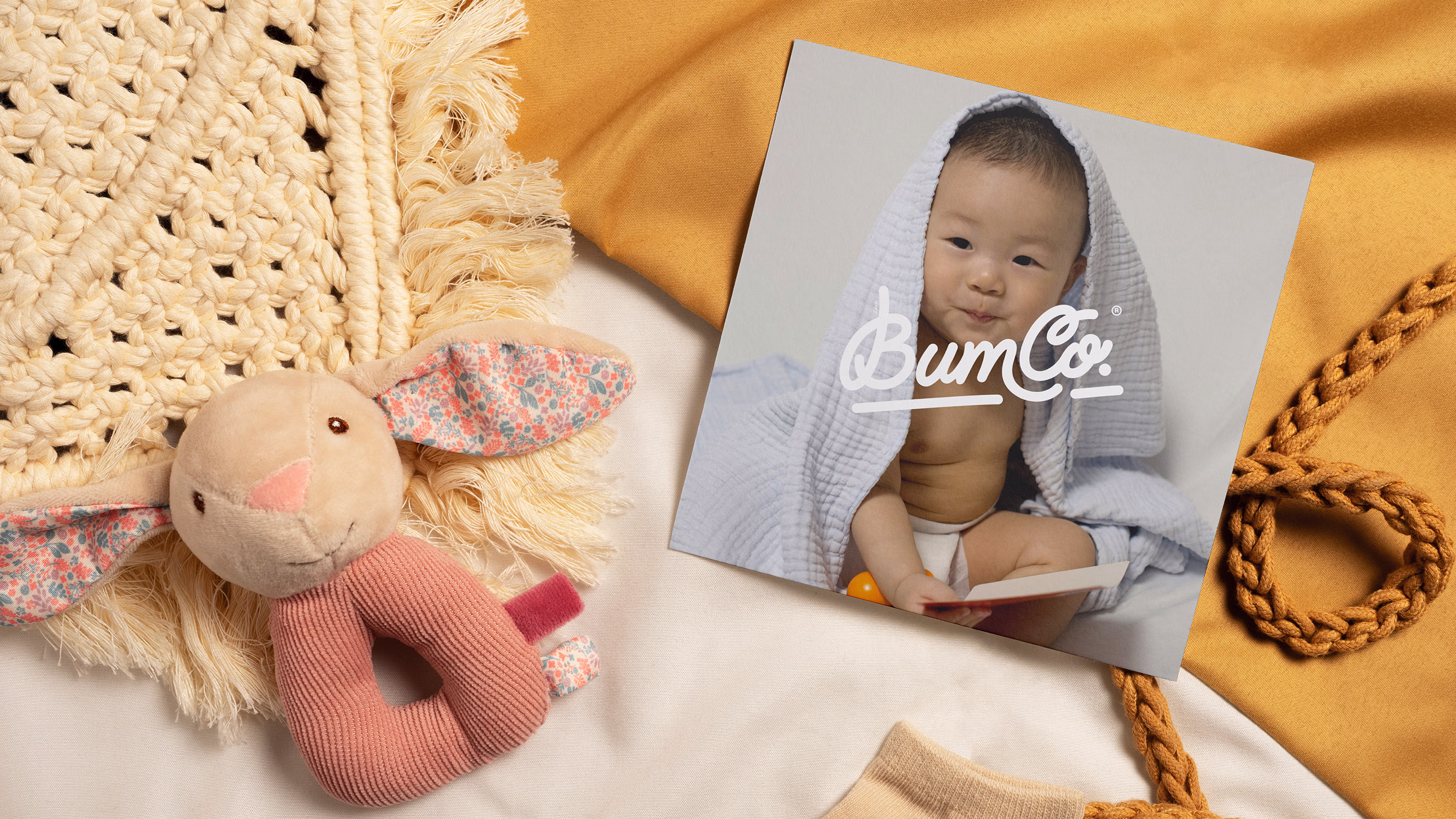
The identity is conceived as a living framework designed to move beyond conventional brand expressions. Its forms translate naturally across materials and surfaces, allowing the brand to appear through crafted details and everyday objects. Each appearance reinforces a presence that feels intuitive and recognizable.
This flexibility expands the system into a broader field of expression. Symbols and letterforms evolve into tactile elements and designed objects, creating moments where the brand becomes part of the physical experience. Structured yet open, the visual language moves across scales and contexts while preserving a cohesive and unmistakable identity.
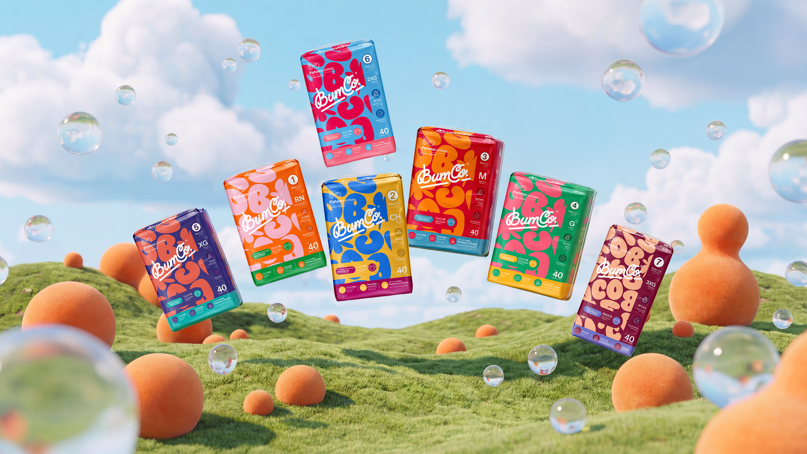
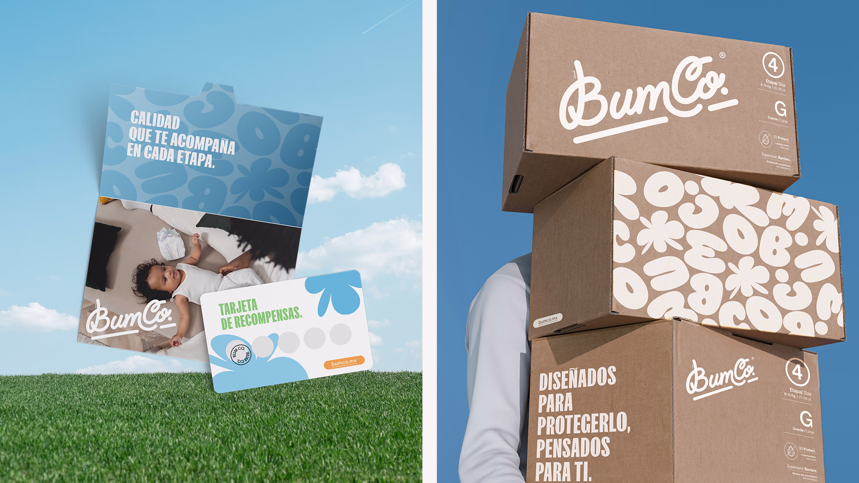
Built for every stage.
The BumCo. system was designed to extend across the full product range, from newborn to larger diaper sizes and wipes. Each stage carries its own color and pattern, giving families immediate recognition and intuitive guidance at the shelf. Packaging consistently applies these elements, ensuring clarity and distinction while maintaining a unified identity across the portfolio.
The result is a suite of products that feels coherent and purposeful. Every package was created with the same principles of simplicity, softness and functionality. From diapers to wipes, the line strikes a balance between practicality and character, reinforcing trust in the present and positioning the brand to confidently expand into future baby care categories.

Why did it work?
BumCo. became a brand families welcomed into their daily lives.Recognition came through clarity and loyalty grew through consistency, allowing the brand to expand with authenticity and confidence. Every touchpoint carried the same intention, making the experience of choosing and using the products feel simple, reassuring, and true to the brand.
From the shelf to everyday moments of care, the identity created connections that felt genuine and lasting. It succeeded because it turned design into lived experience, transforming diapers and wipes into trusted essentials that parents rely on every day.