

hello

Problem
The identity no longer reflected the level of care behind the experience people encountered when visiting Waygood. What guests discovered through flavor and preparation deserved a visual world that communicated the same sense of intention. The challenge was to elevate the brand so its image aligned with the quality that already existed.
Solution
The response was to build a brand universe shaped by the symbolic role coffee now carries in contemporary life. The identity communicates through atmosphere and everyday rituals where it becomes part of how people experience taste and personal style. From this foundation, the brand unfolds as a living environment where the drink exists not only as a product, but as a reflection of character and daily culture.

Coffee as a social sign.
Coffee has become a quiet language of taste and belonging. What people drink and where they choose to buy it often communicates as much about them as the spaces they inhabit or the objects they carry. In this context Waygood becomes part of the rhythm of everyday life where coffee signals personal style and a sense of intention.
From this cultural insight the brand world unfolds through scenes that feel intimate and familiar. Soft light and relaxed environments shape a setting where daily routines take place naturally and moments around coffee become part of everyday rhythm. Within this atmosphere coffee culture appears personal and seamlessly integrated into modern life.
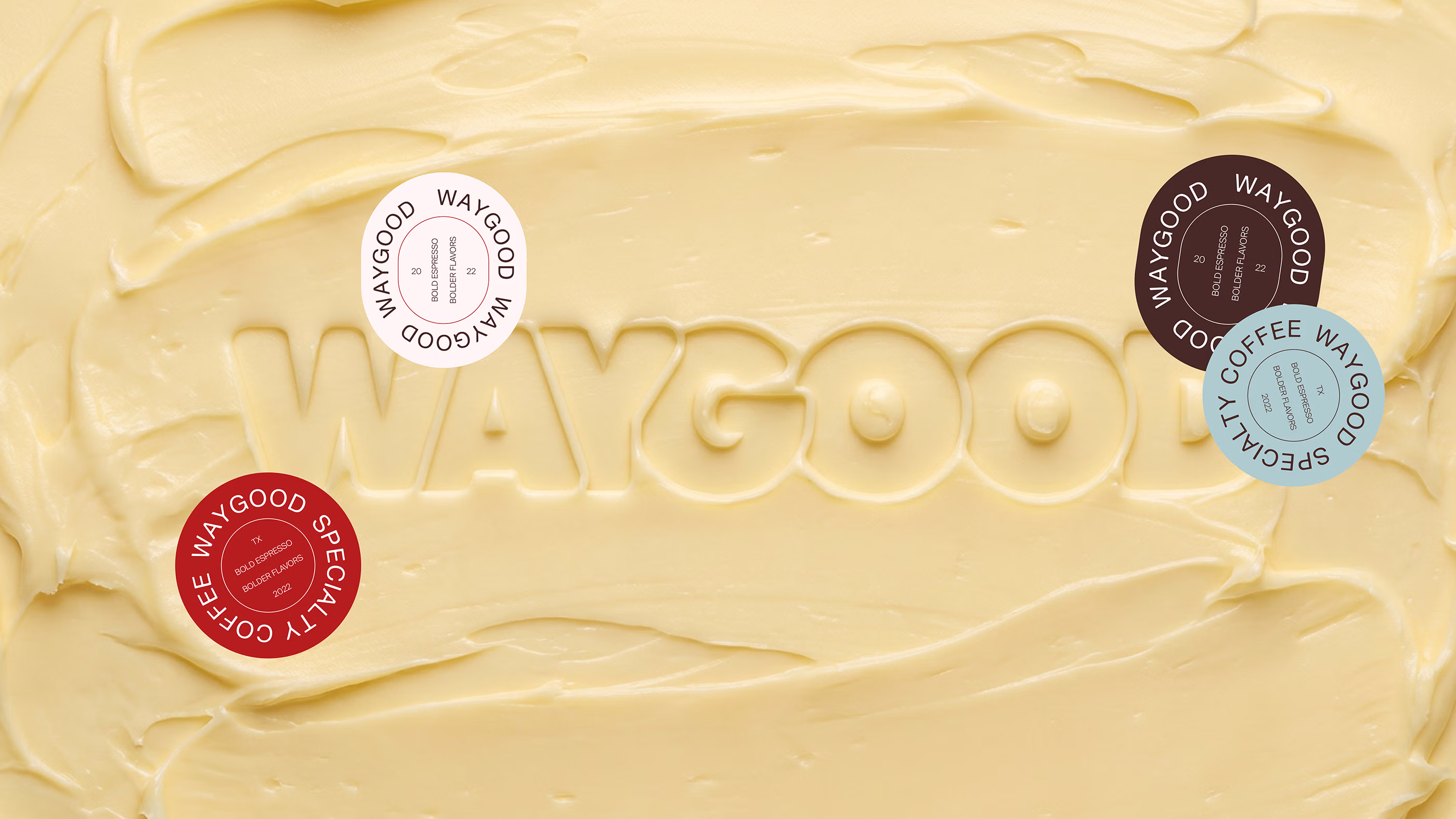
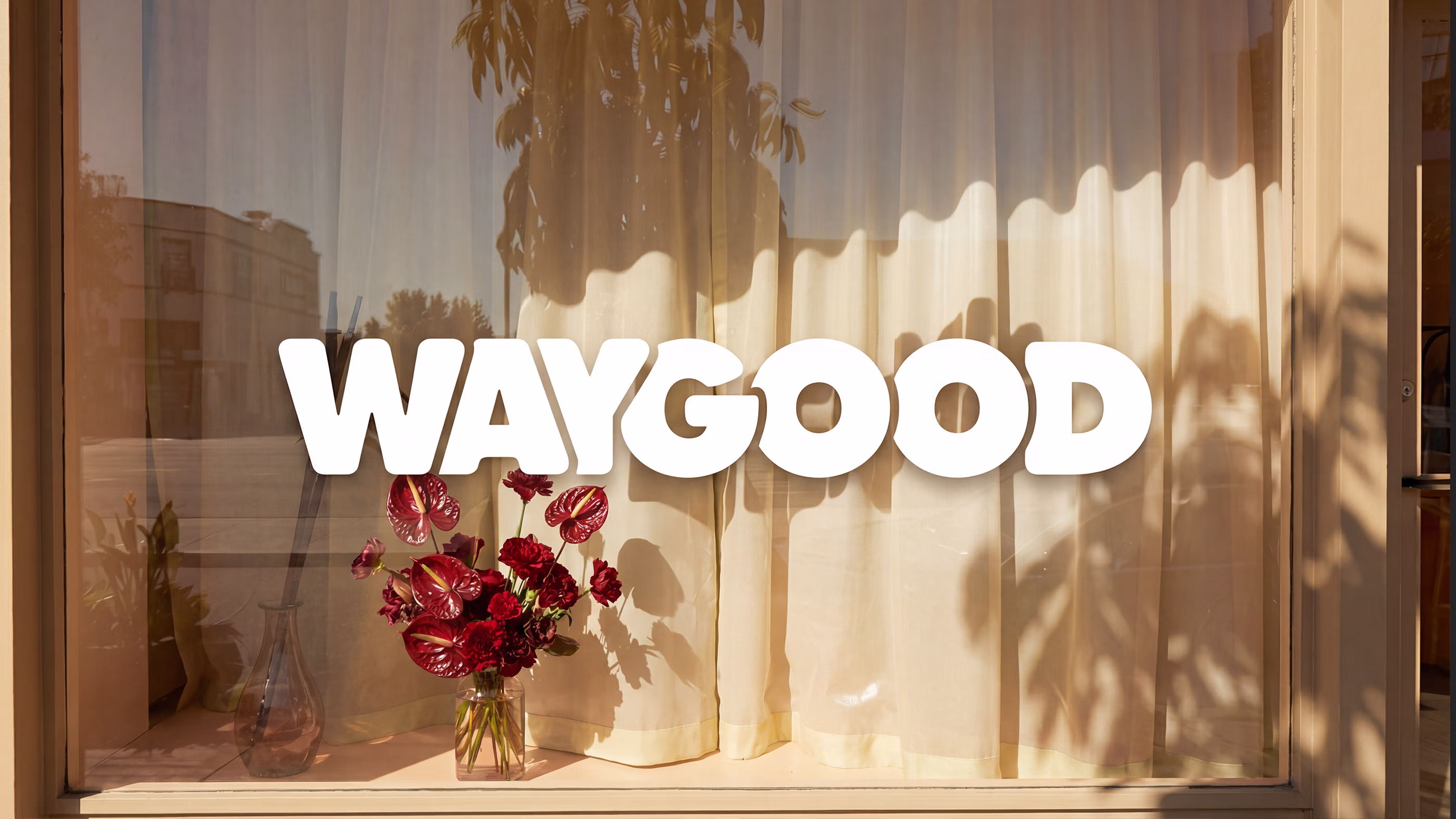
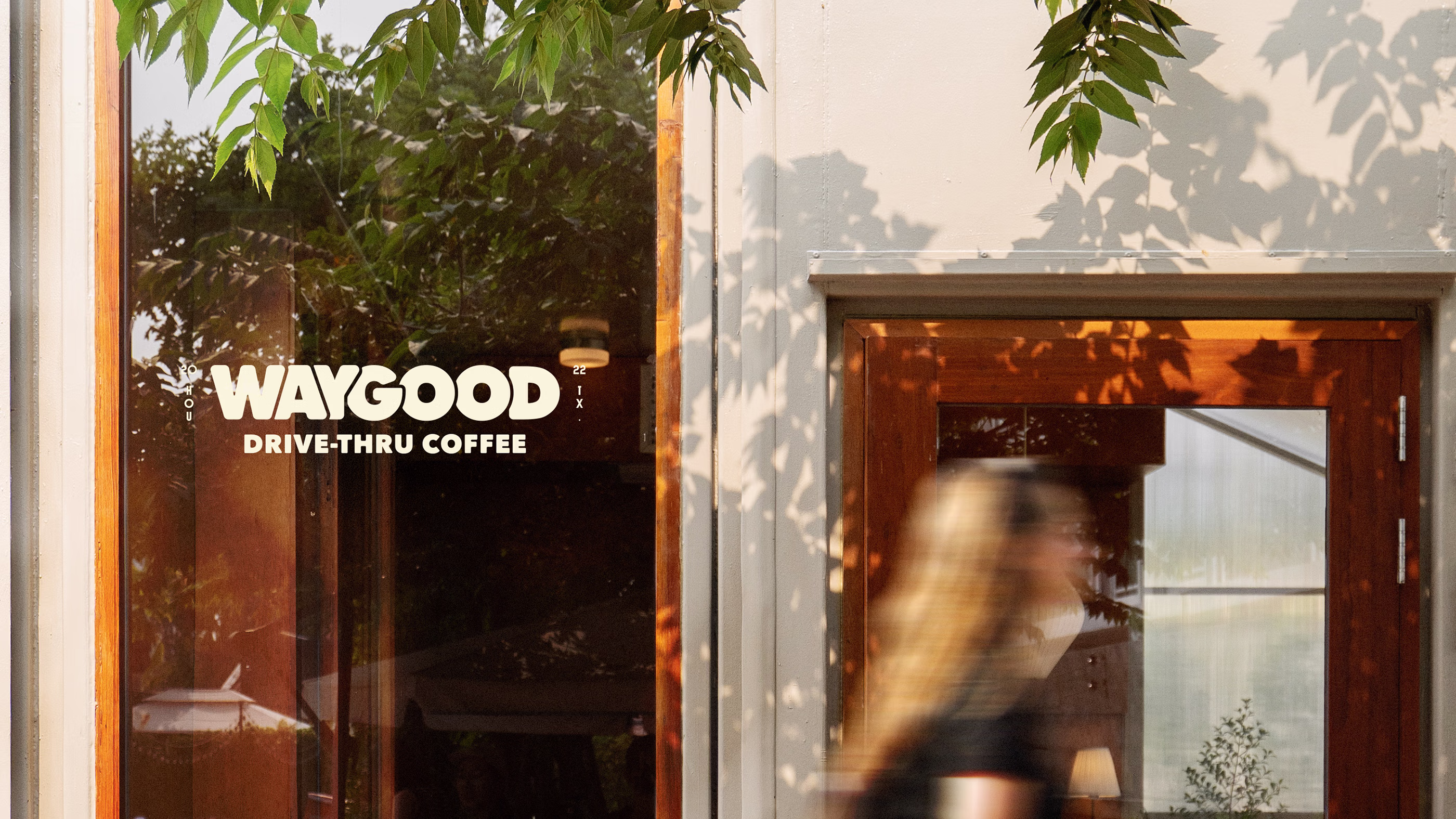
A familiar mark reimagined.
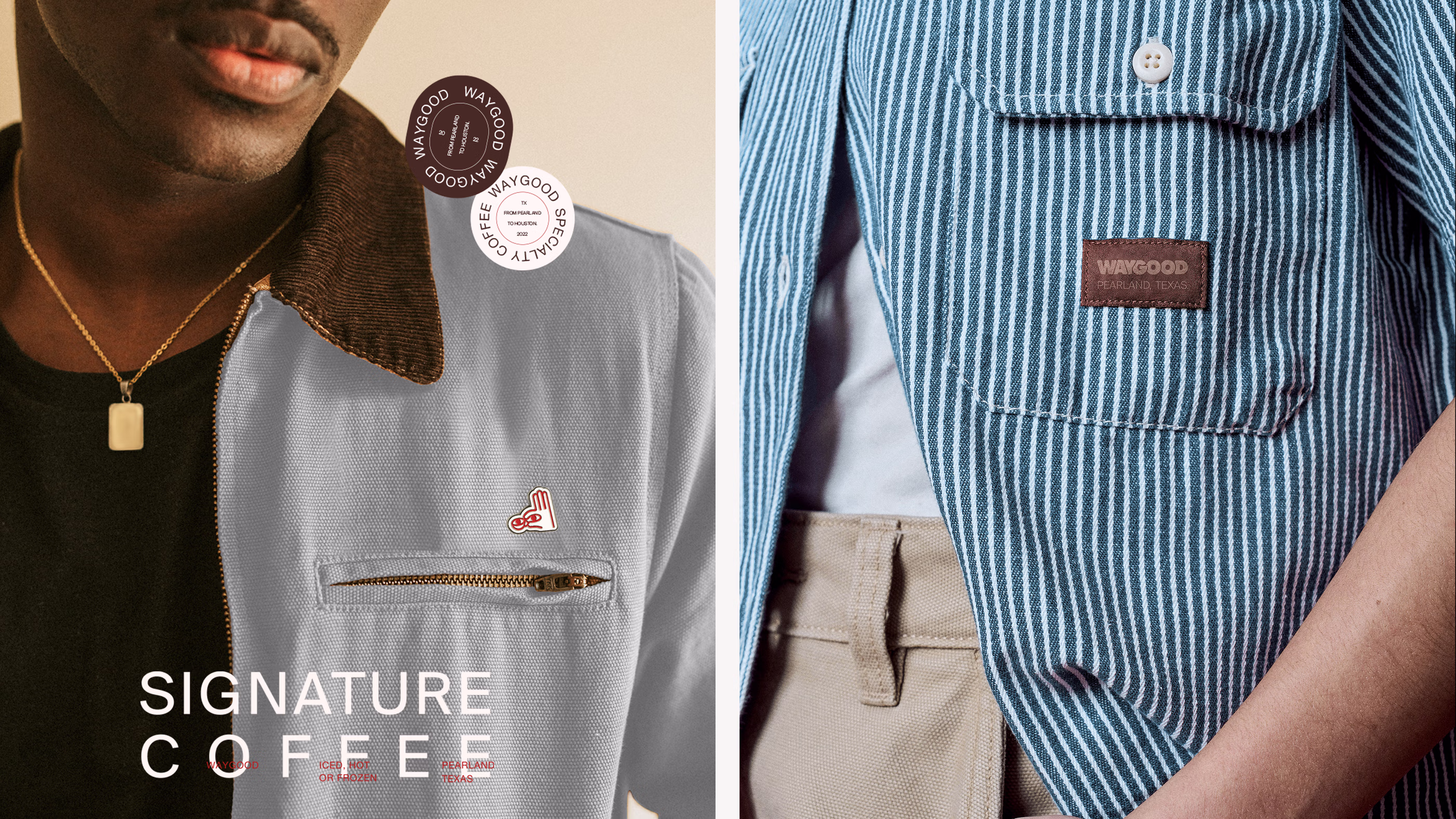
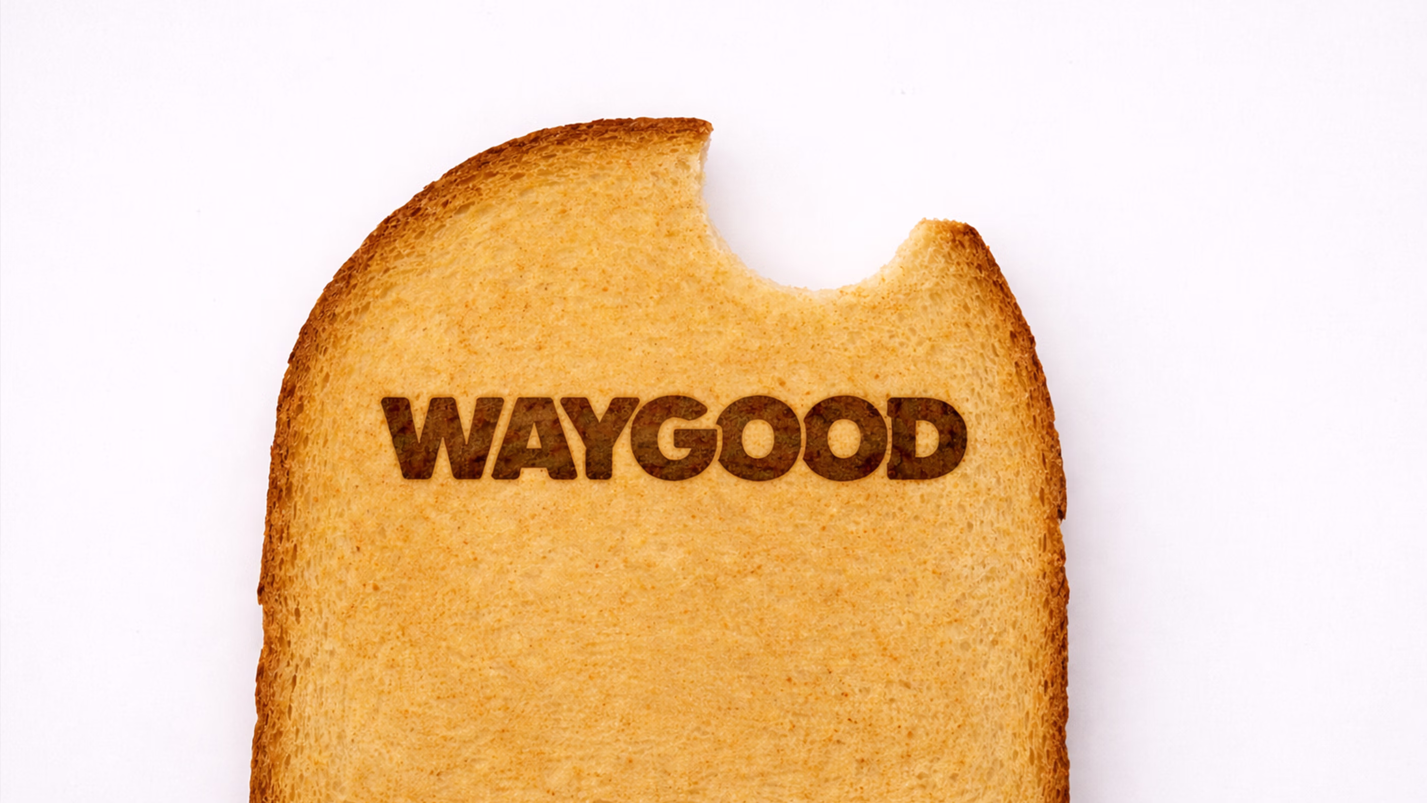
The evolution of Waygood begins by honoring what already exists. The original logo remains as a recognizable anchor while new emblems expand the language surrounding it. These additional marks introduce character and presence allowing the identity to appear across different surfaces without losing its personality.
This reinterpretation gives the brand room to grow while maintaining the memory people associate with it. The identity becomes more expressive without abandoning its origins, allowing familiar elements to evolve with greater presence and intention. The result is a system that moves forward while carrying the spirit that first defined the brand.
A language shaped by taste.
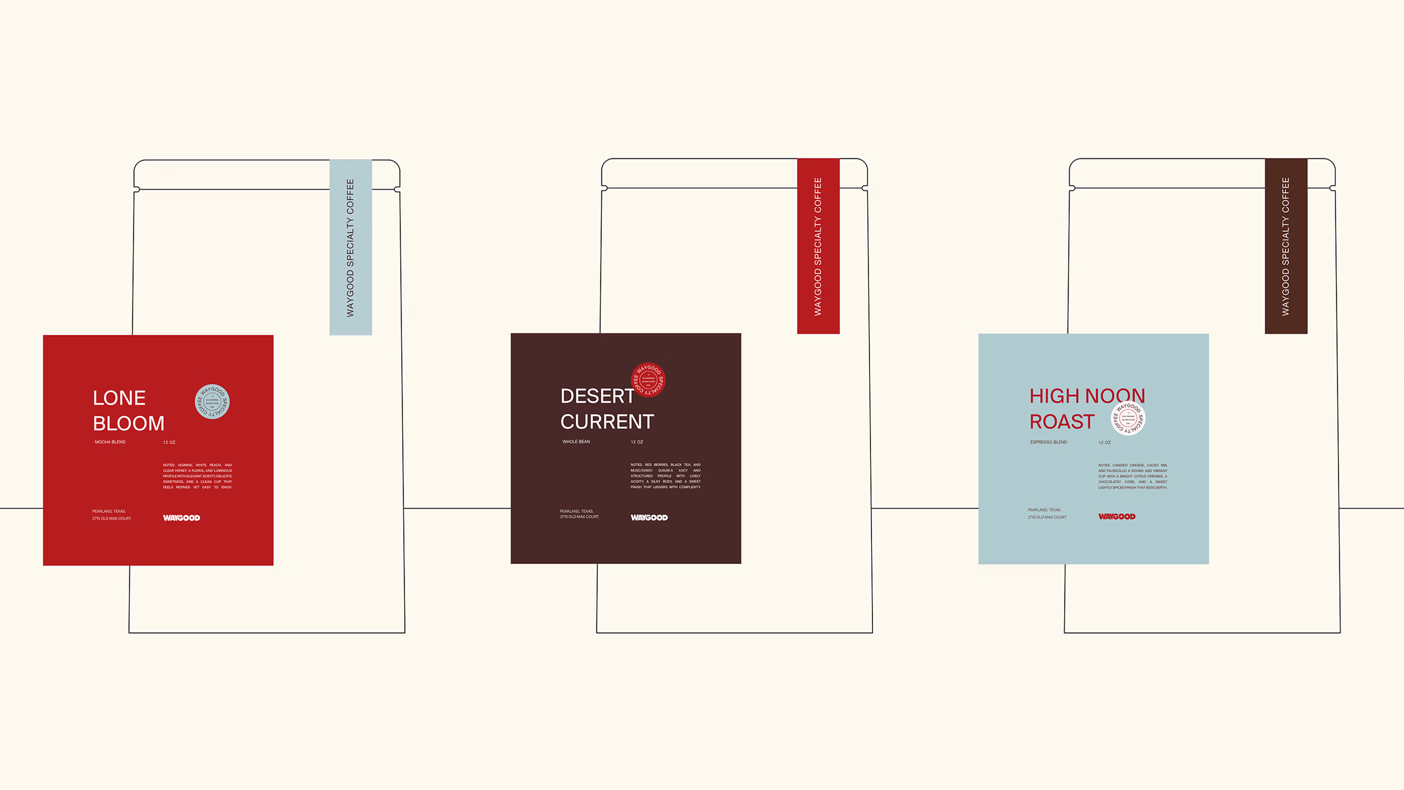
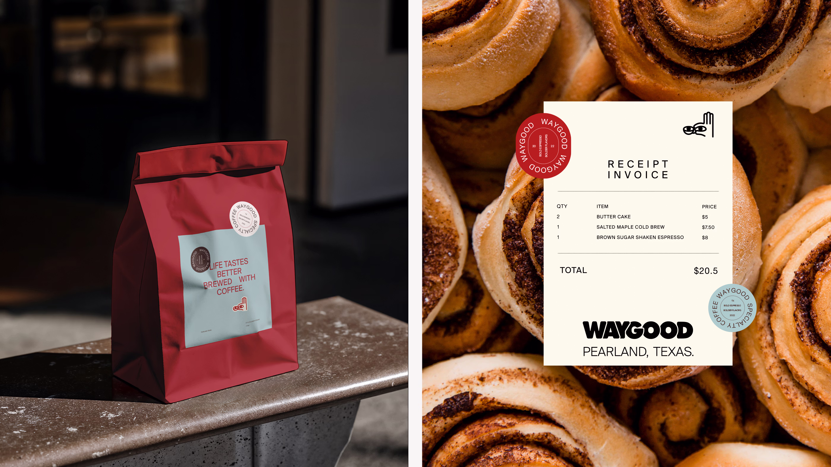
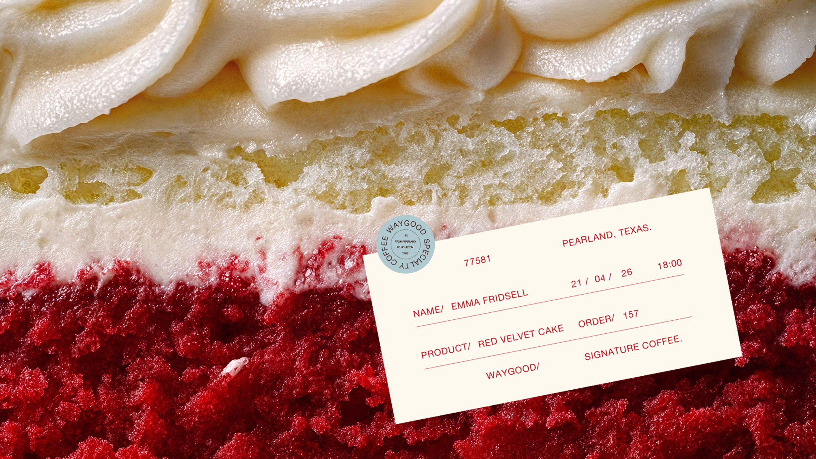
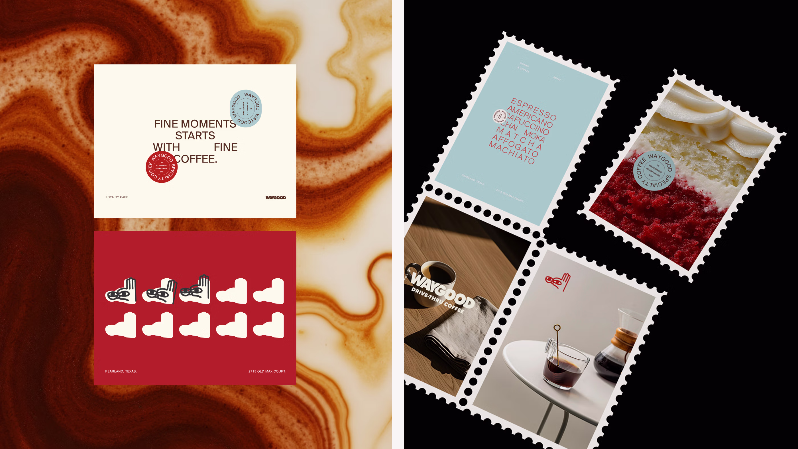
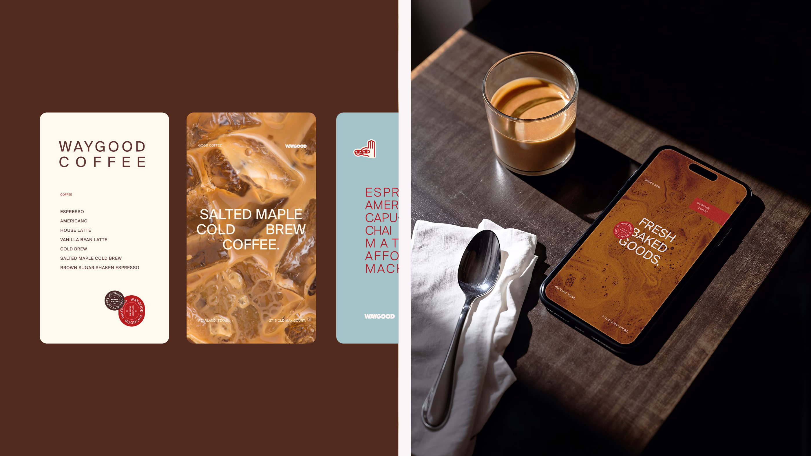
A cohesive world takes shape where color defines the tone through palette dominated by red and softened by neutrals and coffee tones with subtle touches of blue. This balance creates an atmosphere that feels both energetic and calm, allowing the brand to move naturally between product and space while maintaining a grounded and expressive presence.
Typography brings this world into focus through a refined yet functional approach. It balances a timeless character with a sense of refinement, allowing information such as prices and measurements to feel seamlessly integrated within the experience. This creates a system where communication flows effortlessly while the brand retains a sense of elegance and approachability.
An editorial lens on coffee.
The visual language approaches the brand with an editorial sensibility where photography and composition work together to tell stories. Images focus on the quiet details that surround coffee and capture moments that feel natural and unforced. Light and texture reveal the character of the drink while allowing each scene to feel calm and immersive.
Composition introduces structure without overpowering the imagery allowing space and rhythm to guide the viewer’s attention. Photography and layout move together to create a visual narrative that feels refined and contemporary. The result is an atmosphere where coffee appears as part of a lifestyle rather than a simple product.
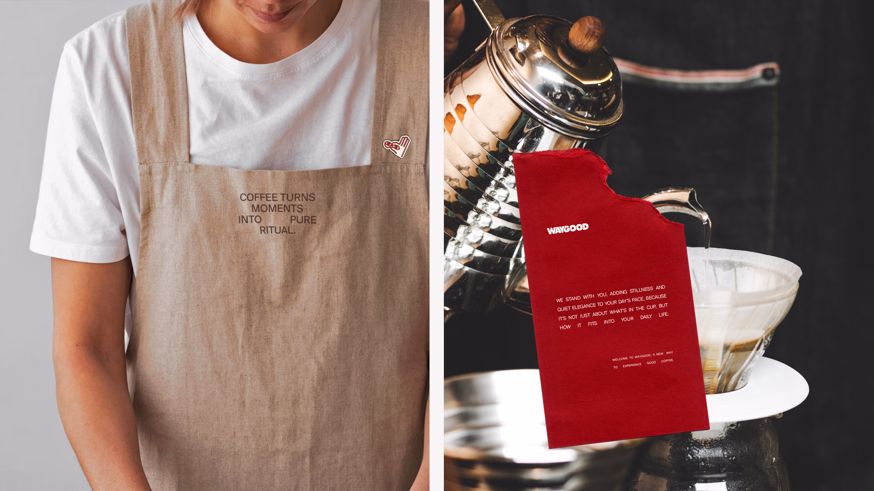
A brand that lives in the ritual.
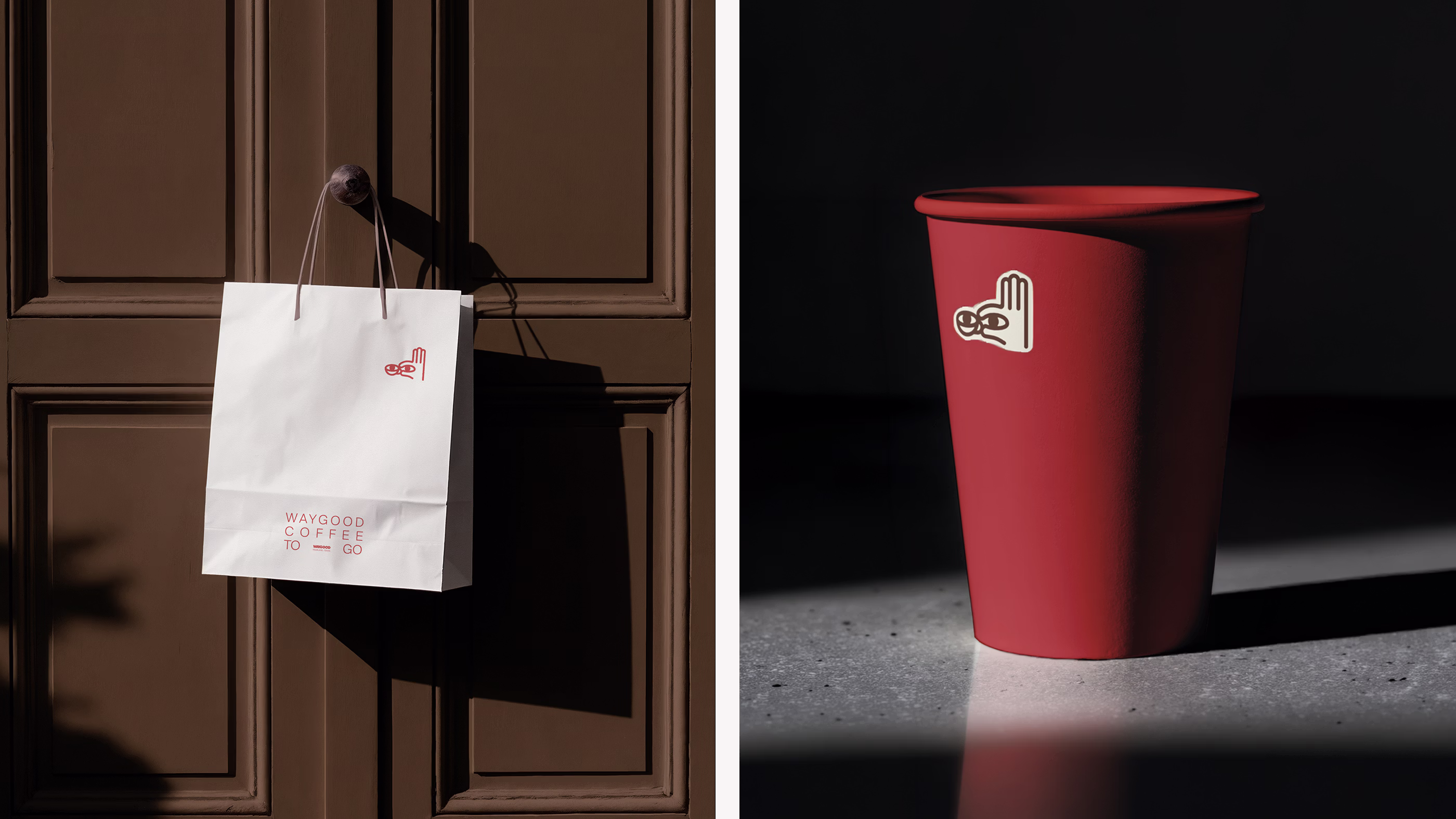
The identity becomes tangible through objects that accompany the daily coffee routine. Cups and takeaway packaging carry the colors and symbols of the brand into people’s hands as they move through the day. Paper menus and pastry bags together with branded napkins extend the visual language into the small gestures that shape the experience of a coffee shop.
Across merchandise and in-store materials the same language appears in subtle ways. Coffee bean packaging and ceramic mugs together with retail items transform everyday objects into pieces of the brand world beyond the counter. The identity becomes something encountered repeatedly throughout daily routines, reinforcing a presence that feels natural and familiar.
Why did it work?
The transformation allowed Waygood to grow alongside the meaning coffee now holds in contemporary life. By keeping the original logo and expanding the world around it the brand retained familiarity while gaining a more expressive voice. What once felt energetic and playful now reflects a deeper sense of style and intention.
Every element contributes to a narrative where coffee becomes a reflection of lifestyle. Color and imagery together with everyday objects bring the experience into the rhythm of daily routines and familiar habits. The result is a brand that resonates with how people live and how they choose to express themselves today.