

hello

Problem
The earlier identity no longer matched the depth of evolution or the creative processes that now define the studio. What once stood for discipline needed to convey adaptability and transformation, while celebrating the expertise gained over time. The challenge was to create an identity capable of honoring its journey while projecting a future of conviction and growth.
Solution
The response was to build a living system that begins with a dot, a clear origin filled with possibility, and expands into a vessel that carries energy and meaning. This dot symbolizes focus and genesis, the place where identity begins to take shape. From that origin, the system unfolds with coherence and adaptability, embodying precision and balance, translating creative thinking into structure and transforming ideas into lasting identity.

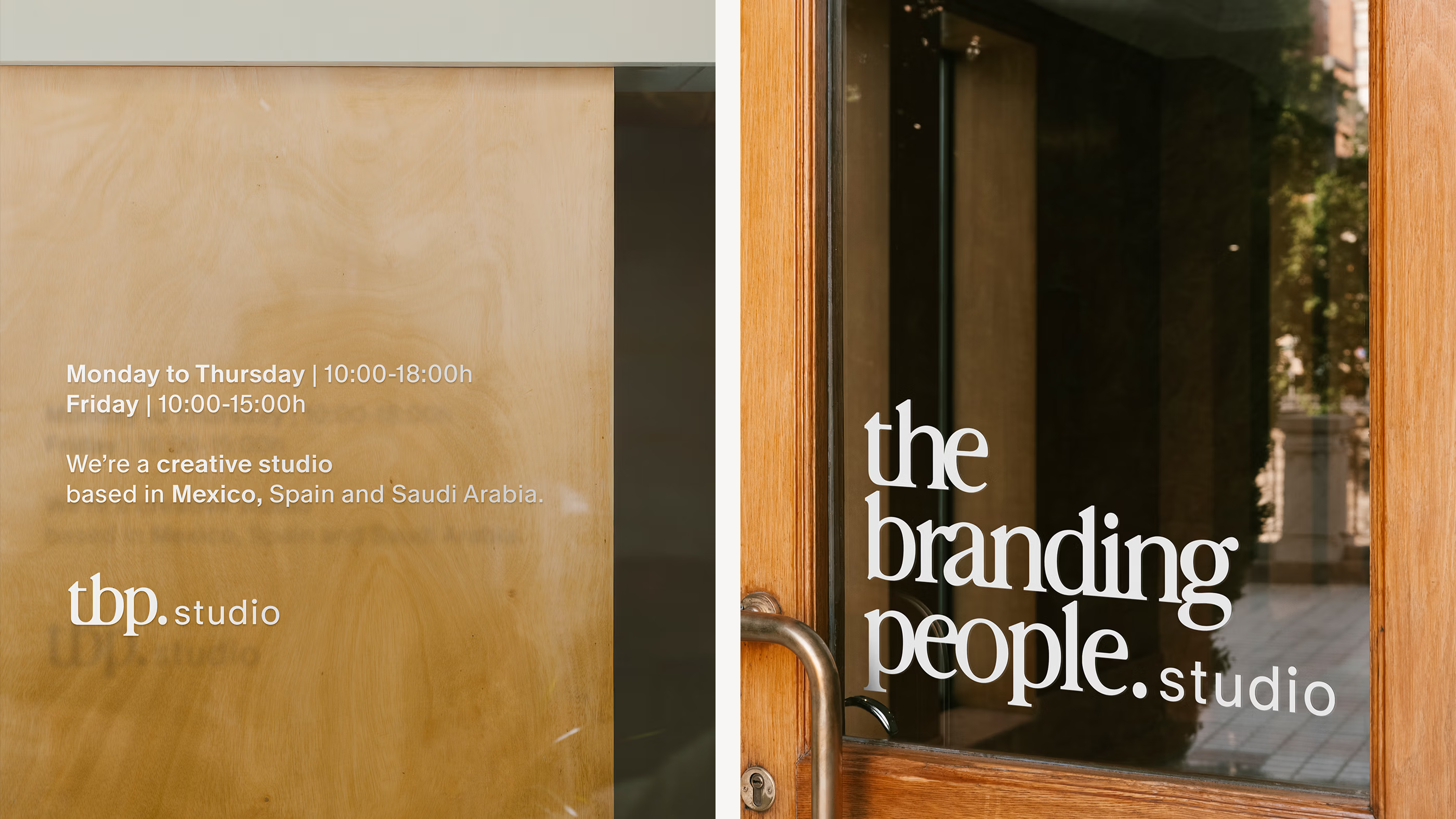
A new kind of signature.
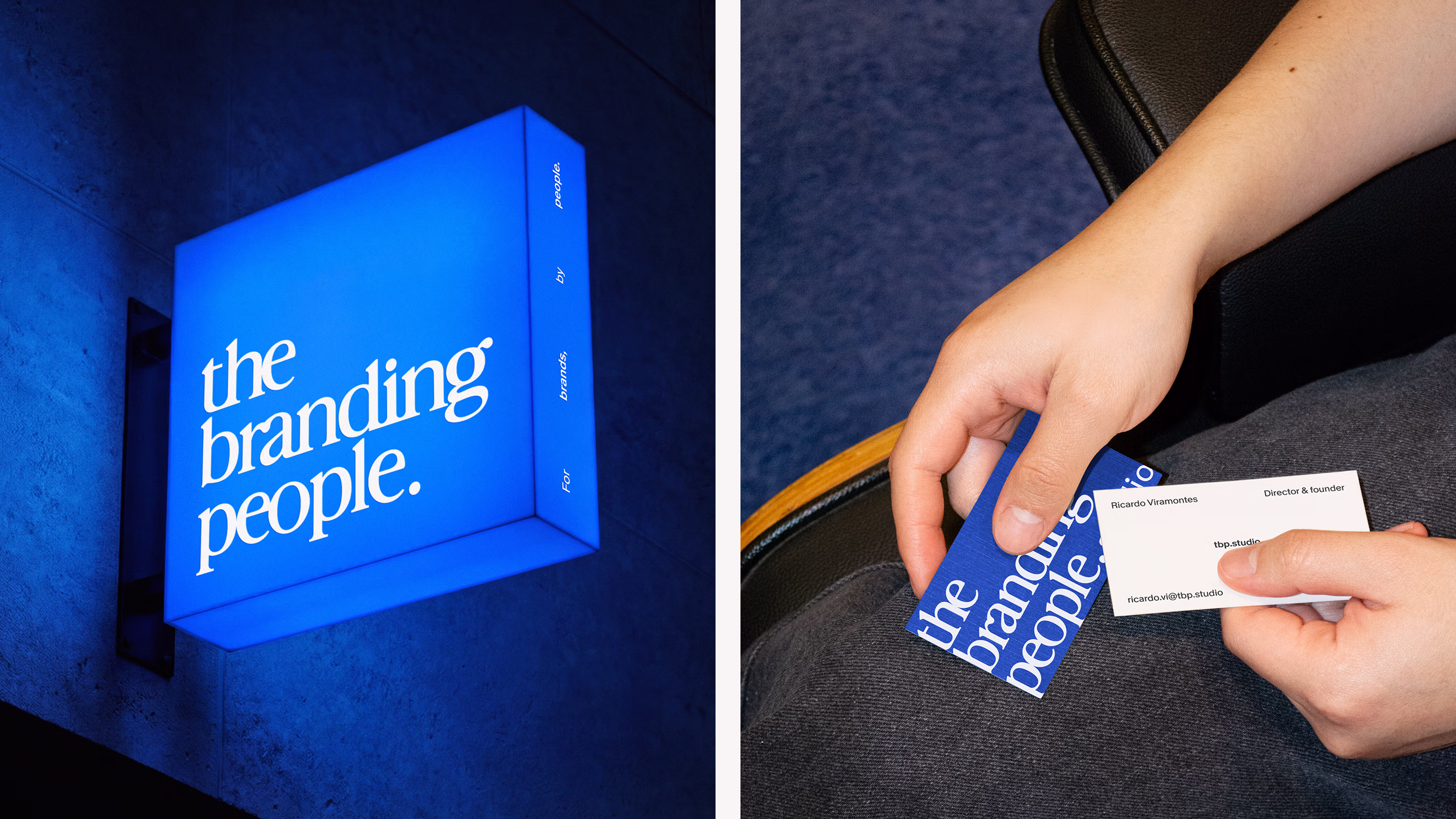
The new logo emerges from a deliberate act of creation. Drawn entirely from scratch, every letter balances craft and precision to define a mark that feels human and curated. The serif construction introduces warmth and character, grounding the identity in editorial heritage while opening it to a contemporary digital context, as a clear expression of authorship, care and direction.
Designed to perform as a living mark, the logo adapts seamlessly across scales and mediums with consistency and intent. Its structure allows it to move naturally within evolving platforms, maintaining clarity and presence. Through a balance of form and sensitivity, it reflects our commitment to innovation and human essence, translating structure into expression and ensuring the mark endures with time.
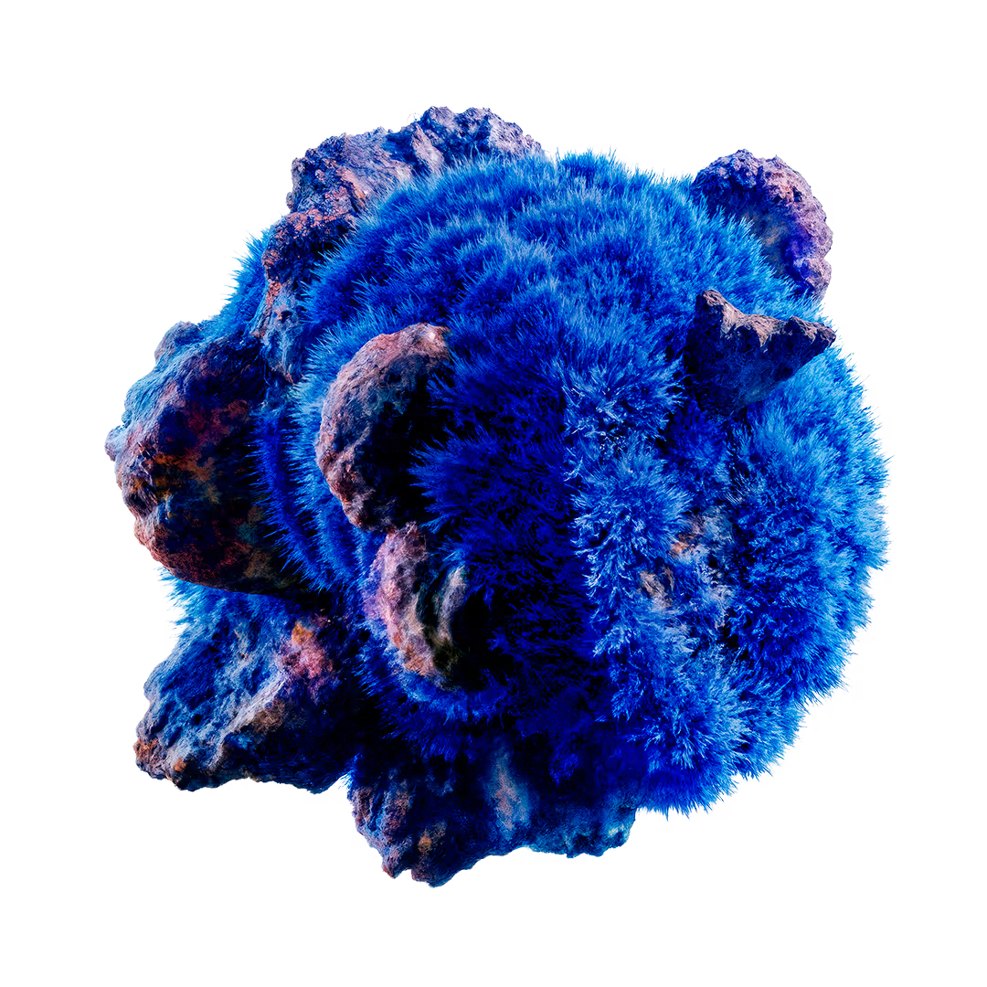
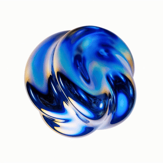
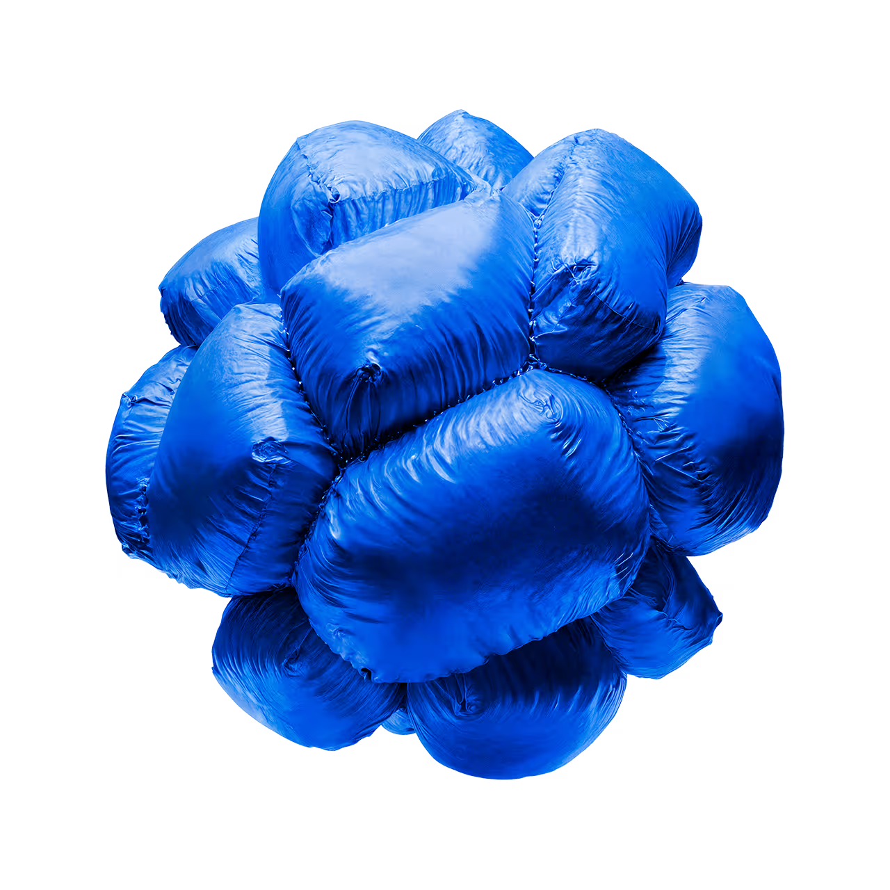
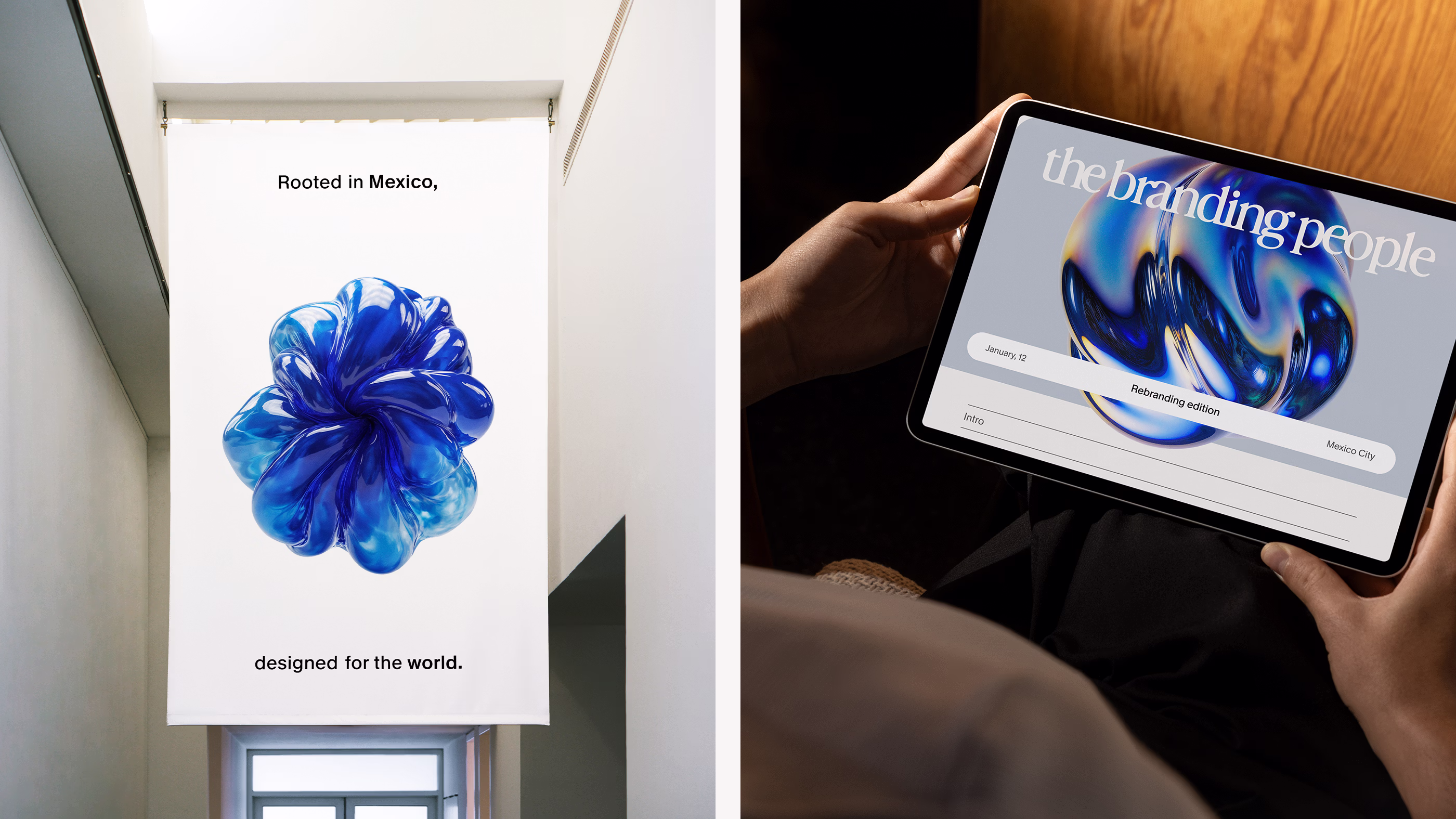
A living vessel.
It begins as a quiet presence, emerging from a single point into a form shaped by transformation. It exists as a space that absorbs context and adapts through nuance, allowing ideas to inhabit it naturally and expand into interconnected ecosystems. Through this openness, it moves fluidly across environments, creating atmospheres that feel responsive and composed.
Conceived as a generative element, the vessel evolves across formats and interactions with fluidity and control. Its mutable nature supports variation and expression while sustaining coherence and depth. Through this living structure, the brand unfolds into immersive ecosystems, translating its way of being into environments that respond to context and remain present through change.
The system behind the form.
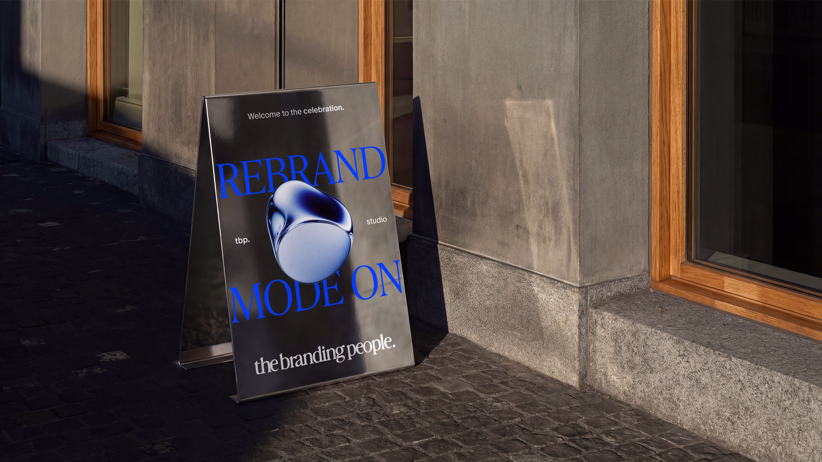
Color defines the system as a continuous thread that connects origin with progression. Blue carries meaning, trust and permanence, shifting across contexts while sustaining a steady presence. Anchored by a calibrated scale of greys, the palette creates contrast, focus and rhythm, establishing balance and coherence throughout the identity.
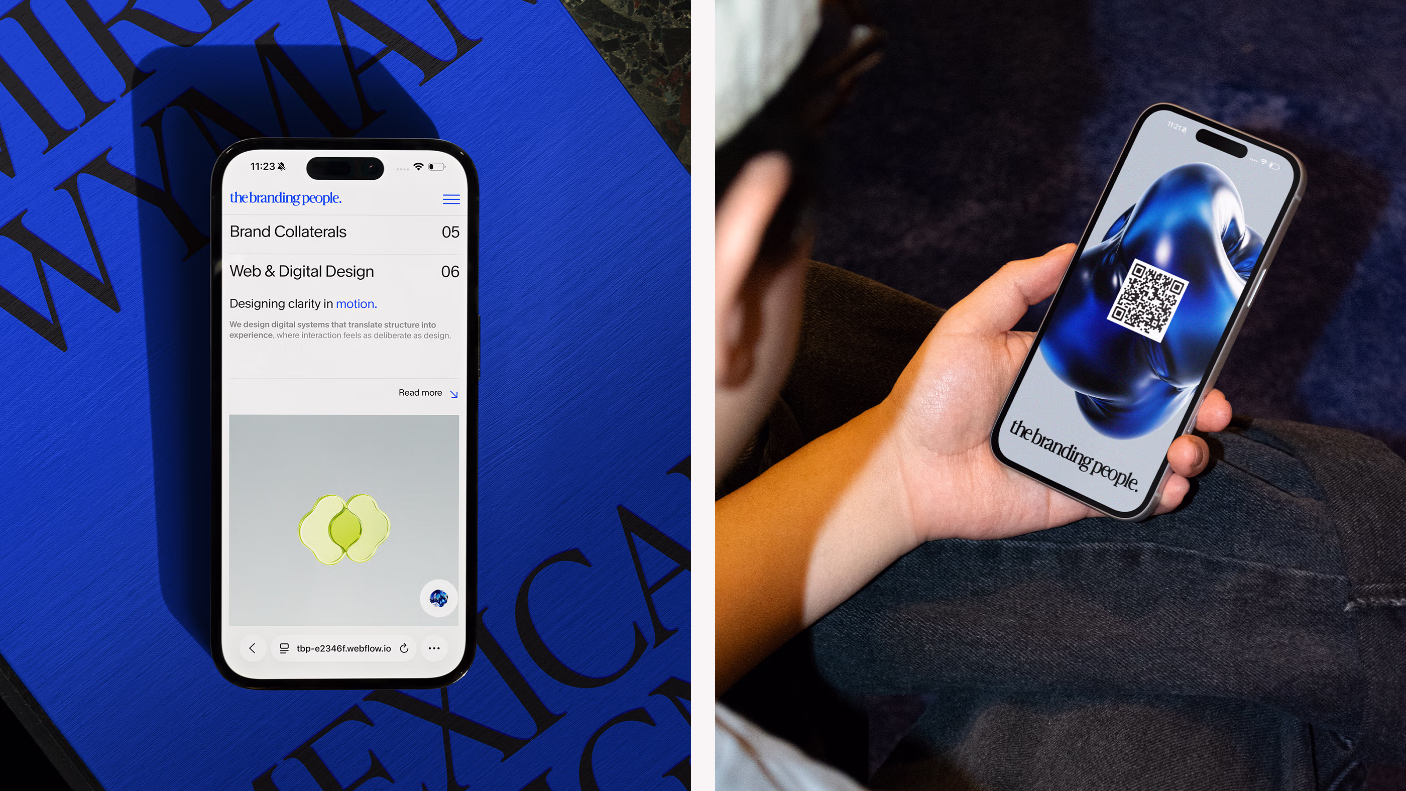
Icons operate as living elements within the system. Abstract and in motion, they function as expressive forms shaped for a screen-led world. Their behavior introduces dynamism and continuity, allowing the identity to unfold through interaction and reinforcing a system designed to expand and articulate meaning with a shared visual presence.
Compositional framework.
Typography establishes the elevated voice of the system. The interplay between serif and sans serif creates a measured balance, where refinement and functionality coexist with ease. One brings depth and presence, the other introduces precision and flow, shaping a typographic presence that reads with confidence and quiet authority.
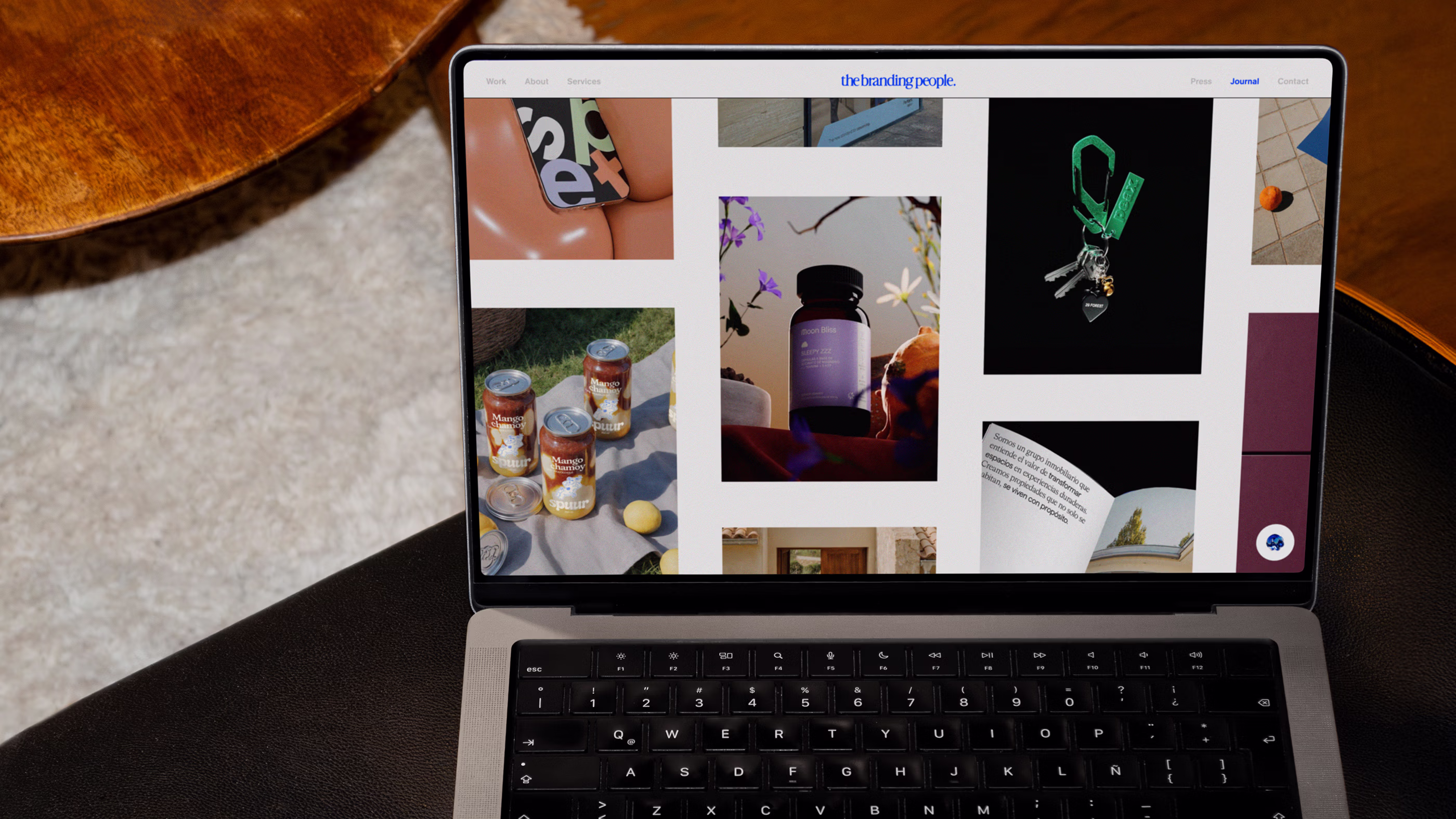
The editorial system extends this foundation through careful composition. Thoughtfully articulated layouts guide content with rhythm and focus, creating an experience that feels refined and intentional. Elevated yet restrained, the editorial approach allows the identity to adapt across mediums while remaining consistent, recognizable and unmistakably its own.
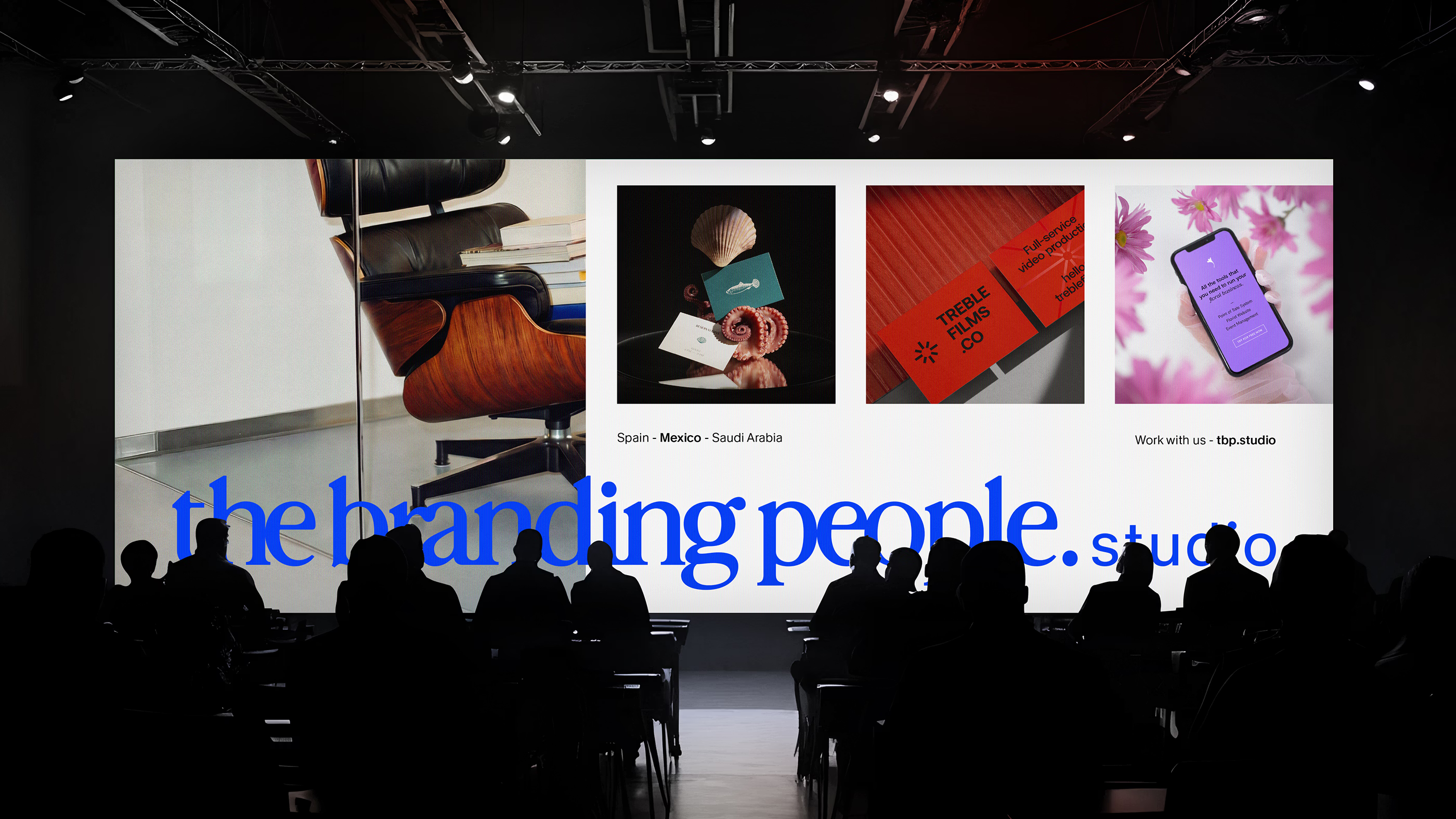
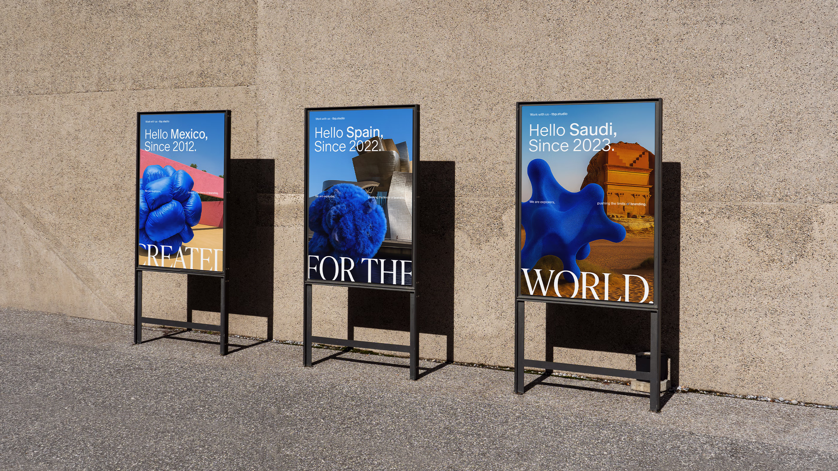
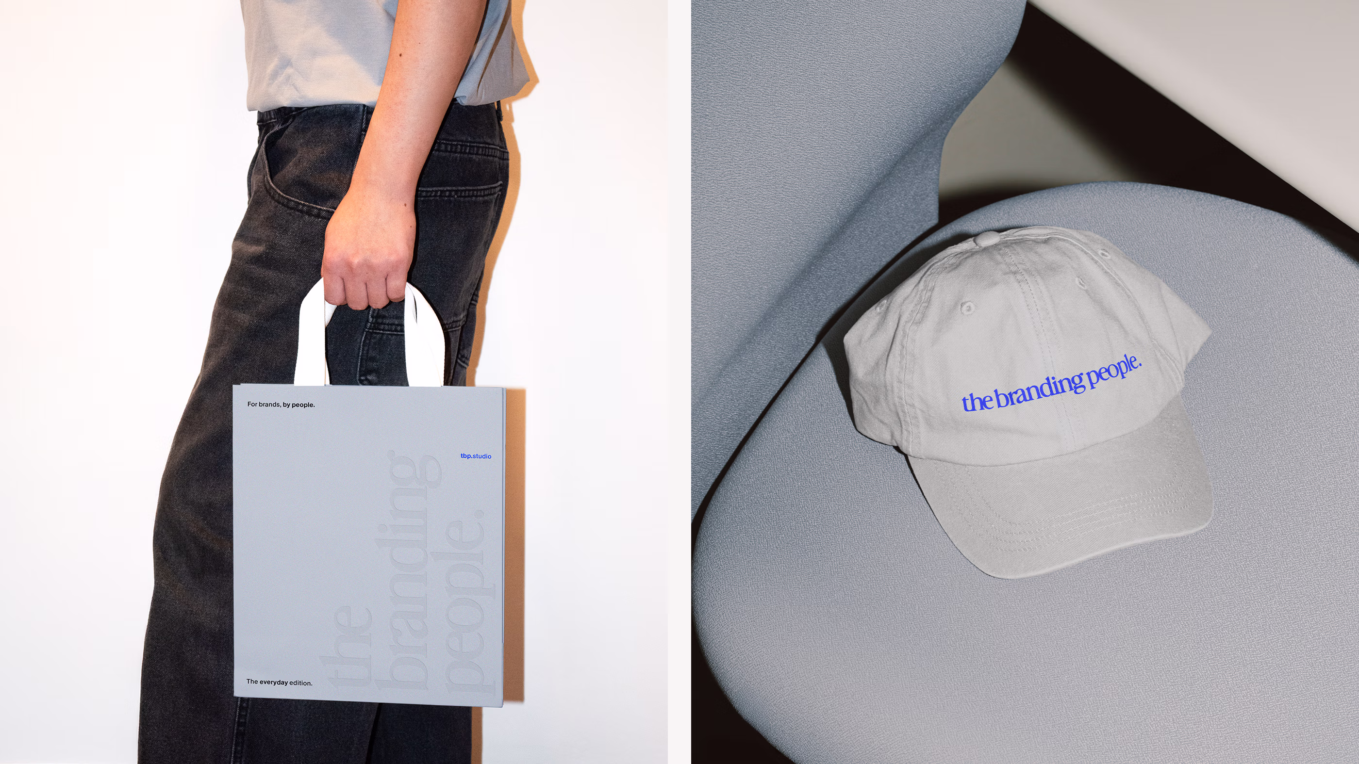
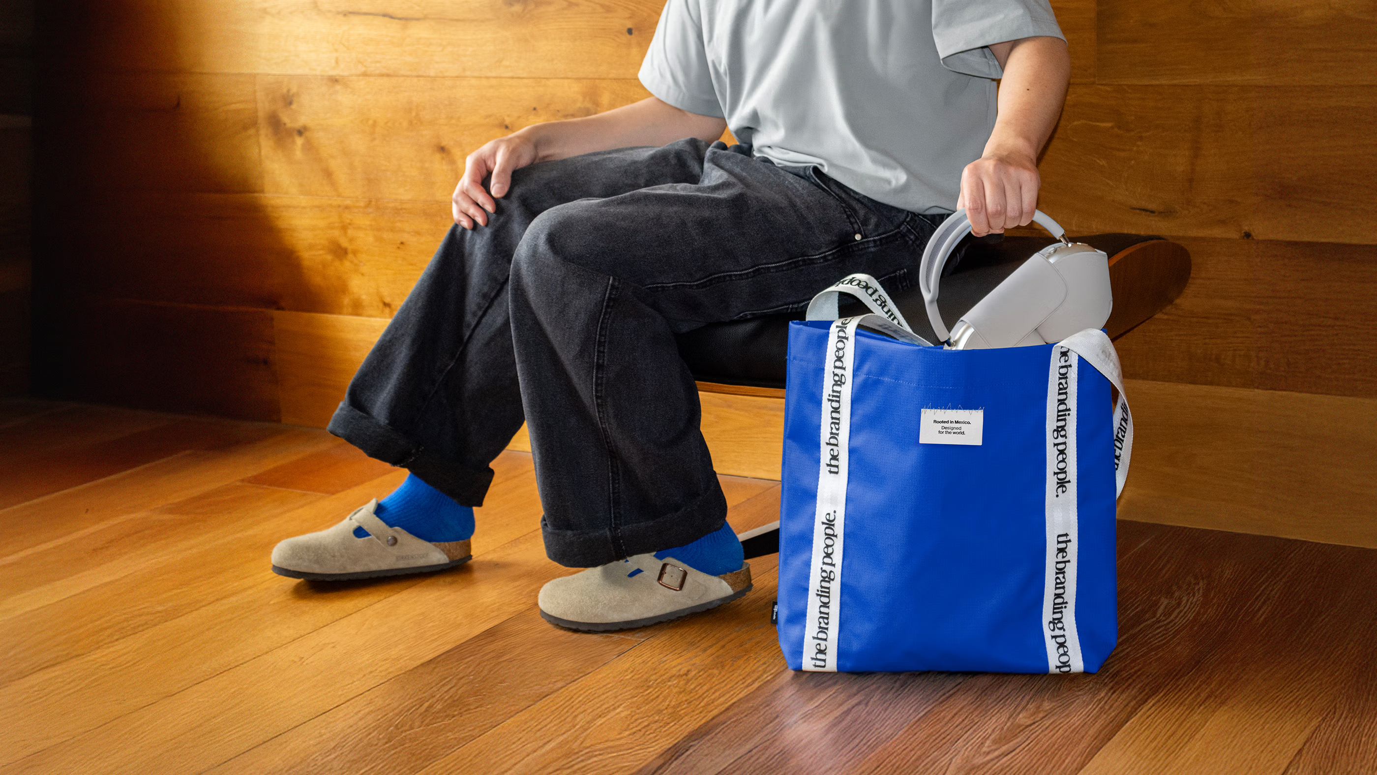
System-based applications.
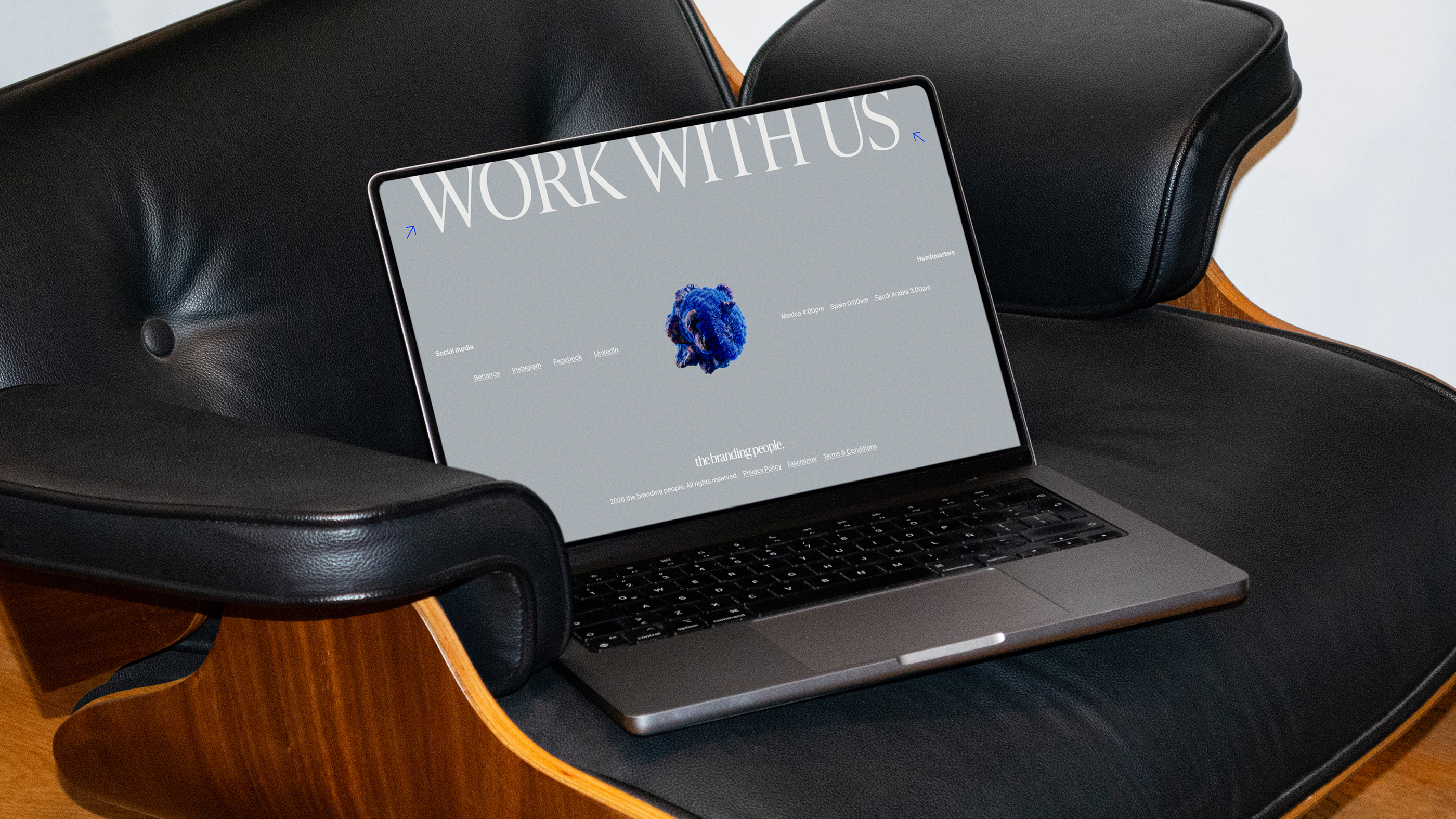
The system comes to life through its applications, translating the identity into tangible experiences and daily touchpoints. Each piece carries the same visual discipline, allowing the brand to feel consistent while adapting to different needs. From owned materials to outward-facing moments, the system supports communication that feels considered, recognizable and built with purpose.
Across platforms and physical spaces, the identity expands with cohesion and energy. Layout, type, color and icons work together to create a world that feels unified, whether it is experienced through screens, printed materials or environmental presence. In every application, the system reinforces a brand that feels present, confident and ready to live wherever it is needed.
Why did it work?
The system brought definition to the studio’s identity and revealed the soul that had guided its work from the beginning. The design organized this foundation into a clear language, aligning intention, method and expression within a single, coherent structure. What was intuitive in practice became visible, accessible and ready to be applied with consistency.
Every component of the identity operates as a strategic element that elevates how the studio works and expresses itself. The vessel connects digital and physical expressions, giving each touchpoint continuity and presence. The result is a brand that functions with intention and structure, uniting aesthetics, functionality and eloquence across every dimension of the brand.