

hello


Problem
The return of professional baseball presented an opportunity to reconnect the game with a town that has long embraced it as part of its identity. Introducing an entirely new team required a presence that felt unmistakably tied to El Fuerte from the very beginning. This created an opportunity to build something capable of becoming part of how the town expresses itself both on and beyond the field.
Solution
Built as a complete brand world, Mágicos brings together symbolism and visual expression within a shared narrative shaped by the character of El Fuerte. The system creates a distinct atmosphere that connects the team to the town, allowing a new franchise to arrive with authenticity and a sense of familiarity that people can immediately recognize, embrace and proudly call their own.

The Magic of the North.
The concept emerges from a place where history and imagination have shaped the identity of generations. El Fuerte carries a distinctive sense of character rooted in its cultural heritage and regional pride, creating the foundation for a team deeply connected to the community it represents. The town itself became the starting point for everything that followed.
From this perspective, magic becomes a natural expression of the town itself. Inspired by local legends and the spirit of the north, the concept transforms cultural references into a shared narrative that celebrates the character of El Fuerte. The result is a world where tradition and imagination exist side by side, giving the team a story inseparable from the place it calls home.
A Mark Built for Belonging.
At the center of the identity is a custom wordmark designed to balance the heritage of baseball with the ambitions of a new generation. Its script-inspired construction draws from the visual language long associated with the sport, while refined proportions and contemporary detailing give the mark a timeless quality designed to endure across seasons and generations.
A family of supporting marks extends the identity across different contexts while preserving the character of the original logo. From simplified emblems to more compact expressions, each variation was carefully crafted to remain recognizable at every scale, creating a system that feels both cohesive and adaptable as the club continues to grow.
Bringing Magic to Life.
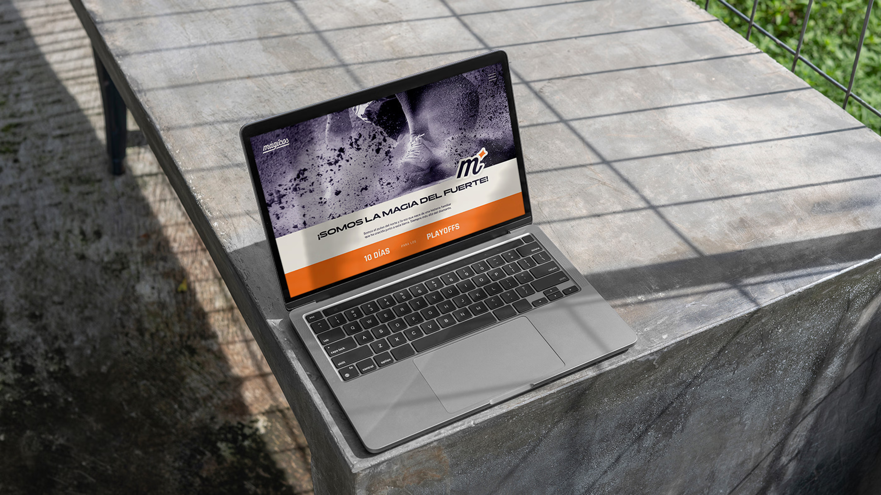
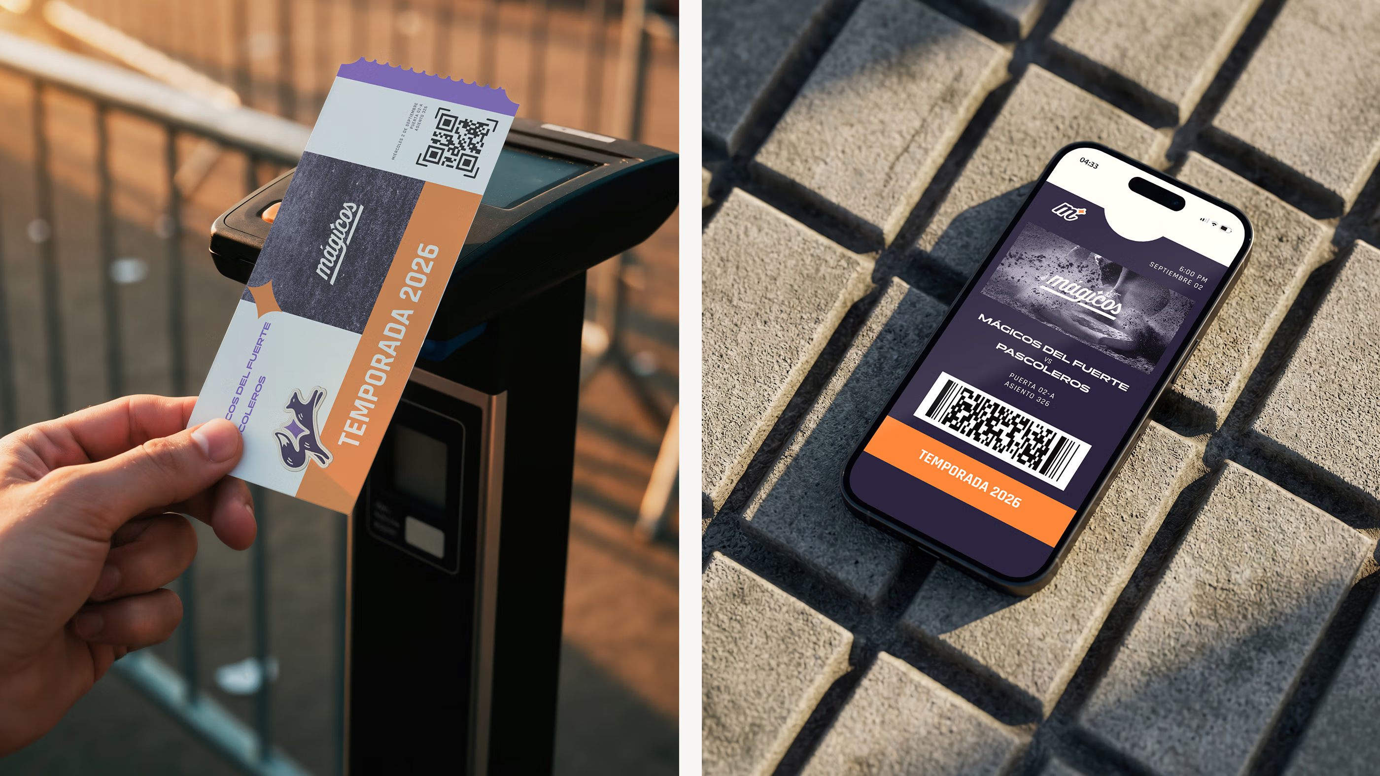
Color, typography and photography work together to shape a visual language inspired by the atmosphere surrounding El Fuerte. Purple serves as a reference to the magic woven throughout the club, while warm orange tones draw inspiration from the landscape and light of the region, creating a distinctive aesthetic rooted in place.
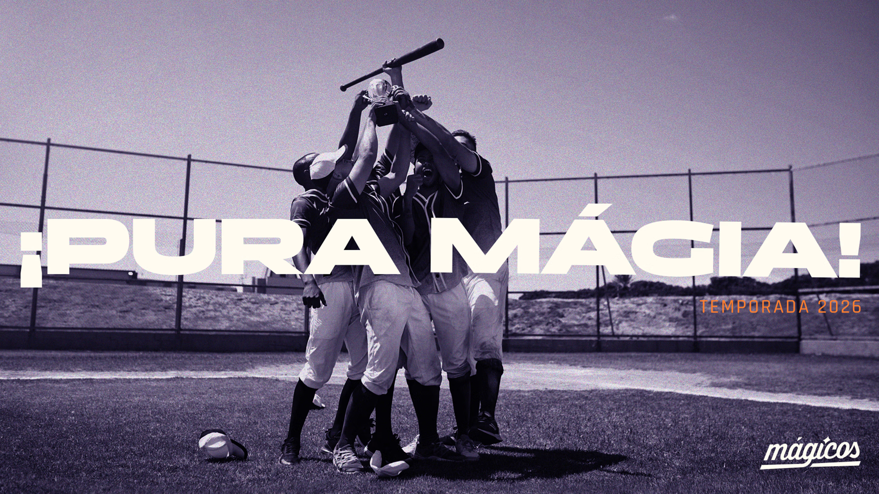
A curated photographic direction reinforces this atmosphere through warm imagery focused on life around the game. Subtle grain and analog-inspired treatments introduce a sense of familiarity, while monochromatic applications in purple add distinctive layers of expression. Together, these elements capture the spirit and energy surrounding the game.
The Making of a Mascot.
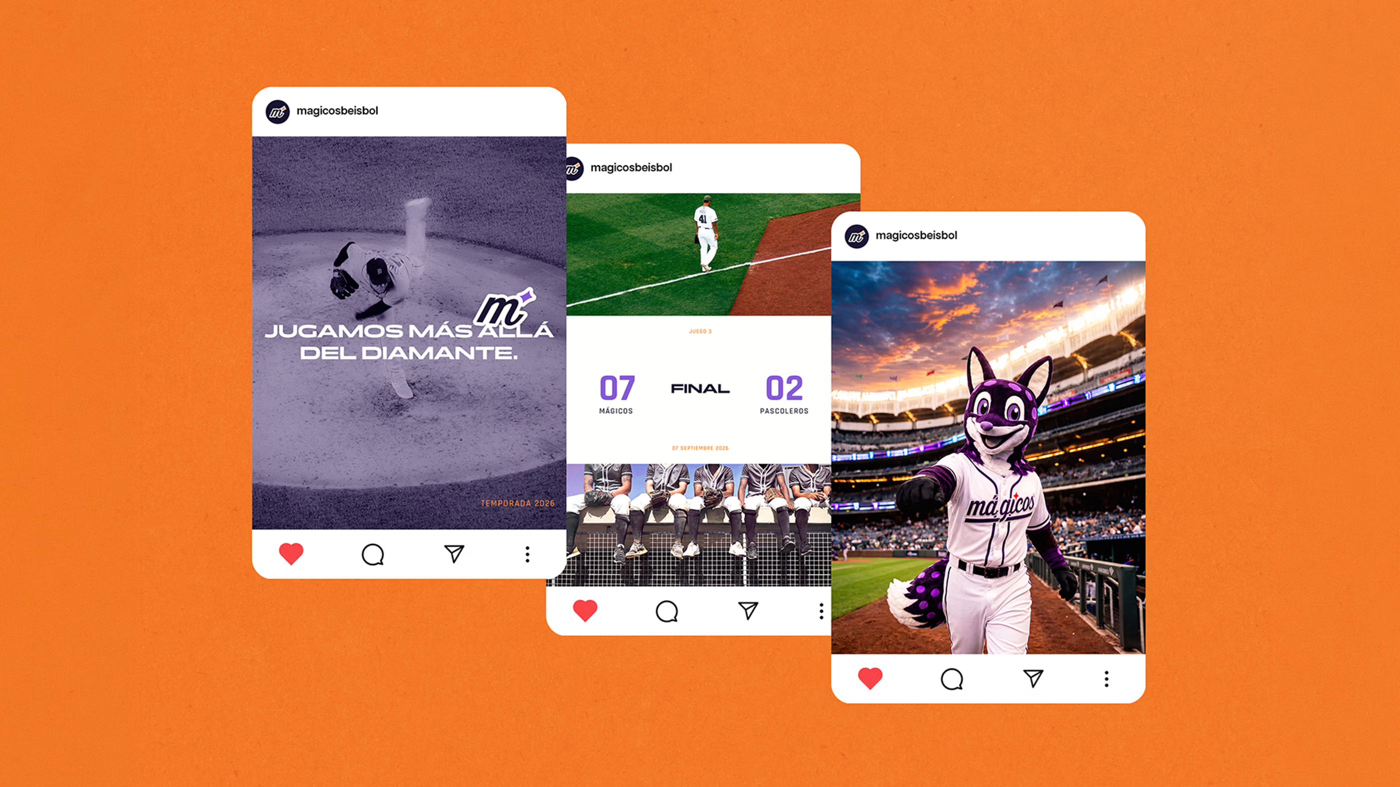
The mascot was created as a character capable of extending the spirit of Mágicos beyond the game itself. Designed with a playful and charismatic personality, it introduces a more approachable side of the team while strengthening the connection between players, families and supporters. Its role goes beyond entertainment, becoming a recognizable figure that helps bring the identity of the club into everyday life.
Its design draws inspiration from the fox closely associated with local legends and incorporates influences from the tradition of Mexican alebrijes. These mythical creatures provided a natural way to express the sense of magic woven throughout the team, translating cultural references into a character uniquely connected to El Fuerte. Through this approach, regional storytelling becomes a living part of the world of Mágicos.
Beyond the Diamond.
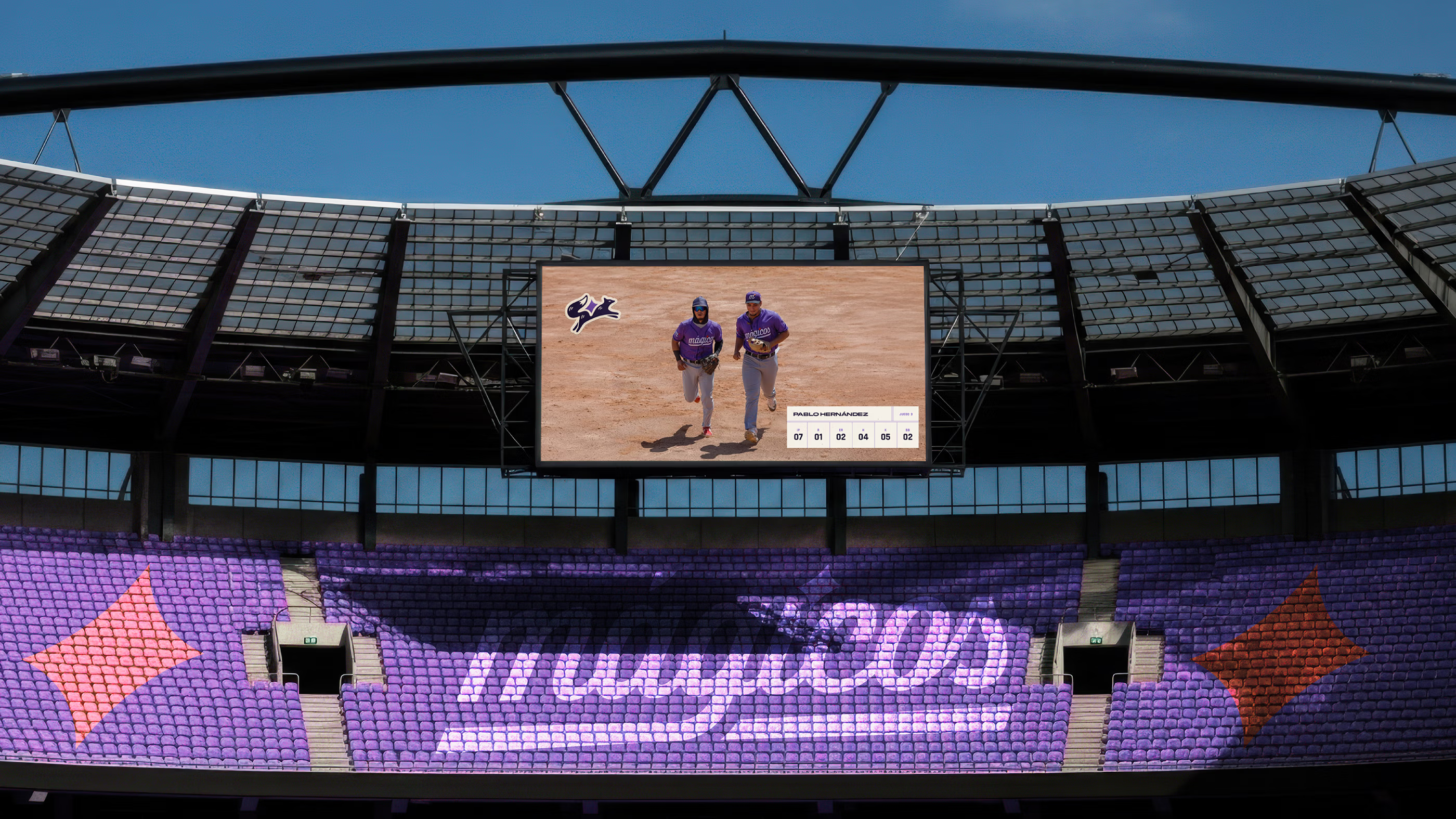
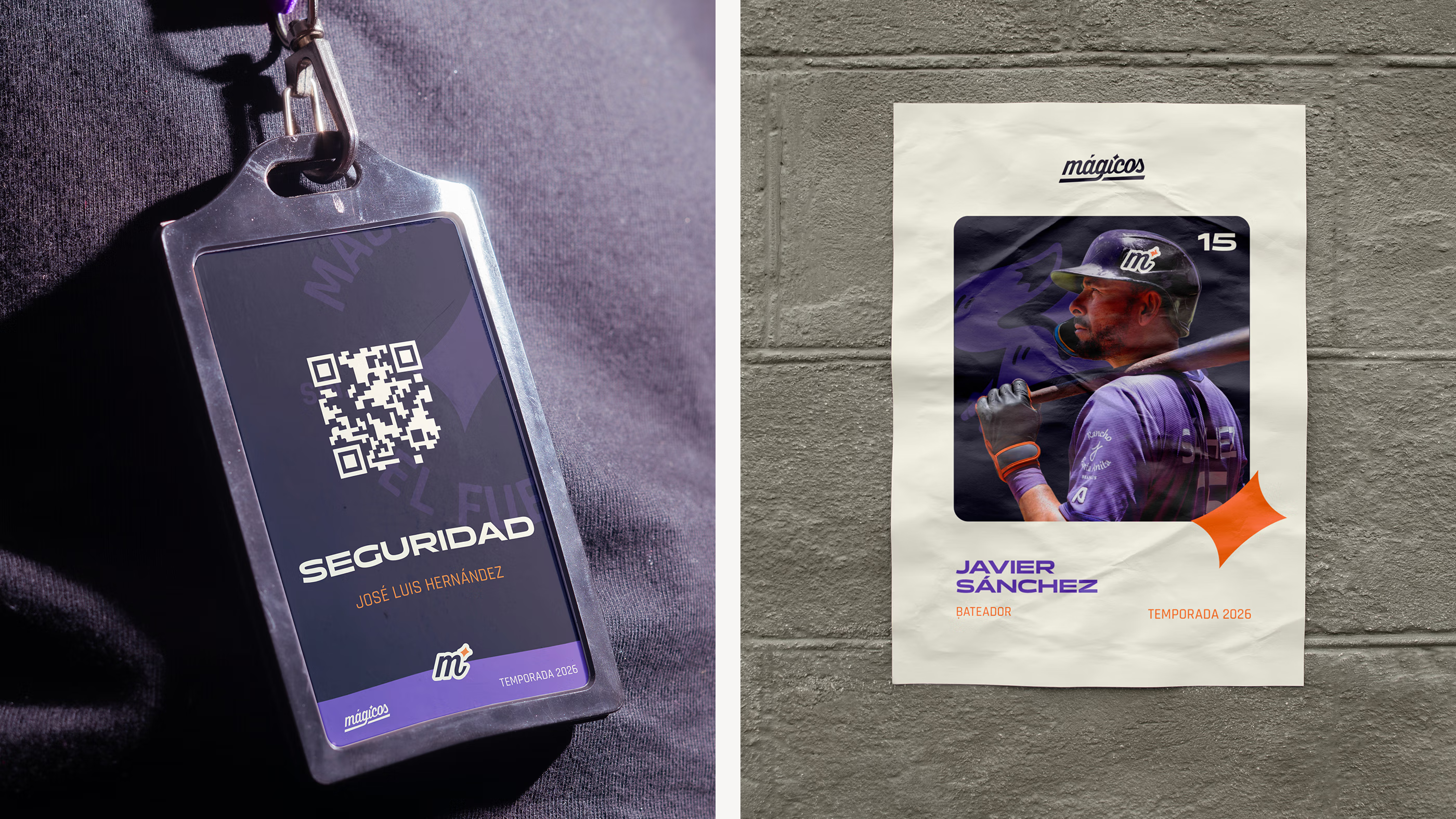
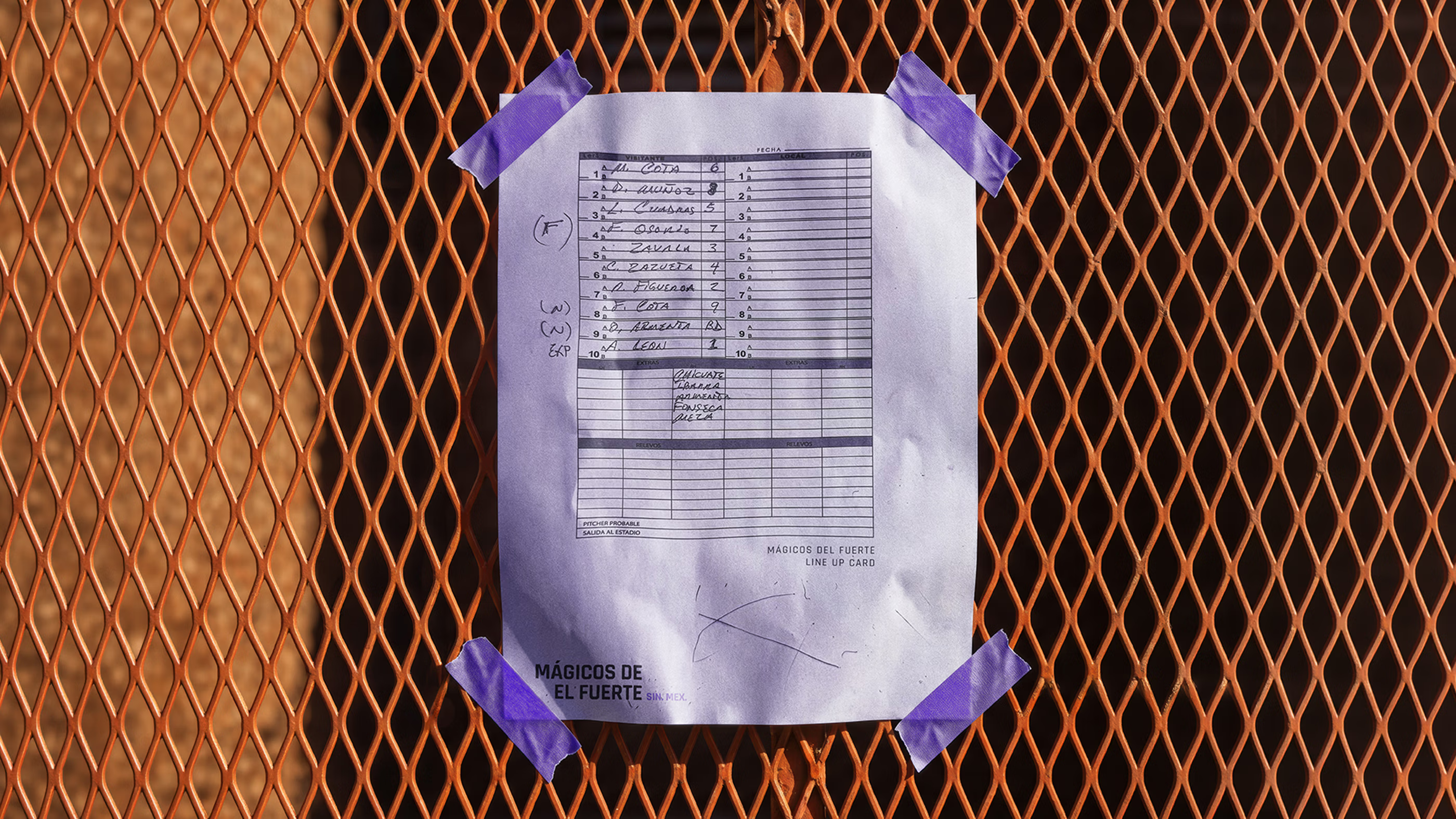
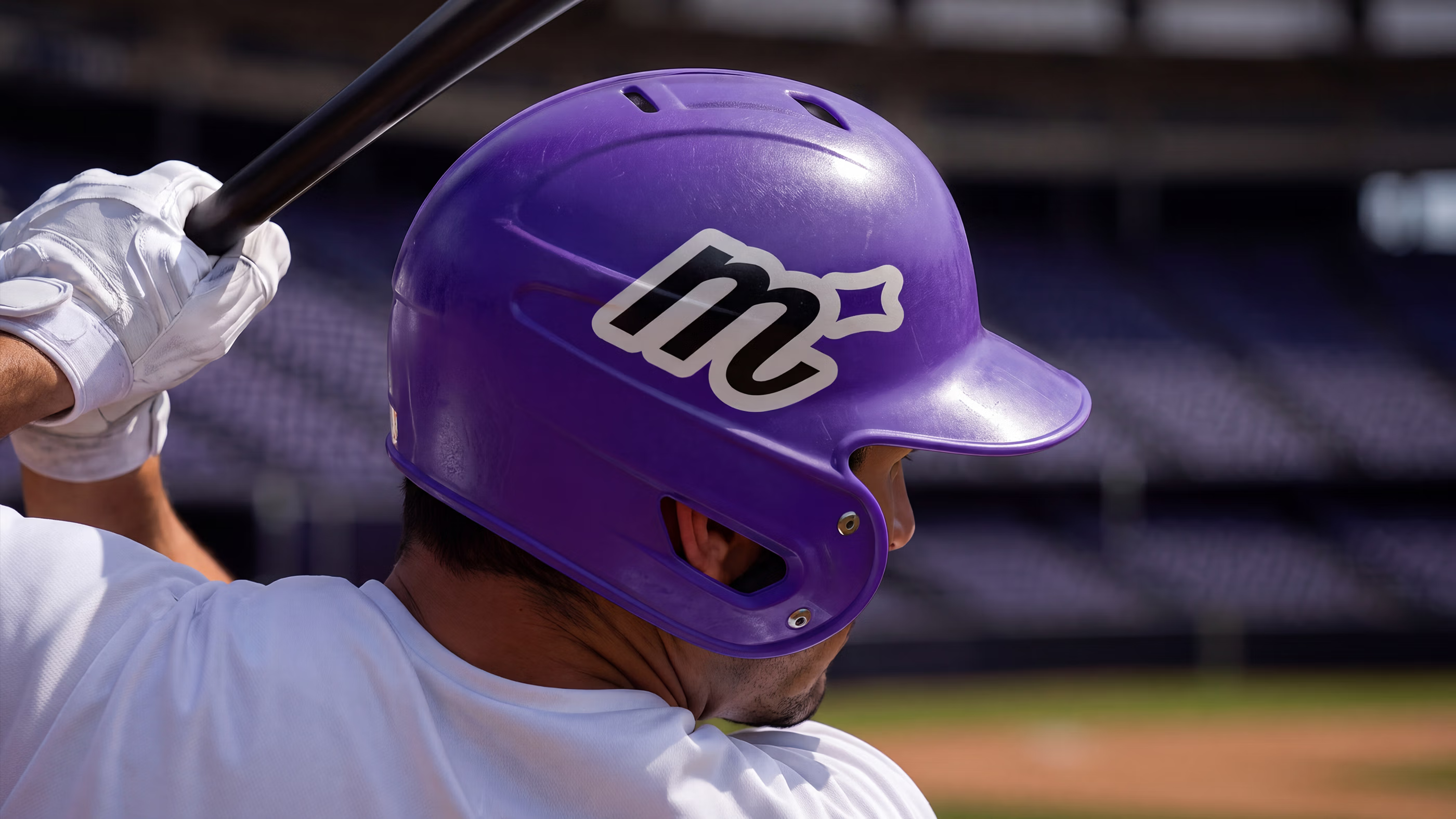
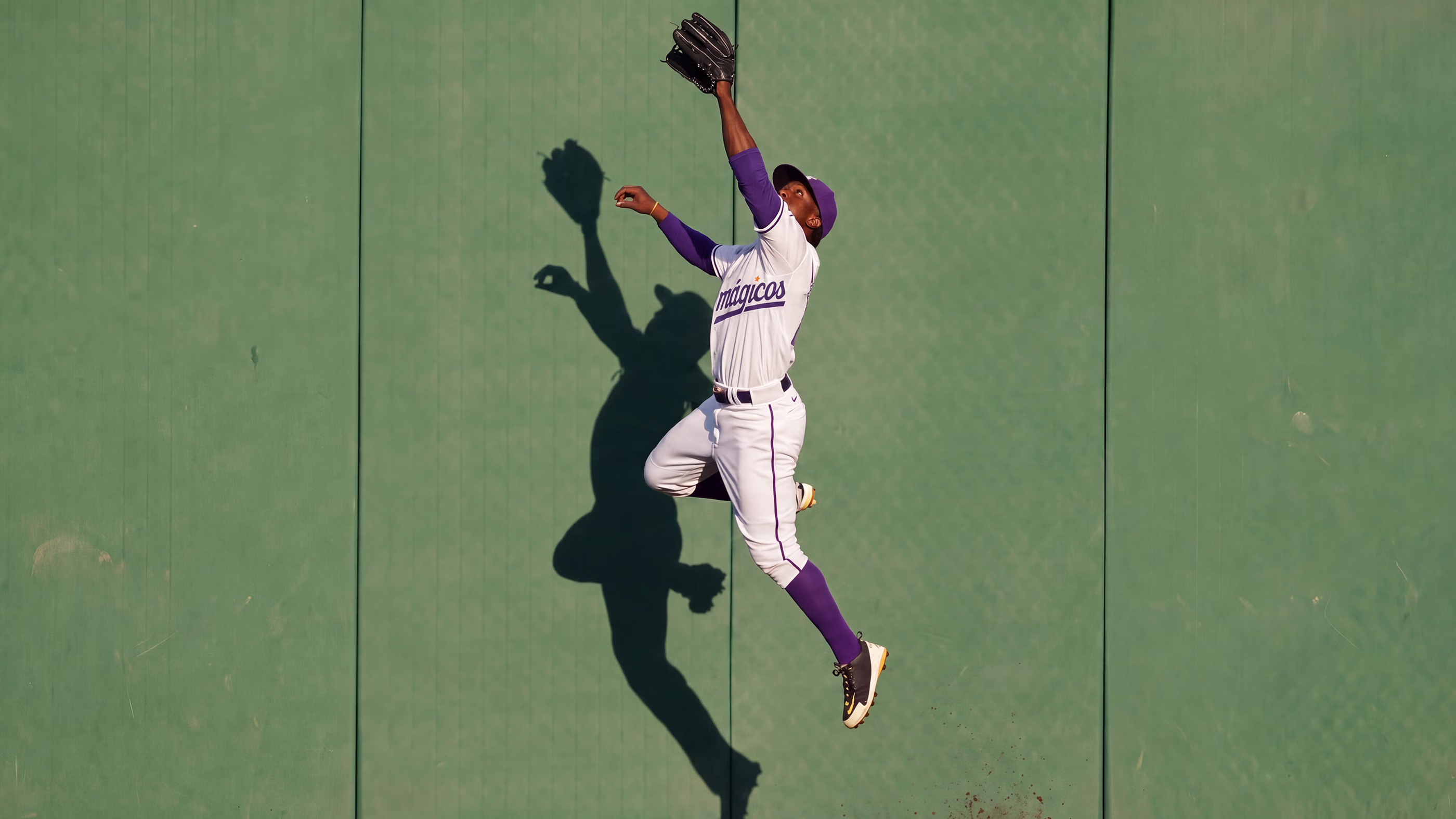
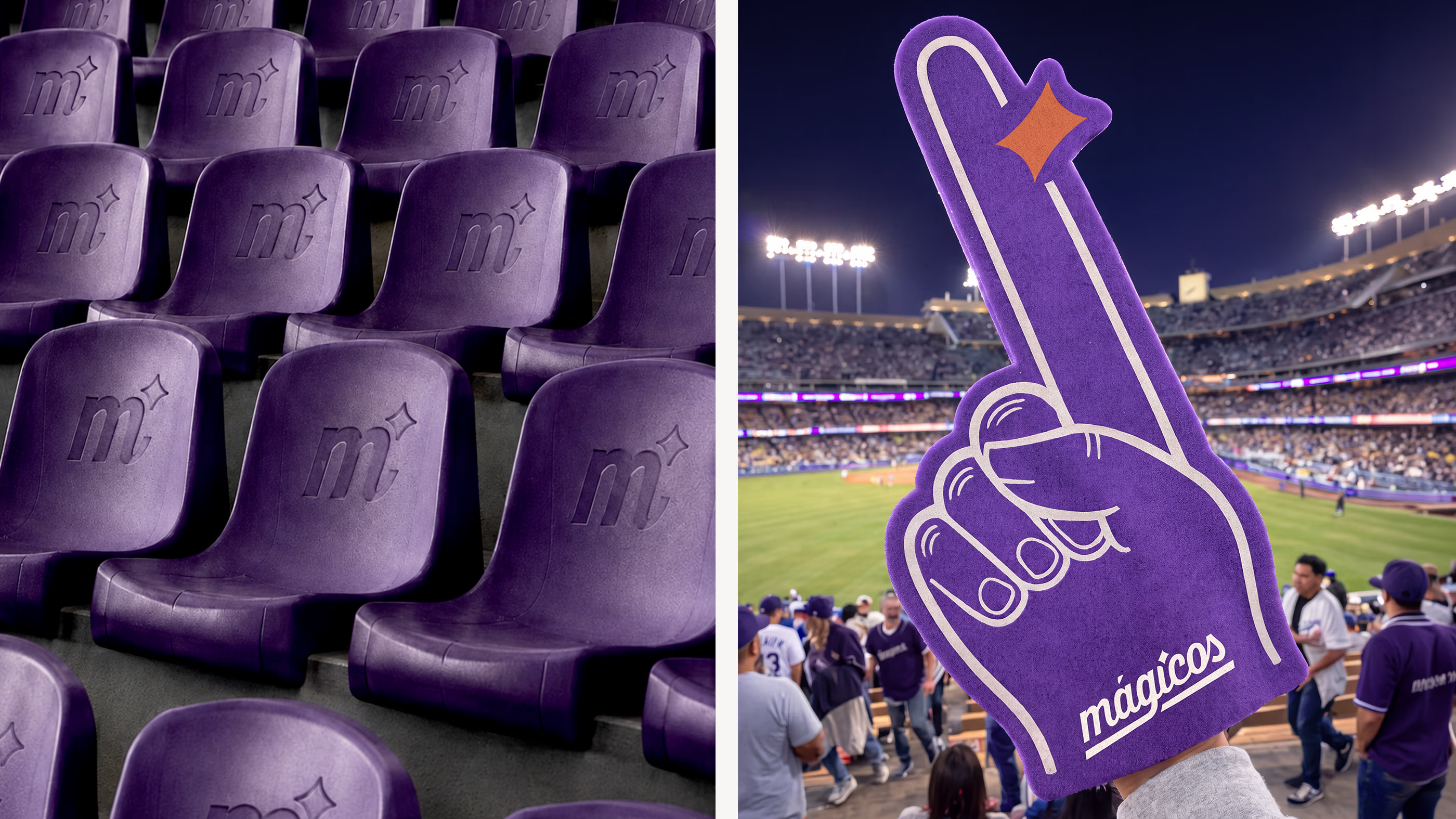
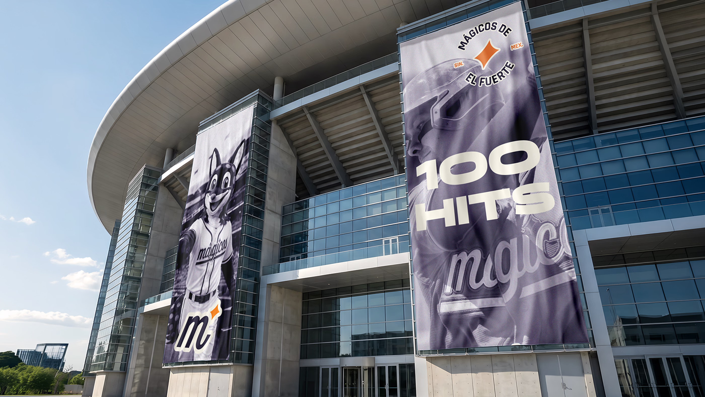
The brand extends across every touchpoint surrounding the team, transforming each interaction into part of a larger experience. From uniforms and merchandise to stadium environments and digital content, every expression reinforces a consistent presence designed to accompany supporters wherever they encounter Mágicos.
This approach transforms the system into something people can experience beyond the game itself. Each element contributes to a more connected world around the team, creating continuity across environments and everyday interactions. Within this ecosystem, Mágicos becomes part of the moments that bring people together around the club.


Why did it work?
The project reflects an understanding that lasting relevance is created through systems capable of carrying meaning over time. Every element of Mágicos was designed to operate as part of a larger whole, ensuring the club could evolve, expand and remain coherent as new chapters, experiences and opportunities are added throughout its journey. The outcome establishes a foundation built for permanence. Through a shared language that extends across the entire experience, Mágicos is positioned to become an enduring part of El Fuerte, gaining significance through the traditions it inspires and the memories it leaves behind, while strengthening its place within the life of the town over time.