

hello

Problem
Regional Mexican music had entered a new era, with new festivals, artists and sub-genres reshaping the category across increasingly diverse audiences. Scale alone could no longer define ARRE’s relevance. The festival needed a stronger position, broad enough to represent the genre beyond a single trend or generation, while remaining distinctive, culturally credible and capable of evolving alongside the scene itself.
Solution
ARRE was reimagined as La Casa del Regional, a shared cultural space where the genre can honor its roots while continuing to evolve. The identity brings tradition and contemporary expression into one cohesive world, creating a platform broad enough to embrace different generations and expressions of regional while giving the festival a distinctive presence designed to remain relevant as the culture moves forward.

Where We Meet.
Regional Mexican culture is constantly reshaping itself, carrying familiar codes into new expressions without leaving behind what gives them meaning. This movement became the foundation for a world built from within the culture itself, where heritage is not treated as something to preserve, but as something alive, shared and continuously reinterpreted.
Rather than responding to what surrounds the genre, the direction finds its voice within it. Familiar references gain new relevance through the way they come together, creating a world that feels expressive, elevated and connected to its origins. The result is a contemporary expression of regional, confident in where it comes from and open to where it can go.
Written in Gold.
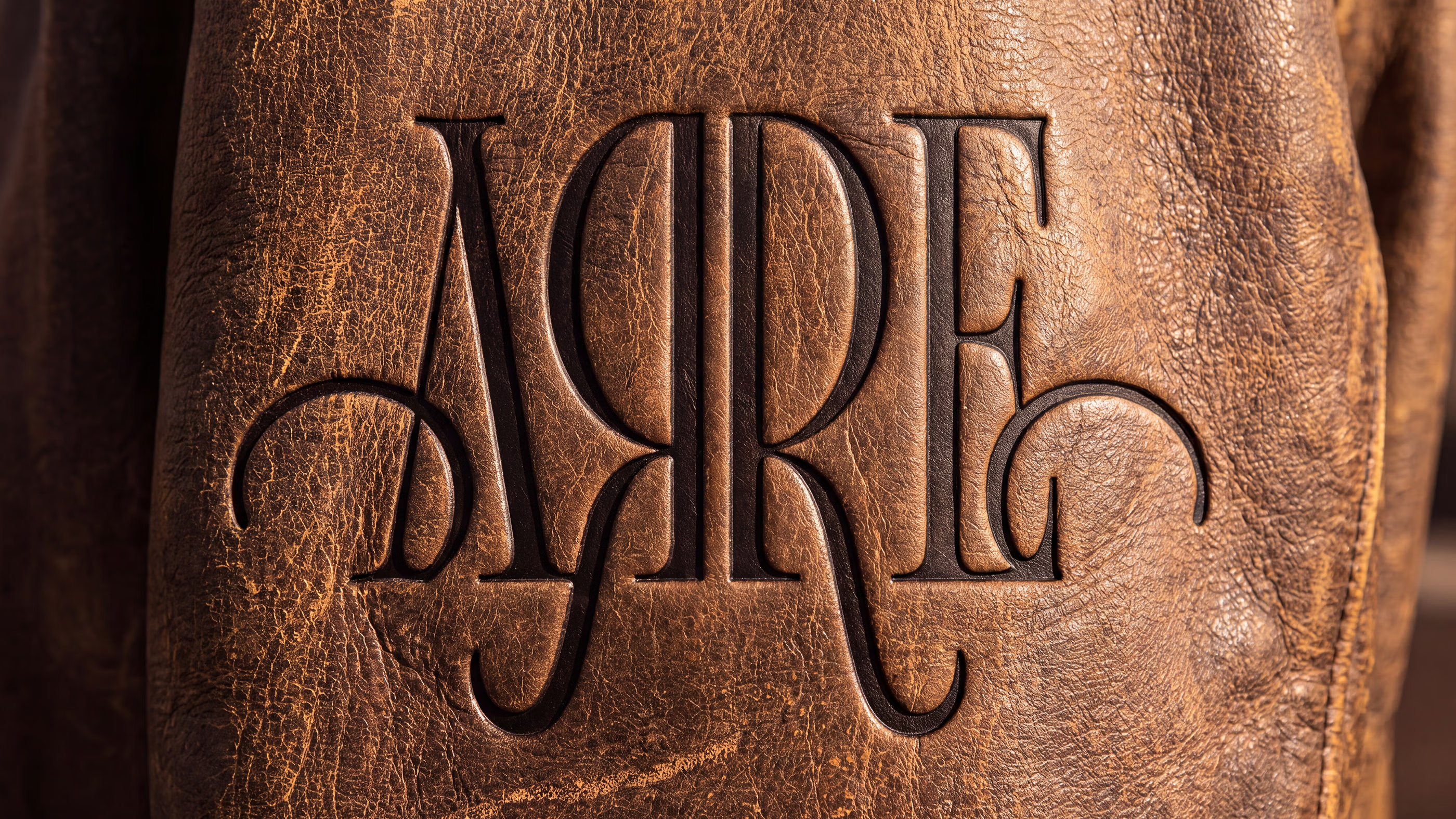
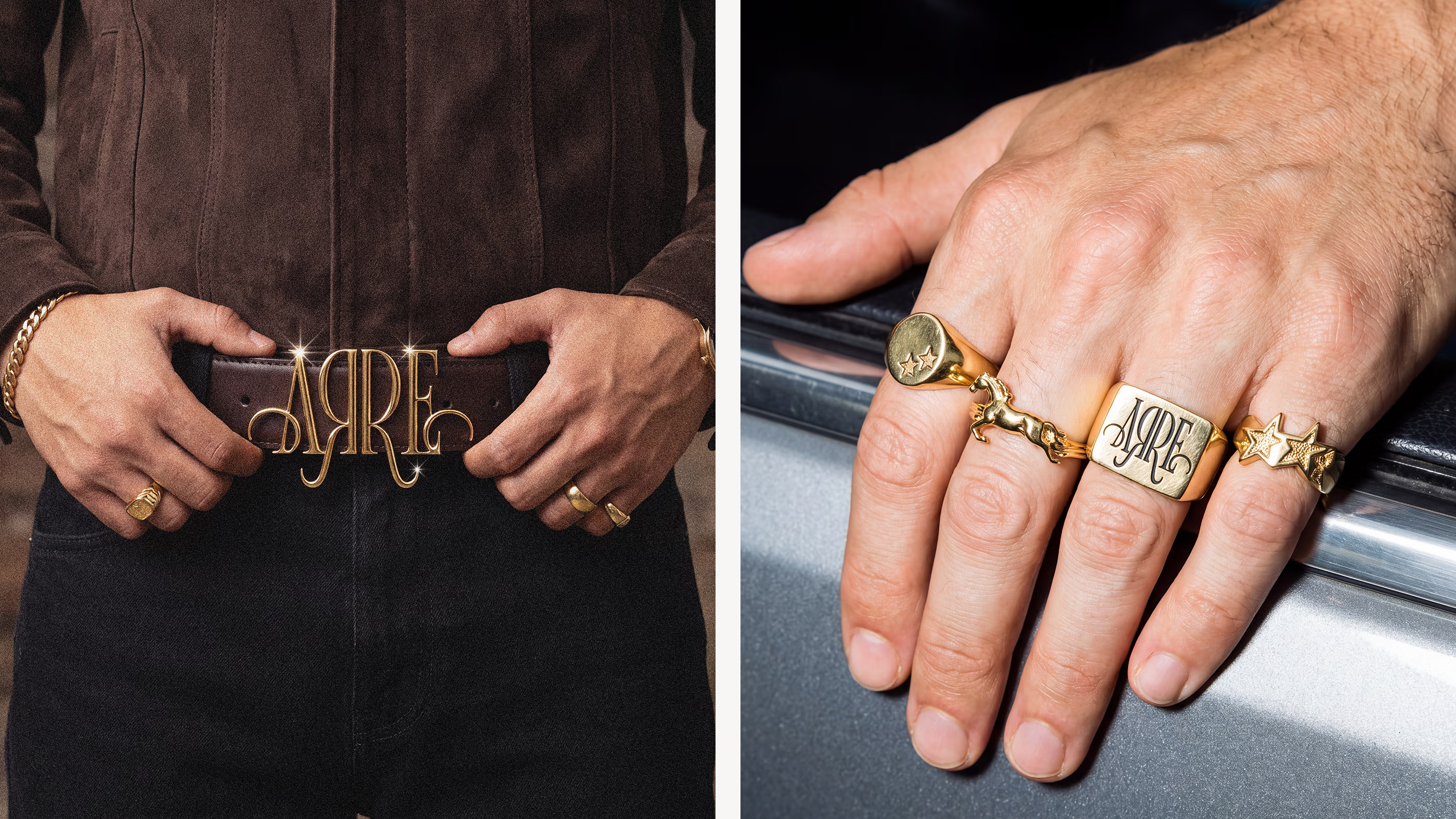
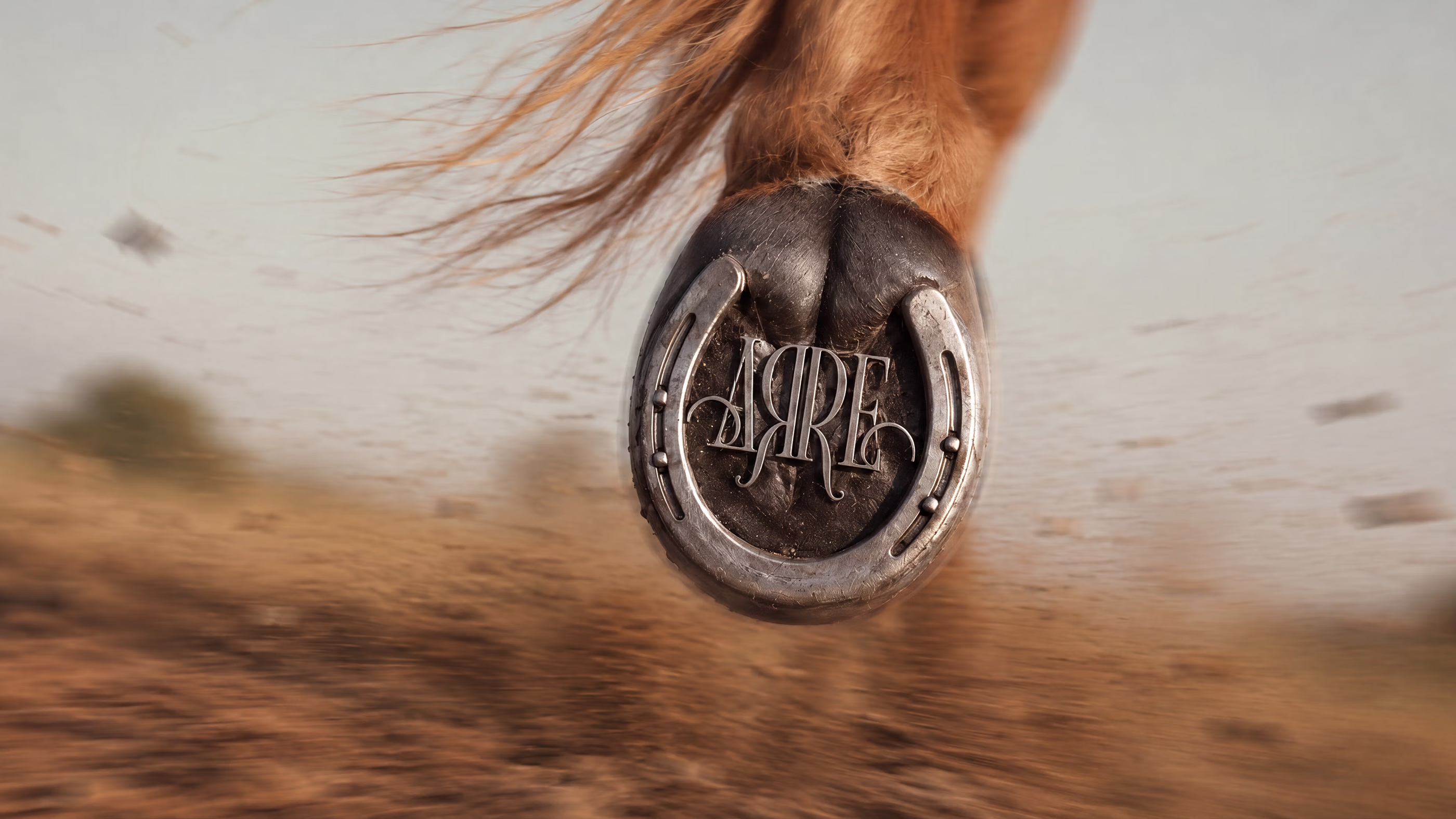
The custom wordmark turns typography into a defining gesture, shaped through mirrored Rs, elongated strokes and unexpected curves that give the name its own rhythm. Built letter by letter, the composition brings precision and ornament together, transforming familiar typographic cues into a distinctive signature that reflects the expressive character of the festival.
Rendered in luminous gold, the mark gains a material quality inspired by the metals, finishes and crafted details found throughout western visual culture. Light and texture accentuate its curves and ornamental construction, giving the logo depth and character while bringing those familiar references into a distinctly contemporary expression.
A Stitched Language.
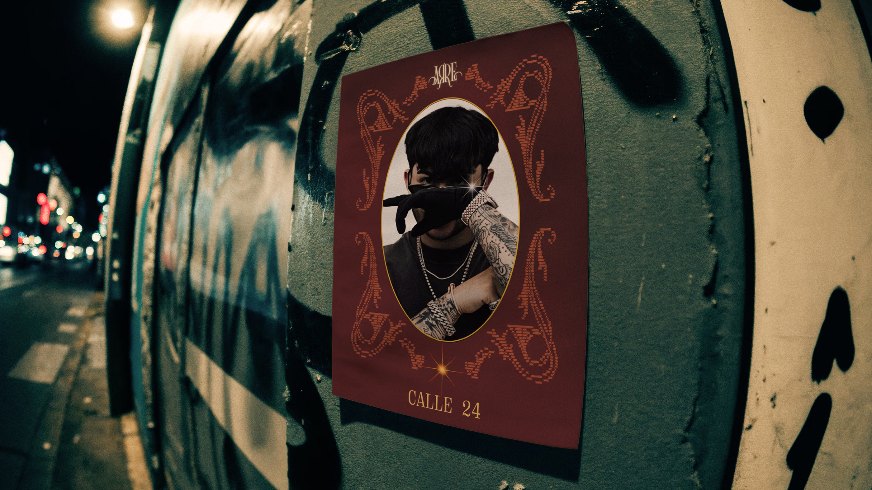
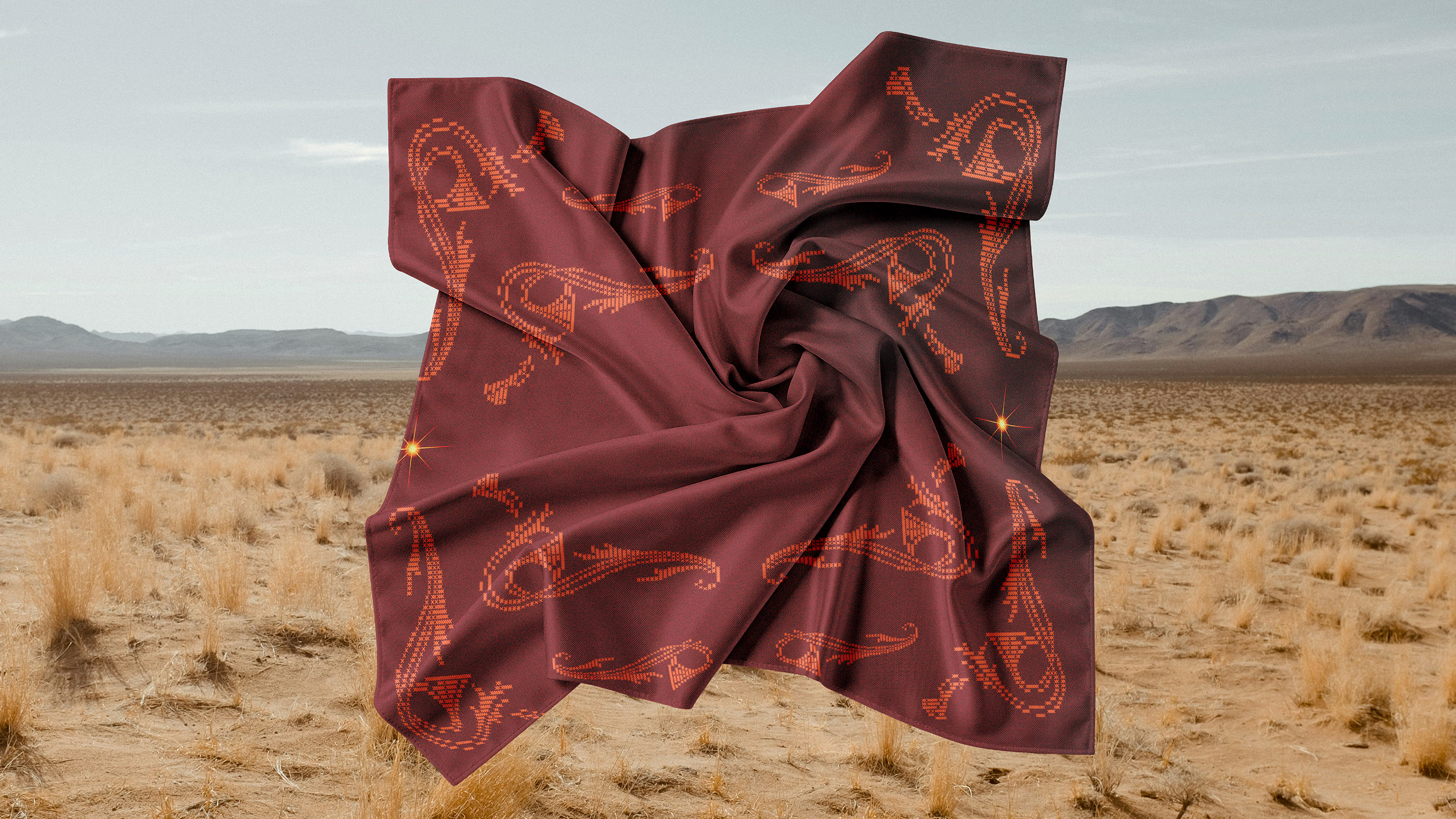
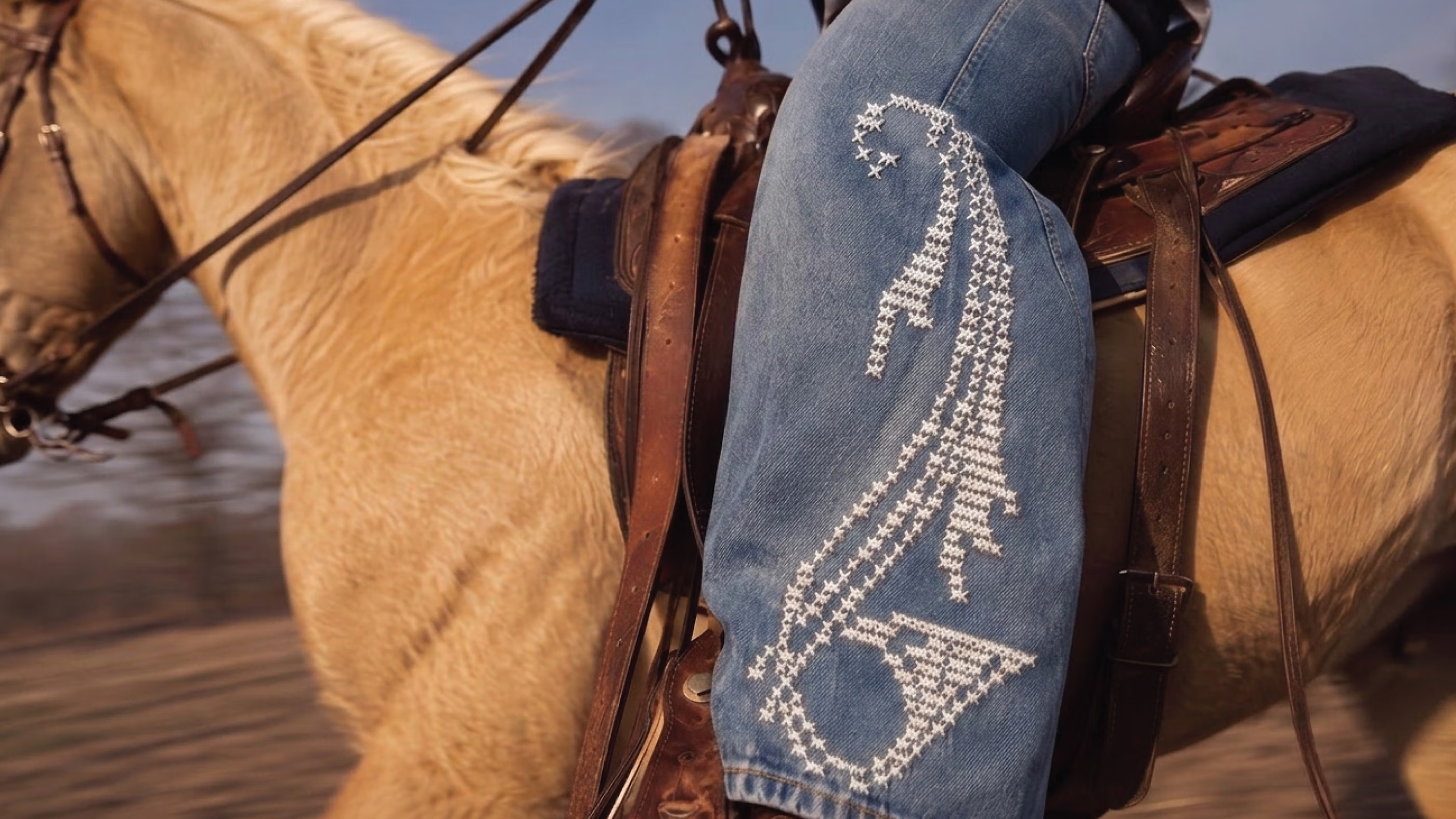
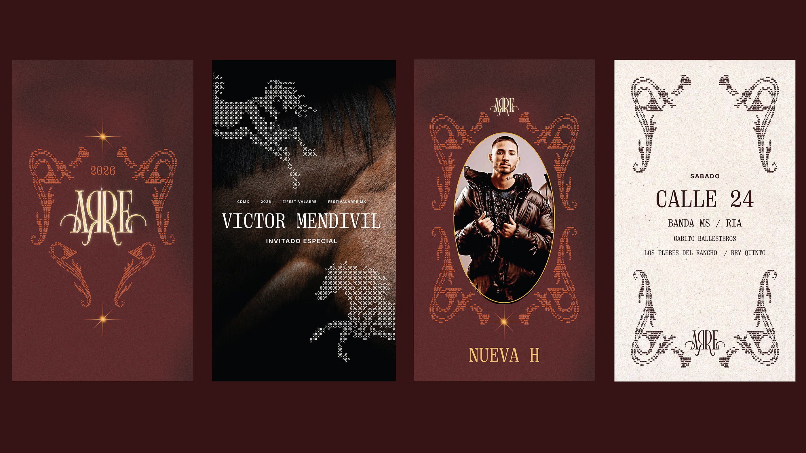
A custom bitmap technique builds recognizable forms through repeated crosses, using density and spacing to suggest movement, depth and detail. Inspired by the quality of embroidery, the treatment gives flat graphics a tactile character, translating digital precision into a texture that feels crafted and connected to the broader aesthetic of the identity.
The technique becomes a recurring language across the system, allowing forms to shift in scale, composition and context while retaining their distinctive quality. From a distance, each element reads as a complete image; up close, it reveals the individual marks that construct it, balancing recognizable forms with the tactile feeling of something stitched into place.
Setting the Tone.
Deep burgundy, earthy orange, clay yellow and off white shape a palette defined by warmth, richness and light. Darker tones create an immersive foundation, while brighter accents introduce contrast and luminosity, allowing the golden presence to emerge naturally. The result feels refined yet grounded, carrying a cultural sensibility that remains immediate and authentic.
Typography introduces another layer through narrow proportions, pronounced serifs and carefully articulated details that reinterpret a more traditional visual language with a fresh perspective. Paired with the palette, it creates a compelling tension between sophistication and familiarity, bringing polish and relevance to the identity while preserving the spirit that gives it meaning.
Made for the Festival.
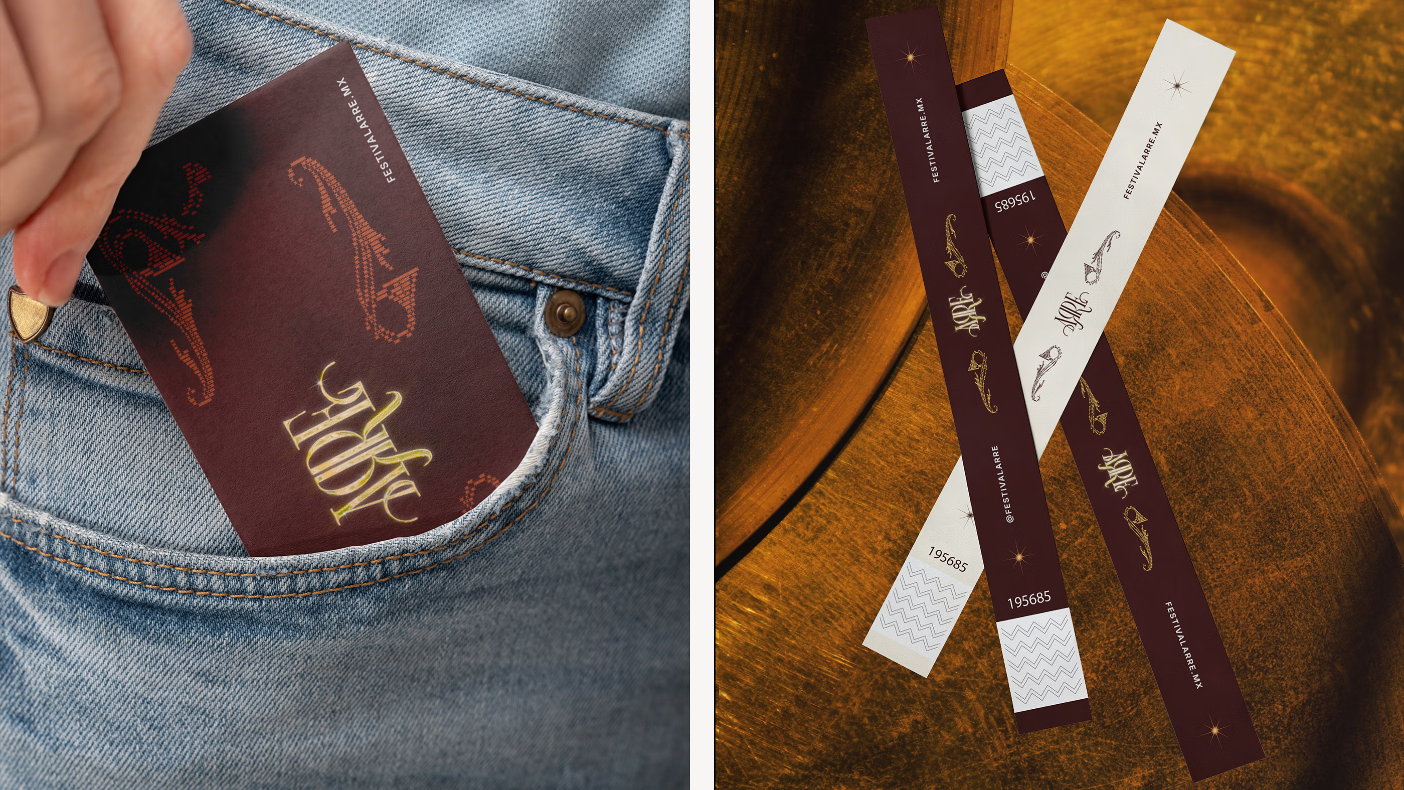
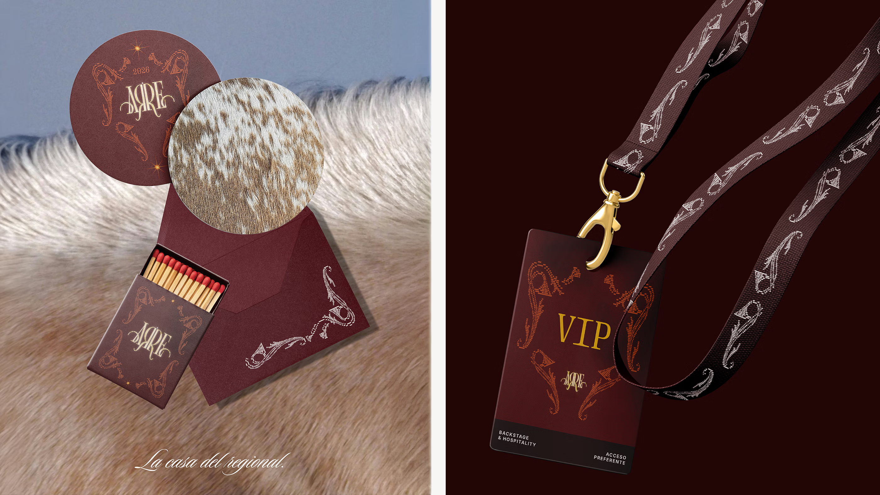
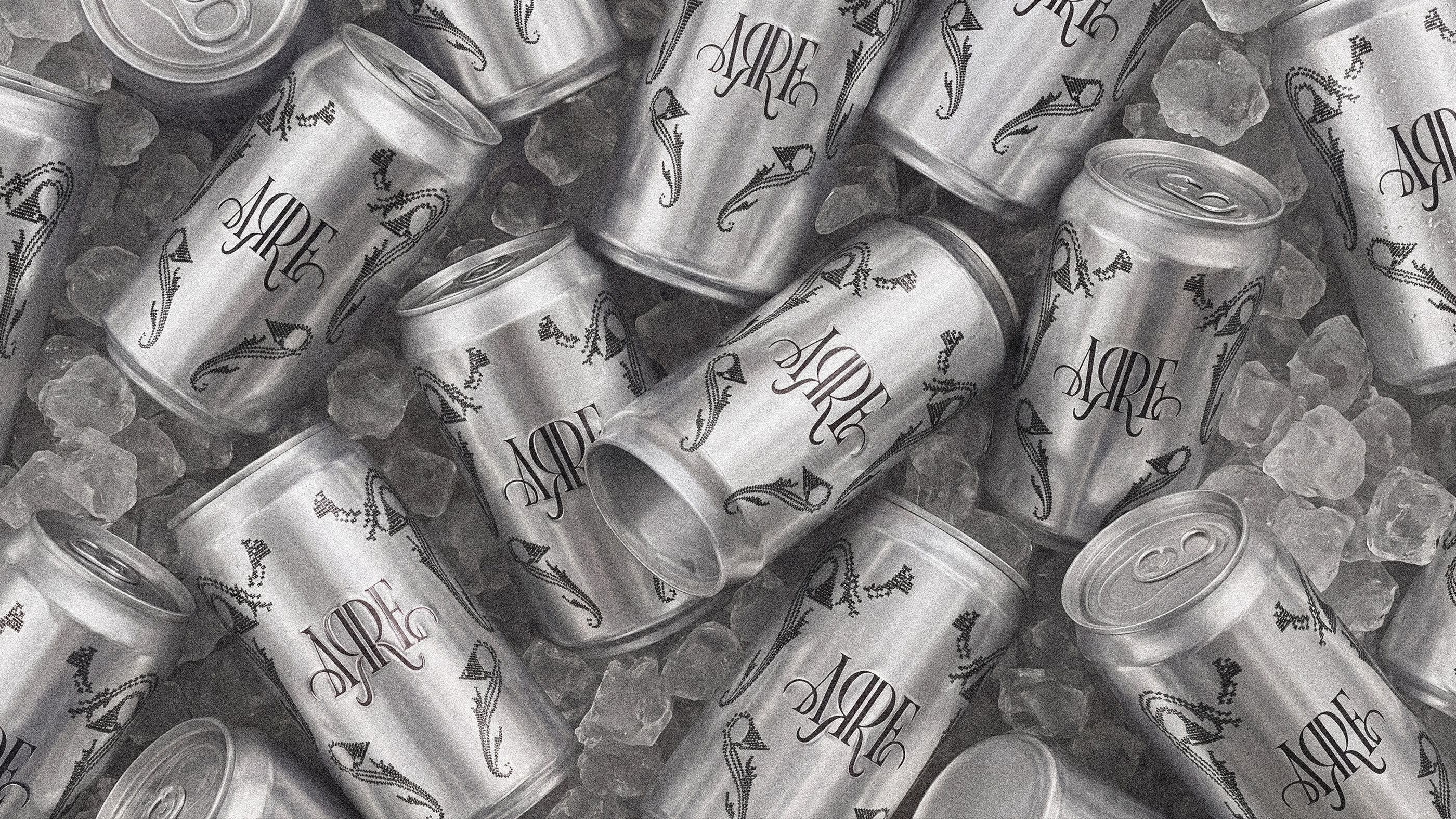
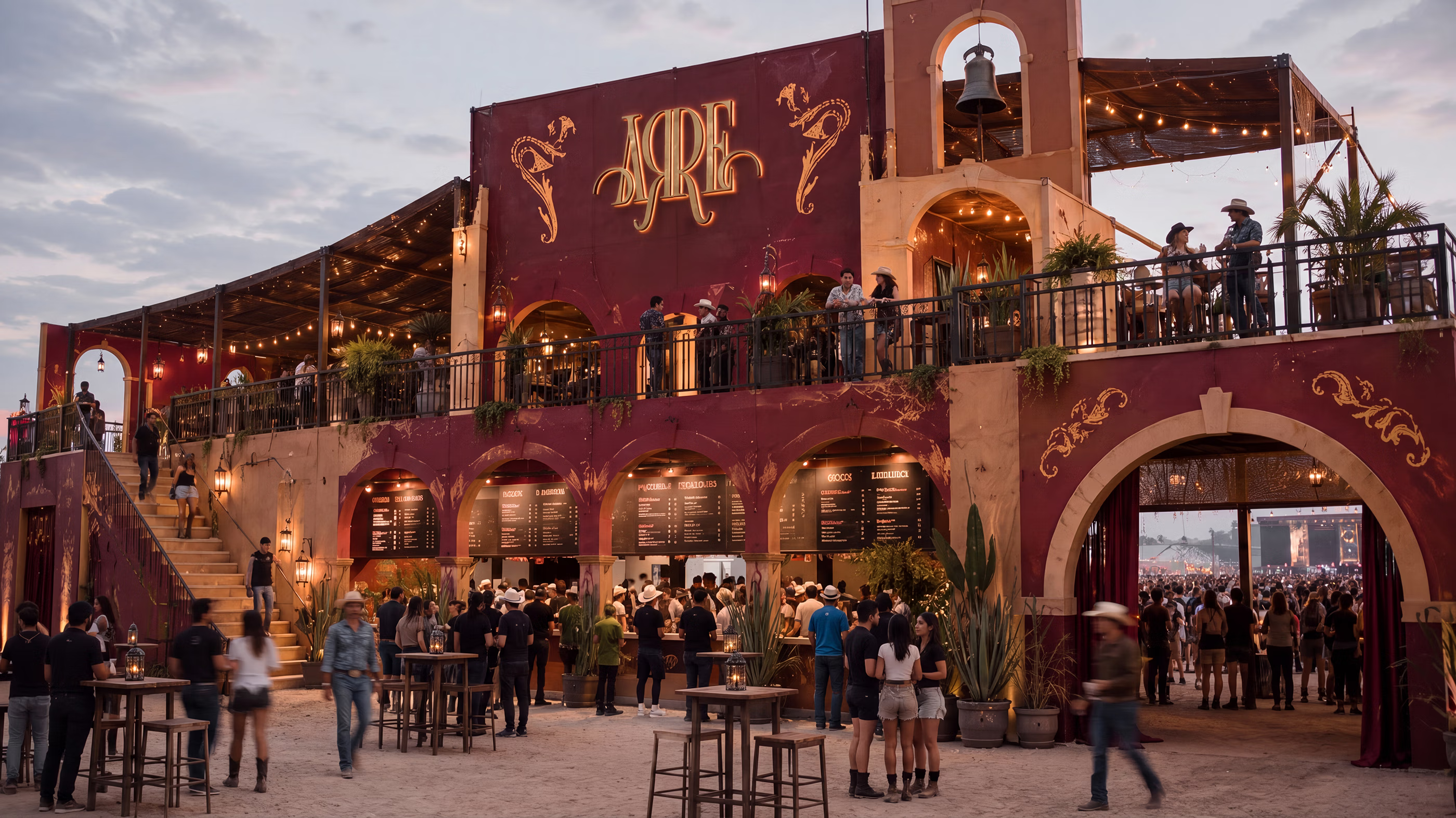
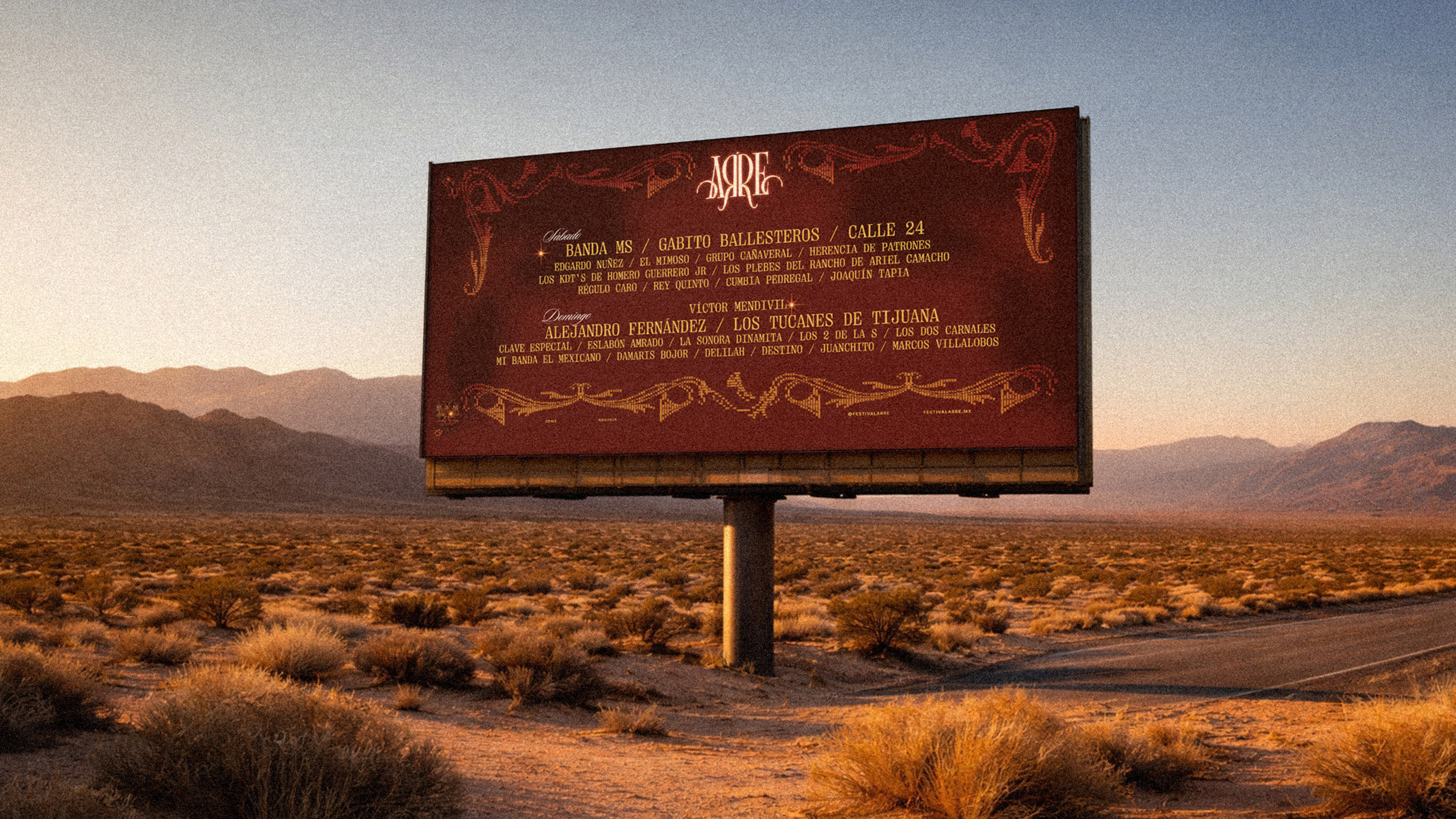
The creative territory develops into a complete festival universe, where every expression contributes to the atmosphere established from the beginning. A shared sensibility guides the system across different formats and scales, turning the ideas behind the identity into a rich and expansive language with enough range to shape an entire cultural experience.
From communication and merchandise to access pieces, objects and spatial applications, each touchpoint gives this universe a new dimension. Together, they shape how the festival is introduced, encountered and remembered, extending its presence throughout the experience and creating a setting that feels immersive, considered and unmistakably its own.
Why did it work?
The rebrand turned a growing festival into a stronger cultural property, giving it the distinction needed to compete in an increasingly crowded category. A defined point of view across communication and experience gave audiences more ways to connect, building equity beyond the lineup and greater value around the brand as a cultural platform.The project also created an asset with the flexibility to support what comes next. Its reach across campaigns, partnerships, merchandise and future editions opens new opportunities to build visibility and commercial value. The result is a platform with the capacity to expand alongside the culture, creating lasting value beyond a single edition while supporting its evolution.